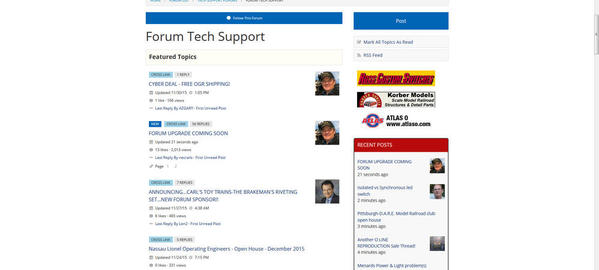
Good on the Upgrade. My programmer son said "upgrade, eh, you mean, they're fixing their site".

I think it's "upgrade" and thank you.

I am finding out that much of the difficulty in using iPads, tablets, etc. has to do with just being comfortable with the way I have been doing it for the last 40 years...since the IBM AT came out. I have made some effort learning how to do the same things I do easily on a desktop, on a tablet. For example, I responded to a question on terminal strips last evening and felt that the desktop with mouse would be a lot easier to scan a drawing and upload. But then found I could just take a picture with my iPhone, and the resulting upload is actually faster and easier. How about that?

And...for what it's worth, I am getting around on the Lionel site much easier now than when it was newly changed. I had to learn a few secret words to search  manuals, but it's not as daunting as I first thought.

Having been through it with my bank and a couple of utilitiy's web pages, part of me wants to cringe when I hear, "Will improve the iPad, tablet, etc., experience of the site." It may have, but it sure made it more awkward to get around on a PC without a touch screen.


Guess we'll have to wait and see.

Last edited by Len2

All change is a little disconcerting, but as always we learn to accept it and then in brace it. I was a little fearful when Hoop La came along but you know I can't even remember the old format. I remember the conversations but how the page was constructed back then is now a non issue. 

I'm sure it will be for the best.

Alibatwomble posted:

I thought it my computer upgrade to windows 10 that caused the formate to change , looks like 200% zoom in & all squshed to the left of my screen & large white area on the right.

James

James, just a thought but since you are in win 10 go to Desktop --> Display Options and make sure the first setting sets the font to 100%... 

Ted

Well, this is one of many web upgrades I've seen over the years (work and play), and very few users over those years have initially liked the upgrade.  This one is no different.  Like all the other upgrades I assume I will get used to it over time.  


What I will miss is the ability to run the curser over the generic Avatar in "Recent Posts" to see who did the post.  I used that function all the time because it allowed me to skip over posts from members whose posts never interested me.

Well, it better than Lionel's...

It was a shock to the eyeballs after looking at the old format earlier today.  Looks like the spellchecker doesn't work on Firefox, either.  Got 3-1/2" of empty white space on both sides of my monitor.

Thumbs sideways until I drive it around a little.

Doesn't seem to be a way to jump from forum to forum without going through the directory.

Rusty

Last edited by Rusty Traque
Bob Rumer posted:

My mom always told me, if I don't have anything nice to say remain quiet.

...

And that, Bob, would be doing the the folks at OGR a HUGE disservice in this case!

But to play by your Mom's rules... I will say something nice.  On an iPad, it does appear that we now only need to click on thread titles ONCE to get to that thread.  But if it takes this forum upgrade to deliver that feature, I'll gladly roll back to the former version of software where we needed to click on thread names twice (on mobile devices).

And now that we're on the topic of iPads... I'm noticing a slight DELAY when I swipe my finger over the screen to scroll up/down.  Not a long delay, but enough to be noticable.  Yet when I switch to another tab in the same browser instance, it scrolls just fine.  Just the hoopla OGR Forum tab encounters this sluggishness while swiping.  Very annoying.

David

Last edited by Rocky Mountaineer

I agree with the foregoing "less than pleased" comments. Big problems:
----The type should be black, not blue. ---Too much open white space, and everything takes up way too much room. ---Takes much longer to go through the contents. ---It's hard on the eyes. ---Oh, and the editing function is screwed up so your changes are not properly reflected in the revised version.

-- Overall much more difficult to use, tiring on the eyes, and plain irritating.

Last edited by breezinup

Now i think it looks weird but I'll get used to it. My real question is this, how would everybody be reacting if this is how it looked since day one and the upgrade made it look the way it used to? Curmudgeny ol train guys just dont like change.

More importantily, whta heppanrd too the speel chekc

I'm using the iPad.

There are a few things I like - the add reply box at the bottom of the screen and the take action drop down using words instead of confusing icons. 

Things I don't like - too much white space, lack of contrast between the white and the light blue/gray blocks, and the way everything kind of runs together. 

I'm confidant Rich will read our comments and continue to work with hoopla to see what can be done. The last thing he wants is for members to be upset and leave the forum - if members exit, advertisers and their dollars will likely follow.


I don't like it either, but I'm willing to give them some time to change things to make it readable, like the colors, font size, spacing, etc. I now have to page down 4 times just to get past all the stickied topics. I get all the advertising, but I never have understood all the stickies appearing on every forum.

Add Reply

Post

OGR Publishing, Inc., 1310 Eastside Centre Ct, Suite 6, Mountain Home, AR 72653
800-980-OGRR (6477)
www.ogaugerr.com

×
×
×
×
Link copied to your clipboard.
×
×