Today was a mural design day. I'm a frustrated artist and not a very good one at that. In retirement I've had thoughts of going to classes to learn to do nice paintings. I tend towards realism, but I have a soft spot for American Impressionism especially Edward Hopper. That being said, I'm not foolish enough to start painting my walls without at least trying some ideas out.
My first three attempts were very amateurish and didn't reflect my mental image of what I wanted. In order of completion here's what I did. This first one had three sequential lumps that didn't represent anything. This was an inkjet print that I used acrylic paint to do the design. Even though it may look like it, I didn't paint this on the wall.
I took another crack at mountain shape. This wasn't as bad, but it still didn't do what I wanted.
Number 3 had larger hills, better palate control and showed the idea of having my high tension poles receding into the distance.
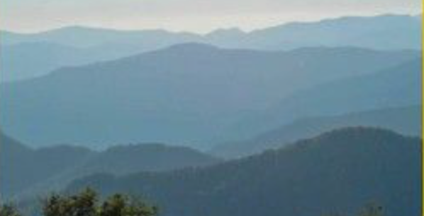
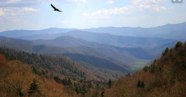
I showed this to my wife to see if it worked for her. She thought the mountains were too big. I agreed. So then I decided to do a bit of research. I went on Pinterest and searched out Appalachian Mountain vistas. I found two that really had the palate I was imagining. It showed me that the colors change as they recede in the distance, BUT they don't just get lighter green/gray. They turn blue/gray.
This one was a National Geographic cover.
And here's another one.
So using the first image's palate, I cobbled together this mockup. I drew the vista on another piece of paper, cut it out and pasted it on one of my previous failures. It's still crude, but I think I'm onto something and my wife agrees. This would look better when the model mountain is covered with something other than cardboard strips.
I'm still not happy with the colors. I will work to grey and tint more blue to the distance hills. I also like that it's not just one lump receding from the first one, but has overlapping hills with differing shapes and distances. I may have to buy latex wall paint to cover the area. I'm using cheap acrylic tube paints. It may be enough, but I'm not sure. The mountains tend to lighten at their bottoms due to the haze lying at lower level. I attempted to do that on the green one in the foreground. Another concern I have is the large quantities of foliage I'm going to need to cover the model mountain. I've been to Bob Bartizek's layout and he has tons of foliage covering his wonderfully rendered Central Pennsylvanian mountains.
While I know I don't have to ask, your input would be greatly appreciated at this time.


