


Max, you had me laughing out loud! :-}
Well, the weekend is here and that means that it's time to play "Dissertation versus Distractions"! So to get those distractions out of my system and get some writing done, here are a couple of updates, and then it's "nose to the grindstone" for me ... Hope you enjoy the pretty colors!
De Colores
Forgoing sleep last night (who needs it? sleep is for sissies), I finished creating the color stick swatches from the acrylic artist and acrylic and latex crafts paints that I have on hand. Here they are all lined up in a row. "Pretty" impressive, huh?:
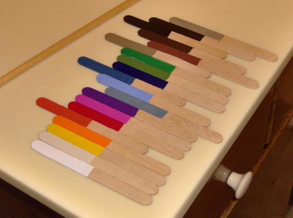
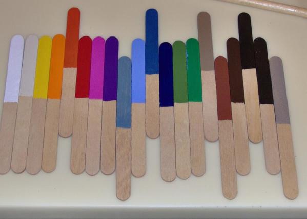
The color swatches are grouped so that the centered sticks are the Golden Artist acrylics that I raved about in a previous post. I am still raving ... (OK, no wisecracks, guys!). The sticks that extend to the left in the top photo and extend upward in the bottom photo are Model Master acrylics. The sticks that extend to the right/downward are Rustoleum American Accents (oh, gosh, "American accents", like I have?).
This was a really worthwhile exercise. I learned a lot, and I now have test colors on wood that I can use without having to haul out the actual paints or make a less useful paper chart. Two of the Golden Artist paints were extra thick, which is good to know if I use them in the future (the mfr even lists that kind of data on the tubes). Otherwise, with these paints, it was one coat and you are done! Luscious, vivid colors and with only light brush lines visible (except for the thick red). Clean-up was a breeze.
I purchased the Model Master acrylics a while ago for an HO-scale house that I (shock, surprise) never finished. These paints separated out over the years. All of them were a disgusting runny grey until I remixed them. Fortunately, they remixed fairly well, with the color being consistent and evenly distributed after stirring. However, there was some clumping at the bottom of the jars. As I recall, these paints worked well for the small brick and slate walkway details that I was painting on a Patel plastic house model. But this exercise is all about how the paints work on wood with a grain that's similar to bass wood, and they were OK.
The American Accents latex paints continued to disappoint me. As you can see in the 9th sample from the left, coverage was poor on wood. But the worst thing was that the paint dried too quickly or something -- it was evening three of a heat wave. So, the paint brush or the paint brushed on the Fudgcicle stick would have a rubbery clump of paint stuck on it that would then get dragged around with each brush stroke. That was not good. By the way, the right-most stick is a silver metallic paint. The photo doesn't do it justice. It's actually decent if you are careful to prevent the clumping problem. I've used it to suggest mirrors for scale trucks and autos that had the body color where the mirrors should have been. Not great but not bad. Lastly, the "just cleans up with soap and water" was misleading. I was covered in the stuff that wouldn't come off with soap and water, and my counter top still has some tiny specks that was Comet bleach resistant (!).
Now let's see this stuff in action!
Previously, I worked out how I want to paint the tile on the resin counter that was included in the Whistlestop Diner kit. On two sides there are nicely inscribed lines for the tiles. In a notebook, I drew a grid that represented the actual number of etched "tiles" on both surfaces. Using the Airport Diner's black, white, and salmon tile as a model (see here), I determined exactly what color each tile would be to end up with a visually balanced pattern. I hope to actually paint it this weekend, but for now, use your "Squint-O-Vision" to anticipate the finished product:
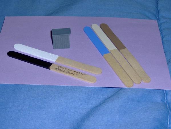
From top-to-bottom, the front of the counter will have a white row, two rows that create a black and white checkerboard, a middle section that will have two centered crosses created out of the light blue -- with perhaps a Titan Buff center, more white, and then the bottom two rows will be black.
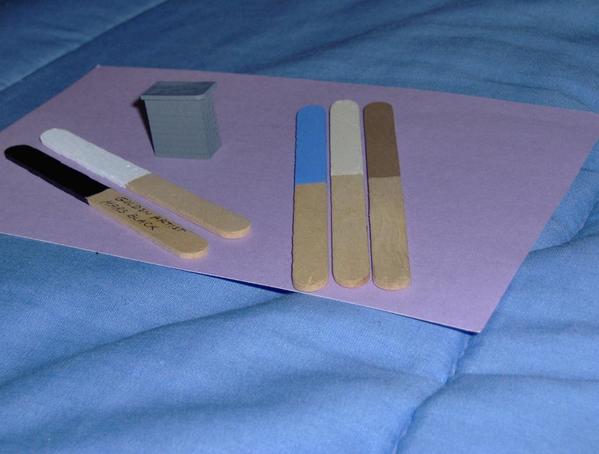
On the short side of the counter, the patterns from the front will wrap around to the side. But because of the narrow width and thus fewer rows on the side, the traditional tile cross won't fit. (It can't be centered.) Instead, there will be a centered square whose opposing quarters will be blue and buff or blue and that darker tan. Both represent a classic diner color combination. Usually, it can be hard to find modern materials that match 1930s and 1940s tile colors, but I think that these paints are perfect. These will be out-of-the-tube colors because the choices are so great.
The rear will be a light tan suggesting wood. I hope to draw a simulated series of shelves with plates or coffee pots or something on them to glue to the back side. The top will simulate pink marble with brown lines, so I'll have to do some mixing when the time comes. And, speaking of time ...
Distractions: 1 Dissertation: 0
(Unless you count the purple 5x7" index card in the photo that has dissertation notes on the other side ... ![]() )
)
Tomlinson Run Railroad


