


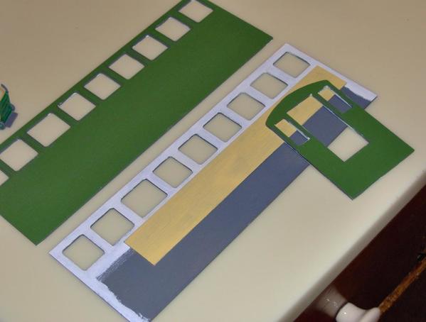
It was going to rain the next day, so on Saturday I finished priming the remaining wood pieces so they'd be dry in time for painting today. I decided to use the interior wall supplied with the kit, but knew that it would need to be shortened to accommodate the combined width of the refrigerator and stove. They will be placed side-by-side at the short end of the diner, opposite the door, and fit very snugly without the inside wall.
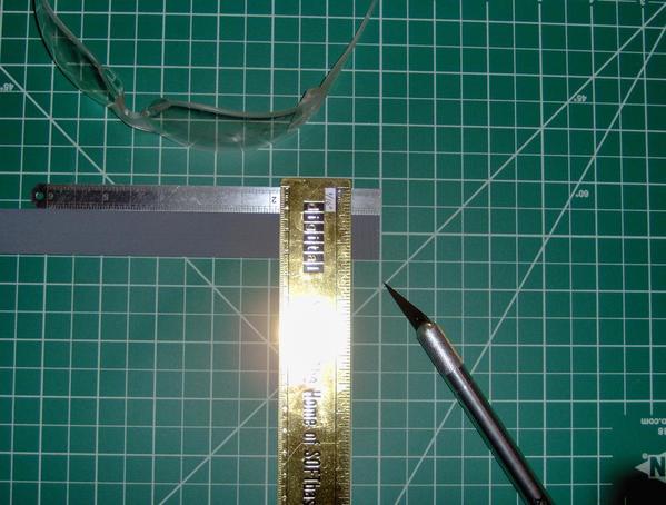
Removing one inch of the wall length worked well with my intended floor plan. It helps define the kitchen area, too. Because the wall height matches the resin counter height, I wanted to use one of the cut-off ends as a side wall for the counter. This would create an L-shape behind which Chef or Roxie the waitress could stand. My intention was to scribe lines on the wood that matched the tiles inscribed on the counter, and then paint the wood extension accordingly. Unfortunately, cutting lines kneeling on the kitchen floor on an overcast day didn't work very well. In fact, I cut a little too deeply on one score, and will need to redo this section or try and glue it. Unfortunately, the interior wall is very thin at about 1/32" -- half the thickness of the wood that I bought on Friday. You can just barely see the vertical score lines where the knife tip is pointing in the photo below. The horizontal lines came next:
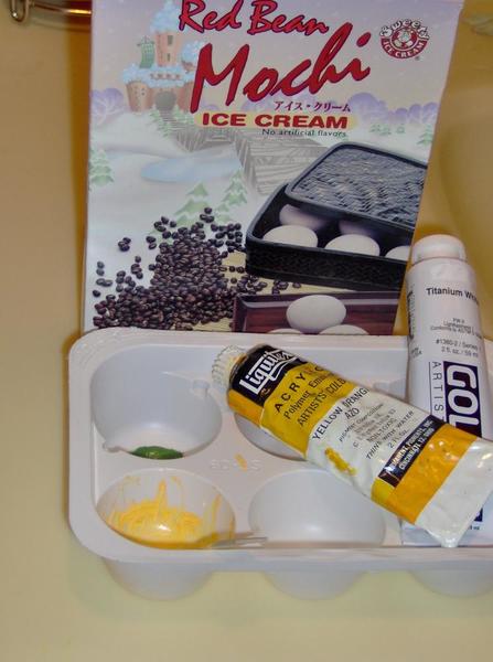
The interior wall was to be painted salmon with black "tile" touches. A nice salmon, according to my color wheel, is made from equal parts of orange and yellow, tinted with white. To my pleasant surprise, in the box of ancient paints that I dug out on Friday was a pre-mixed tube of Yellow Orange. OK, it wasn't "Golden Artist" paint but hey ... it was yellow orange. After all these decades, the paint in the tube is still liquid and I checked the color against my Color Map chips (see below) to confirm it didn't go "bad". It's still good to go! It's the stick that sticks out:

I think the Yellow Orange goes well with the green that I've chosen for the outside of the diner. So, when lightened with white, the yellow-orange should still blend well.
And speaking of "going well", Chef Chuck Wagon thought that Mochi, Japanese ice cream, would go well with the traditional Memorial Day hotdogs and buns that I had planned. Who am I to argue with a 1/48 scale pewter figure? Besides, I got to eat all the ice cream and, in keeping with our food theme, the container made a perfect paint mixing tray. Unfortunately, the mixing did NOT make anything perfect let alone remotely like "salmon":
Chef thought that he could do better mixing these:
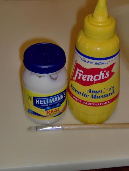
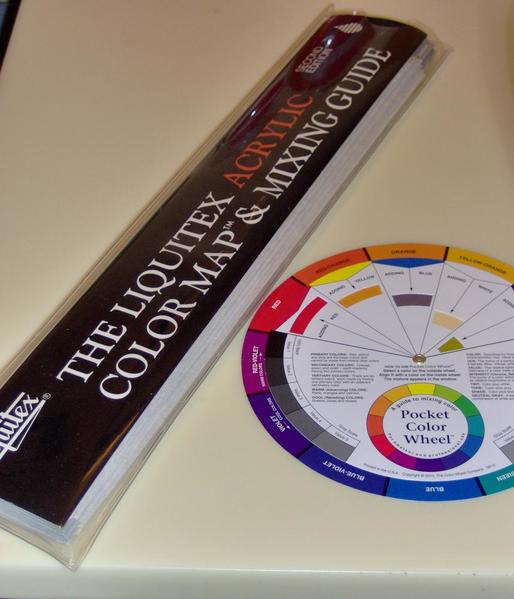
There definitely wasn't enough red in it. So maybe the next time I'll start with plain orange and add white. Because my time was limited to this holiday and I wanted to do as much as possible, I went ahead and painted the inside walls with this pseudo-salmon, knowing that it was temporary. Later, I will spend some quality time with my rediscovered Color Map & Mixing Guide. (Who knows what I was thinking when I bought it years ago, but maybe it will finally come in handy?) The map unfolds to reveal actual graduated paint chips in all the available colors, and shows in excruciating detail how to create various shades and hues. It's got to be better than the paper wheel that "looked so good on paper", but failed in the execution:
Here are the outside and inside walls, and a sample end wall:

I originally thought that I would paint the insides of the windows white but after I started, I decided that they looked better primer grey. So they look pretty messy at present. I'll touch up the areas where the white slopped over the sides later. It was so overcast today that the white looked just fine under my working lamp. However, when I took the pieces into the bathroom and fired up the overhead heat lamp for photographing, the extra light revealed that a second coat is in order! Yuck! (The heat lamp also messed with the color of the primer - it's neutral grey, not blue.)
In actuality, most of the white may end up being covered by whatever the window solution ends up being, and the trim will be black. Side note: I'd hoped to paint my three Bar Mills hand carts this weekend, too, but only got part-way through painting one. You can't tell in the top photo, but it's a different shade of green with a nice high gloss that I'll try and tone down after the rest of the detailing is done. Compared to staring at a computer Monday through Sunday, painting was quite meditative. I just wish the results had been a bit cleaner. But there's nothing here that a little touch-up can't fix.
This weekend, I also tried to add a black border to the "tile" floor pattern that I picked out of my various security envelope patterns that I've scanned. Here it is:
Unfortunately, in my two graphics programs the pattern is huge! It may be how it was scanned. I spent a lot of frustrating time trying to understand why it wasn't behaving and/or fix it. And speaking of unexpected results with scanning ... Up Next: Experiments with ventilation ...
Tomlinson Run Railroad


