Avanti posted:
TomlinsonRunRR posted:


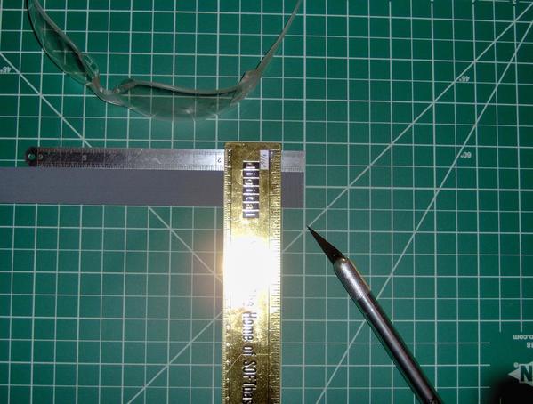
Wow! A Digital Equipment Corp. ruler.

Used to consult for them a million years ago. I still have a nice collection of DEC coffee mugs and other SWAG.

Ha, Pete!  I figured that somebody on this forum would get a kick out of that ruler.  It's a hefty brass one that's good for scoring line, although it's awfully short.  I too was a consultant and then an employee, perhaps during the same million years ago as you?? :-).  

I never got any mugs, but they apparently were popular "swag".  I have my ruler (I worked on that product), a five-year anniversary Cross pen, and a DFO3 modem that actually works with an Amiga 1000 computer.  

Digital had the BEST online forums and user groups 'way before the internet.  You've now got me wondering whether there were any forums for model trains/railfans?  It was a great company with great people. Glad that you had a chance to be a part of it, although consulting can be hard.

Tomlinson Run Railroad

Last edited by TomlinsonRunRR

I've been working on some supervisor changes at school this month and haven't had much time for my diner model.  But I have had time to work on some of the accessories.  I desperately need a new camera but I also need a new phone, so I'm holding off on the camera. Who knows, the phone may be good enough.  Until then, please bear with me; the photo quality is poor. Be sure to use your "Squint-O-Vision" liberally!  Some photos are borrowed from a recent Team Track Tuesday post.

Here's the resin counter that came with the kit.  It is almost complete and took forever to do.  To paint the individual tiles as cleanly as possible, I created a painting tool by cutting a 2-mm wide tip out of a wooden coffee stirrer.  I beveled the tip about 45 degrees.  The tip fit the tiles perfectly but using it left streaks in the paint.  The wood was too rigid or something.  Likewise, for this particular task, nail tips and toothpicks weren't as effective as I had hoped.  So, I returned to small paint brushes.  The model took several coats to get decent white coverage over the grey primer.  Also, I had to redo the tiles several times to clean up paint that went over the lines.  I intentionally left some white showing on the bottom 2-rows of black tiles to indicate the grout.  I dunno, it was a judgment call:

The checkerboard tiles look uneven in these photos.  I think that's because of the unevenness of the model itself. They look OK in the wild.  On the right side of the counter is a four-tile embellishment that is prototypical. The top two tiles are light blue and buff, respectively, and the order is reversed on the bottom tiles.  This creates a sort of "diapered" effect.  As I wrote earlier, it was a way to get a 2-tile centered design in this narrow space because the 3-tile crosses couldn't be centered. The blue and buff colors may not seem to go with the black and white, but such mixing was prototypical.  The same buff color is used inside the black crosses to tie the tile designs together.

Yet to do: The pink "marble" top needs to be darkened with some purple and some brown striations to simulate the original marble in the photographs that I took of the Airport Diner, Shirley, MA (see posts above).  I also hope to create some sort of image for the back of the counter that will look like shelves with dishes stored in them.  It may not be visible once installed in the diner, in which case, I might just skip it.

Here's the refrigerator, which Chef calls his "Frigid Dare":

I tried to add a bit of grey to the door seals but it didn't work.  So, I left them au naturel and rely on shadow to create the effect.  I may draw some condensers/coils for the back of the refrigerator if it will be visible from one of the rear windows.  In this photograph you can also see two of the three hand carts that I painted in various mixtures of glossy green and red.  They could use some weathering. 

In the truck in this photo, sitting on top of the unpainted stove, is the itty bitty toaster:

I bought the unpainted toaster kit (considerably cheaper), which has a thin copper wire that you are supposed to glue on the side for the electrical plug.  I painted the "cord" alternating colors and left some copper visible to simulate an old cloth weave cord cover. The toaster cords that I remember often had a bit of copper thread. But I rather like the toaster without the cord.  I held the toaster in a long large pair of tweezers so that I could apply silver paint to the sides and black to the bottom, slots on the top, and the handle.  The tweezers' tips left blank spots in the areas that they had covered.  I then painted those areas in a simple grey color that I hand-mixed.  Using grey here and there, instead of making the whole toaster silver, gave it a more realistic "reflective" look.  At least I think so, but until I get a better camera, you'll just have to pretend that you can see it, too.

Out-of-focus accessories outdoors with flash, note the writing on the fridge emblem:

The stove will take some advance planning before painting as it has very complex surfaces.  The Suffolk sheep is from a large package of unpainted animals that I got -- some of which I showed in grey primer in one of my earliest posts.  I tried to follow good painting techniques -- really I did:  I started with a dark brown on the under body  and in areas that would be in shadow, added buff to the underside and etc. to indicate dirty wool and more shadows, then used white for highlights.  There are also brown highlights that you can't see for the eyes, and inside the ears, and on some hooves.  The head and legs are black.  I was disappointed with how it came out.  I tried a buff or white wash (I forget which) to tie the colors together but without success.  However, now I think that I may need to extend the white highlights down the sides further to get a more realistic look.  Then wash it again to smooth the transitions.  That might help.  (Note that the flash is likely accentuating the contrast more as well.):

Thanks for looking!

Tomlinson Run Railroad

Attachments

Images (8)
  • mceclip0
  • mceclip1
  • mceclip2
  • mceclip3
  • mceclip4
  • mceclip5
  • mceclip6
  • mceclip7
Last edited by TomlinsonRunRR

Today's Diner Project: Mustard and Catsup squeeze bottles; Beer bottles and a cup of Chili from Toothpicks

Disclaimer: I'm really not looking for food items to use in my diner model.  Honest. They just find me!

We don't have just any old toothpicks where I work.  We have "Tea Tree Therapy MINT Toothpicks":

These birchwood toothpicks are "infused with [Australian -- take note Max!] TEA TREE OIL, mint, cinnamon" and more to help "freshen breath and kill bacteria".  Good to know.  But what I found more interesting was their suggestive carved shapes!  I could envision scale pepper mills, cups, goblets, and more depending on where and how one cut the carved ends.  You could even split them down the center axis for even more possibilities.  And, as an added bonus, the top of each toothpick is raised and has a sort of reddish "grain" suggestive of food -- Chef's 3-alarm chili comes immediately to mind.  Here were some initial experiments dividing the tops up into three different sections:

These were the most obvious divisions to me.  It's a hard to see, but in the photo above at about 9:00 is a bowl of chili (on its side), at about 1:00 or 2:00 is a bottle with the neck facing upward, and about 00:25 is a footed bowl.  [Some better photos below ... ] These items were created by cutting from the top downward, leaving a pointed stick for more minty fresh modeling projects. 

The pause that refreshes: Never one to miss a culinary opportunity, Chef Chuck Wagon suggests pairing these minty fresh toothpicks with a tall cool glass of Pappy's Sassafras Tea -- it's "Refreshing as Spring ... All Year Long". Who can argue with that?:

This morning I decided to use these toothpicks to create four sets of mustard and catsup squeeze bottles for the tables and counter that I will be adding to my diner model.  Here, I've painted four catsup and mustard sticks, plus two glossy green sticks from which I will make bottles. 

But first, a digression: Previously, I purchased a set of miniature "Fiesta ware" plates.  Here's Chef modeling them (he thought it was "Fiesta wear" and was pleasantly surprised to find out they were china):

Fiesta ware comes in different mix and match colors.  Had I purchased more of these plastic dishes, I would have (spray?) painted each sprue a single but different color, clipped the plates out of the sprues, and then mixed them up to create new sets.  It seemed more efficient to paint them all one color than try to hand paint different dishes different colors on a single sprue.  But, these lovely dishes are expensive, and being cheap, I decided to experiment with other ways of making dishes such as using the paper punches on plastic sheets that I described earlier.

However, I had the Fiesta ware painting approach in the back of my mind when I started to create my mustard and catsup squeeze bottles.  By painting the ends of the sticks a single color, when I cut out the bottles, I'd get bonus "dishes" -- one a cup of chili, the other a footed bowl, as by products.  If I use lots of colors, the result is instant mix and match Fiesta ware!

Here's the first cut, which creates four cups of chili:

The cups of chili are sitting on a paper prototype of a dish that I created using a standard size paper punch.  The blue dot to the right is a "Blue Plate Special" that I created from a Tums lid. The punch is 3/8ths of an inch or something and could be a bit larger, but the Tums lid makes for a really nice shiny plate. (By the way, those tweezers are useless.  Items as small as the cups of chili need a longer pair with a lot of spring, which I switched to, but didn't photograph.)

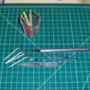
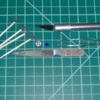
As you can see in the photograph above, there was some loss of paint in the remaining sections.  From these I will create the squeeze bottle and then a footed bowl.  I touched up the paint on the bottle "necks", and did a little light filing before continuing with the cutting. Garnet paper would have been best for touch ups but I didn't have any.  Cutting was easy with a #1 X-Acto knife and facilitated by rolling the toothpick while applying pressure.  A few chili cups were lopsided, but in general, this technique worked well.

Above are what will be the mustard squeeze bottles sitting on top of what will become footed bowls.  The cups of chili have already been removed and are on the blue lid.  The tops of the yellow "bottles" didn't need as much touch-up as the red ones did.  This photograph also shows the plastic Tums lid.  I cut out bits of the rim so that the paper punch could be slid onto the lid to create some sample Blue Plate Special dishes.  If I had used a regular punch, cutting the rim wouldn't be necessary.  However, the paper punches may provide greater visibility for lining up smaller punches to suggest plate depth as I described in a previous post. 

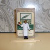
Here is my head steward modeling two sets of catsup and mustard squeeze bottles.  He's getting ready to place them on a table in the diner, except that I haven't built those yet!

As you can see, some bottle necks are a little wider than others. I'm not sure whether that was due to differences in the (minty fresh) toothpicks or the klutz cutting them.  I'm inclined to suspect the latter.

By the way, to hold the bottles on the tray, as well as to keep the figure upright, I used double-sided Scotch tape. For the tape on the tray, I've left a little nubbin on the left side so that I can remove the tape easily after photographing. Ignore it.  So far, the tape doesn't seem to remove paint on the figures.  It has just enough hold to position items or a figure for, say a photo shoot, and then it looses some of its hold.  I'll be cutting out little plastic square stands and using them for posing figures in the future.  The double-sided tape allows me to add temporary plastic stands to figures, then disassemble them so that the figures can be stored flat in their packaging.

Here's what looks like a Heineken bottle and a cup of Chef's 3-alarm chili, along with some Fiesta ware in various stages that are waiting to be released from their toothpick matrices:

Here are all the items that I can fashion out of a single minty fresh toothpick:

Rear of tray: Heineken bottle, catsup squeeze bottle, mustard squeeze bottle

Front of tray: Footed bowl/egg cup, cup of chili.

Foreground: Before and after minty fresh toothpicks. And, when I say "minty fresh", I mean it.  These things are strong -- if not 'refreshing as spring'.  Oh, yeah, and you can actually use them as toothpicks, too. Another view; note the textured reddish tops:

A note about the "footed bowl/egg cup". This is the last item fashioned out of the toothpick's carving. You can either paint below the last carved shape or not.  At first I thought I'd cut the toothpick at the base of the last "shape" (red line). 

This would create a bowl with a foot on it similar to an Asian rice bowl.  I intentionally painted beyond this section so that I would have less retouching to do after painting.  But then I realized that if I cut into the toothpick section below, that I could create a real foot -- like a wine glass or goblet has (blue line, approximate).  So, that's what I did here.  It's more stable and looks better.  Because I cut further than I painted, it also gives a two-tone effect.  A #5 X-Acto did the trick.  My X-Acto medium saw blade worked, too, but caused some splintering.

Any suggestions of projects for the leftovers?  They still make great 1:1 toothpicks . And they are so minty fresh!

Tomlinson Run Railroad

Attachments

Images (15)
  • mceclip0
  • mceclip1
  • mceclip2
  • mceclip3
  • mceclip4
  • mceclip5
  • mceclip6
  • mceclip7
  • mceclip8
  • mceclip9
  • mceclip10
  • mceclip11
  • mceclip12
  • mceclip13
  • mceclip14
Last edited by TomlinsonRunRR
MaxSouthOz posted:

Inspired modelling there, TR.  AA Elephant

I did take note . . . I know that you will love a touch of pedantry . . .

http://trove.nla.gov.au/newspaper/article/22857040 

Thanks, Max.  Your encouragement means a lot. 

The newspaper article was an interesting read (speaking of which :-).  And here I thought that the "Tea Tree" allusion had something to do with the fact that these toothpicks are stored in our tea cabinet! 

And speaking of "pedantry" ... I'm supposed to be working on Chapter 5 today.  Yikes. Better get to it.

Thanks again,

Tomlinson Run Railroad

Prototype Road Trip #2!

Too much work and too little time and I've made *no* progress on my diner building other than lots of thinking about interior and exterior accessories.  However, with the long holiday weekend, I did manage another prototype research road trip -- this time to the actual prototype. 

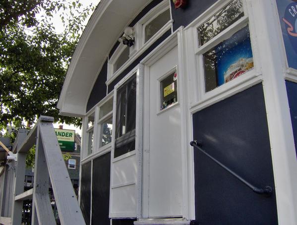
Yesterday, I drove to Charles Ro in Malden, Massachusetts to pick up a long awaited Lionel railbox car. Then I walked all of .6 miles on the former Boston and Maine rail trail (conveniently situated at the foot of Charles Ro's parking lot) to the Lunch Box diner at 902 Eastern Avenue.  This is the real life prototype for the Whistlestop kit.  Google Maps said the diner was "Permanently Closed".  Fortunately, it looks like it's under new management as the "Crazy Good Kitchen".  My camera setting used was "beach & sun" to try and offset the time of day and strong back lighting, so the new blue-grey paint looks more grey than blue. I finished the road trip with dinner at the Pearl Street Station (1892 Boston & Maine), also in Malden.

Inspiration: The real diner's white trim clearly needs a second coat, as do my model's white sections.  I'll try and get that done during the long weekend.

The journey begins ... "Durable" bumper on rails in between Charles Ro's parking lot and the East Coast Greenway/U.S. Bicycle Route 1 (nee Boston & Maine Railroad). The locals would call this a "bumpa":

On my way, some nice construction workers waved "hello":

The backside of the diner; I made a mental note-to-self to study the interesting roof detail, colors, rust stains, and etc.:

Perhaps I've already written that I've been struggling with how to treat the roof. Under consideration so far: just paint it (keep it simple principle), painted rough-side tape, glued and painted foil yogurt tops (rough surface), or to-be-determined.  Studying photos of barrel-roof buildings shows that many have flat grey or red tile as shown here.

If any of you read my recent post to the diners, trolleys, and converted rail car restaurants topic, notice the circles on the roof line. This indicates that the original diner had the row of light bulbs featured in that post.  Their traces are so ubiquitous that this light bulb placement under the eaves must have been a factory feature.  As I've said before, wouldn't it be fun for someone to model!

I've already described my plans for the rear wall but every so often I think about getting one of those MTH (?) telephone shacks or outhouses and simulating the real thing:

I can imagine some of you easily tackling the current version of the ventilation system, shown above and below. I'm going to stick with the cyclone vents that came with the kit. I did manage to get them painted but they need weathering:

Here's proof that it used to be the Lunch Box Diner:

I remain very interested in the roof details where the roof line joins the body.  I'd really like to have a solid section to raise the roof line slightly as is shown here and in the side-view 4 photos above:

The side porch is a nice touch.  Given the interior details that I plan to use, I won't be adding a door. There just isn't enough wall space in the model:

Of course, rows of soda cases would look nice, as shown above.  Here's another side view with window detail:

Looks like layering a short top pane over a larger bottom pane (adding the stained-glass/wood trim detail), and then gluing the unit to the inside of the window might do the trick.  The motto on the side says "Not Responsible for Your Obsession" Since 1930.  (I don't get it, but I guess it goes with the "Crazy Good" name. They serve acai bowls. 'Nuff said.)  Notice the old brown ceramic telephone insulator installed side-ways:

One of the "accessories" that I've been thinking about adding is an air conditioner on the side, just above the door. The prototype doesn't have one but it does have the classic vents -- now converted to windows. I'd previously posted experiments for simulating a mesh version of these mirror windows:

Tomlinson Run Railroad

Attachments

Images (13)
  • mceclip0
  • mceclip1
  • mceclip2
  • mceclip3
  • mceclip4
  • mceclip5
  • mceclip6
  • mceclip7
  • mceclip8
  • mceclip9
  • mceclip10
  • mceclip11
  • mceclip12
Last edited by TomlinsonRunRR

It's been a long time since I've contributed to this topic, or more accurately, to this diner kit.  My school work, job, and etc., are taking top priority -- especially the school work which has a hard and
fast approaching deadline. Yiikes.   However, I *have* managed to do some pondering and a teeny bit of experimentation.  AND, at the risk of now having *two* unfinished diners, I decided to pick up a Bachmann Plasticville Diner.  It was on sale, so why not?  Thus, I am temporarily hi-jacking this thread to document my efforts working with that kit.  I say it's better to have one topic and two unfinished diners than two topics and two unfinished diners, right? :-}  (I'll see whether I can rename the topic accordingly.)

This week, I am on a staycation and so have had a little time to devote to the simplier Plasticville kit.  My theory: By focusing on a simple build and not fussing with the interior details (for the equally fussy Chef Chuck Wagon); hopefully, I can accomplish something around school work and Chef can have his diner.  The Plasticville example is *really* a nice building and many of you have done great things with it as a starting point. 

But first, last fall, I had what I call a "Golden Opportunity".  An art playspace held a going out of business sale and offered art supplies at ridiculous prices.  I managed to pick up some more Golden brand paints (mostly colors I already had) and a bottle of their gloss medium. All for a song!:

Pondering #1: A Six-pack

Chef was thirsty, so I immediately set about seeing how well the gloss would simulate glass by mixing it with matte brown paint.  Here are some of those nifty mint toothpicks that I wrote about before. You can see that the gloss gave the flat brown paint a nice sheen.  A somewhat uneven application (or incomplete mixing?) was a benefit in that it resembles glass with different reflective patterns. Each "bottle" looks a little bit different as you would expect with glass and natural light:


(For comparison, the green example was a low semi-gloss color to begin with.)  The next photo shows the toothpick "beer bottles" with 2-color labels and gold caps, ready to be released from  their toothpick matrix.  I think the caps are too big.  The next time I make some, I'll crop them closer as I did in the green example above.  I'm not too fond of my choice for the labels but am running low on toothpicks:

Using some prior experience with origami, I worked out a way to fold a long strip of paper that simulated a six-pack carton, complete with a bottom, mirrored side creases in all the right places, and a cut-out carrying handle.  As a proof of concept, it worked, but the execution was sloppy.  I've since misplaced my POC, which should indicate how "pleased" I was with my first attempt.

When I have time, I'll create another one and provide a drawing of the paper strip and how to fold it.  It was fun working out how to shape and fold the strip.  I'll create a new topic for Pondering #2.

Tomlinson Run Railroad

Attachments

Images (4)
  • mceclip0
  • mceclip1
  • mceclip2
  • mceclip3
Last edited by TomlinsonRunRR

Pondering #2: Zip Tie AC Units and Single and Double-slice Toasters

Another little pondering project from last fall involved experiments with zip ties. They come in various colors, and sizes, and you can literally find them all over the place.  When you cut off the tie part, you are left with an interesting shape that suggests many possibilities. 

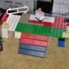
Here is Chef with a florescent green zip tie that I will paint and use as an air conditioning unit on the Twin Whistle kit when I get back to it.  The shape and size, and even the two little divots look great in the classic AC position located just above the side entrance.  It also looks good in the corner of a window on the front of the diner.  Once the tails are removed, the black examples can become double or single-slot toasters for Chef's kitchen.  With the addition of tissue paper "napkins", the smaller one might work as a napkin holder for the counter or a table:

I love free stuff!

Tomlinson Run Railroad
Attachments

Images (1)
  • mceclip0

Pondering #3:  Neon signage

Although this pondering was originally intended for the wooden diner kit, due to the size and proportions involved, it is best (perfectly) suited for the Plasticville kit. 

My office recently added a cafe.  The baristas use cups called "Greenware" that are apparently made out of plants.  Who knew?  On the bottom is embossed "COLD DRINKS ONLY".   Because of the embossing and the natural transparency, I thought that it might be possible to add color to "COLD DRINKS", cut it out, simulate a hanging or electrical wire, and place it in the front and side windows of my diner.  Instant three-dimensional neon signage.

It's hard to photograph, but here's an attempt at capturing what I'm talking about:

I've been experimenting with adding red and orange color with Sharpie markers.  Unfortunately, the Sharpie tip (or my hand) isn't precise enough. 

Next, I tried to add the color to the rear -- using the well of the embossed area to catch the pigment, and then -- in theory, wipe off any excess.  That should leave just the letters colored.  But, in this case, the embossing wasn't deep enough for this to work.  Wiping off the excess in effect removed all the color. 

Another possible approach is to use an ink pad if I can locate one somewhere around the house, and then add ink that will stick to this plant-based "plastic".  If just light pressure is applied in "stamping" the embossing, then the letters and not the surrounding area should pick up the color. 

Obviously, there are a lot of "ifs" involved here.  Any suggestions are welcome. 

We are having super hot weather this week and the relative humidity in my den is currently 76.  I'm going outside in the "90s, feels like 100s" temps to cool off and bring in Chef's pitcher of homemade "sun tea".  More info and pics will follow after I scan photos of the prototypes that I'm using for the Bachmann diner.  I hope that you enjoyed these little forays into past ponderings before moving on to the Plasticville build.

Tomlinson Run Railroad

Attachments

Images (1)
  • mceclip0
Last edited by TomlinsonRunRR

Add Reply

Post

OGR Publishing, Inc., 1310 Eastside Centre Ct, Suite 6, Mountain Home, AR 72653
800-980-OGRR (6477)
www.ogaugerr.com

×
×
×
×
Link copied to your clipboard.
×
×