
Replies sorted oldest to newest

They could at least vet the colors "right"; red is always going to register as stop for me. (I don't care about color pop to be right the little light beams don't help much with imbeded color association phycology)

I had noticed "follow" missing, but figured it moved. I don't play the "click me" game either; I call it as I see it, Poor graphic design by failure to convey an idea easily at first glance.   

But that's from a low brow perspective.

 The think tank reasoning for the push is progressing to one language eventually for science/software.(to start). The "icon" is a bridge between what we have and the final, utopian goal.... still a NWO pita, but it's gonna get worse before it gets better and is going to happen because we won't apply ourselves to not letting it happen. Like other things of far more importance today it's "too hard"

Thank you for these posts.  They “follow” my train of thought exactly.  When I returned to the OGR Forum after several months away while preoccupied with other matters, I had all the same questions and reactions. 

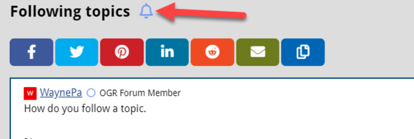
Fortunately, I searched for “Follow Topics” in the Forum search box, found this topic, and found each reply was a response to a question I had but hadn’t even asked yet.  The change of labeled buttons to icons might be intuitive to software developers and the folks in the IT Department, but “Follow” and even “Like” seemed clear enough to me.

Thanks, everyone, for responding to my confusion and answering my questions two months before I knew I was confused and had any questions.

Cheers!

Alan


Add Reply

Post

OGR Publishing, Inc., 1310 Eastside Centre Ct, Suite 6, Mountain Home, AR 72653
800-980-OGRR (6477)
www.ogaugerr.com

×
×
×
×
Link copied to your clipboard.
×
×