
Folks,

The following is the latest newsletter of Gary Schrader, covering the new E's units manufactured by Key Imports. For most of us common mortals, who cannot afford such models, I hope the following will give you a glimpse of the level of quality reached by Key and the fantastic work of extra details that Gary provided on these units:
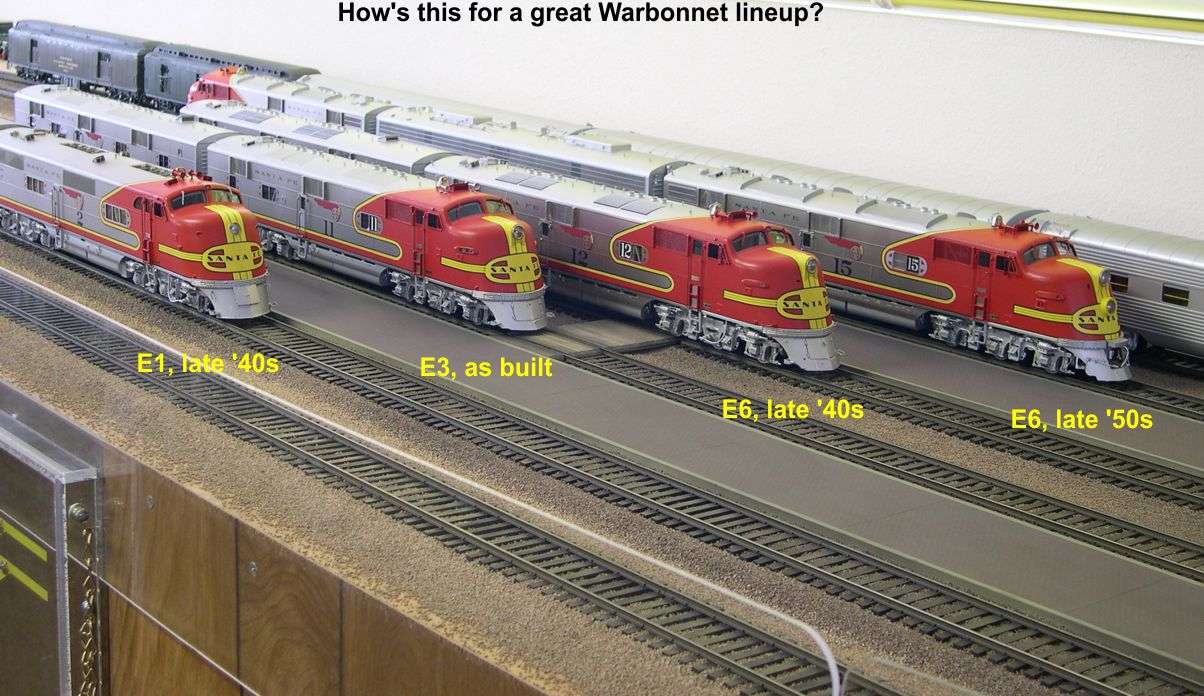


All,

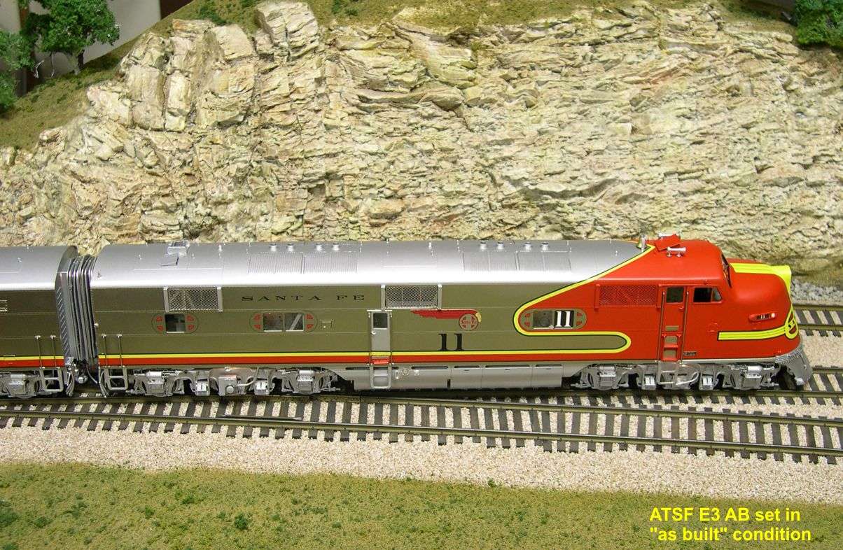
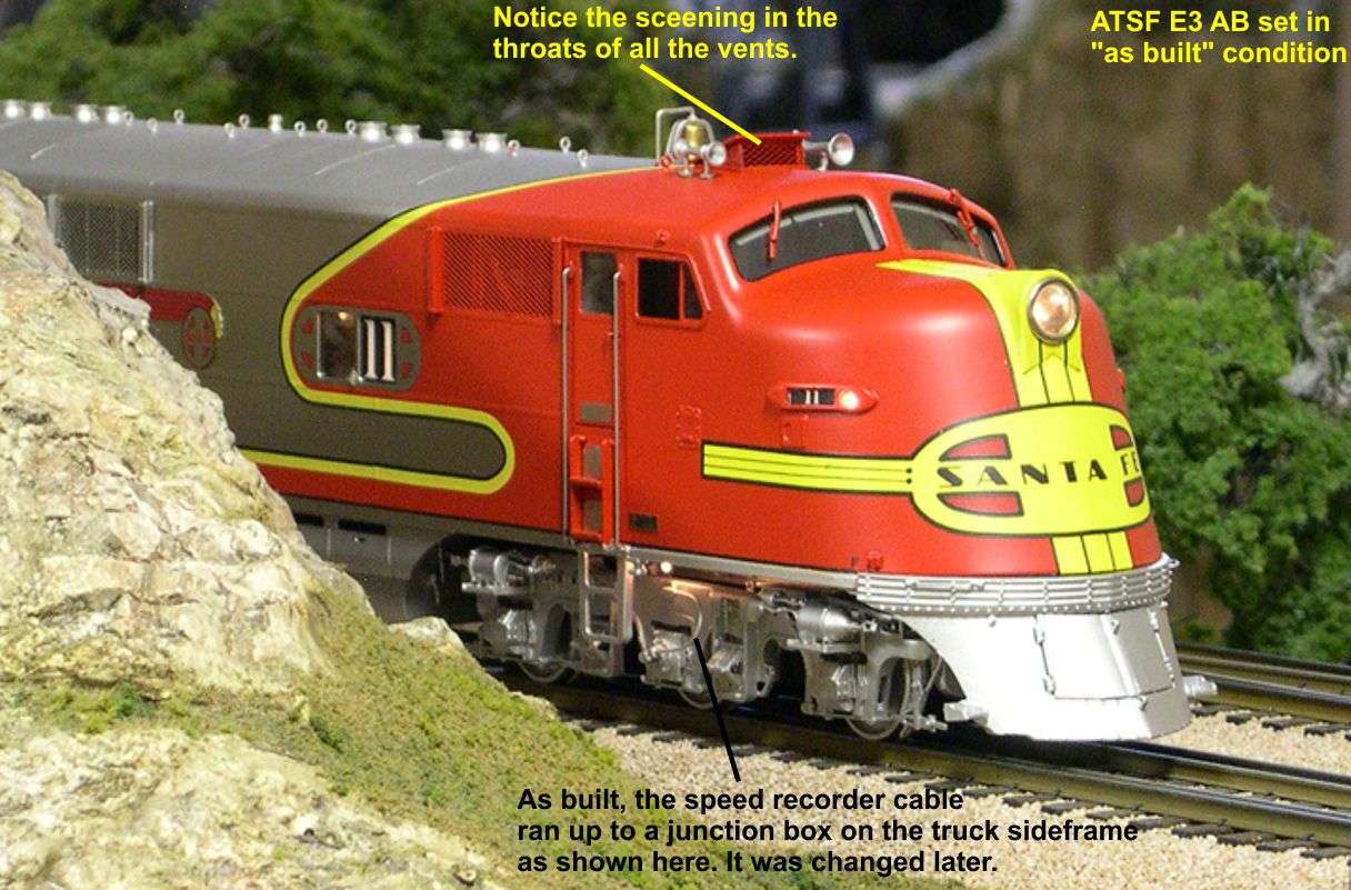
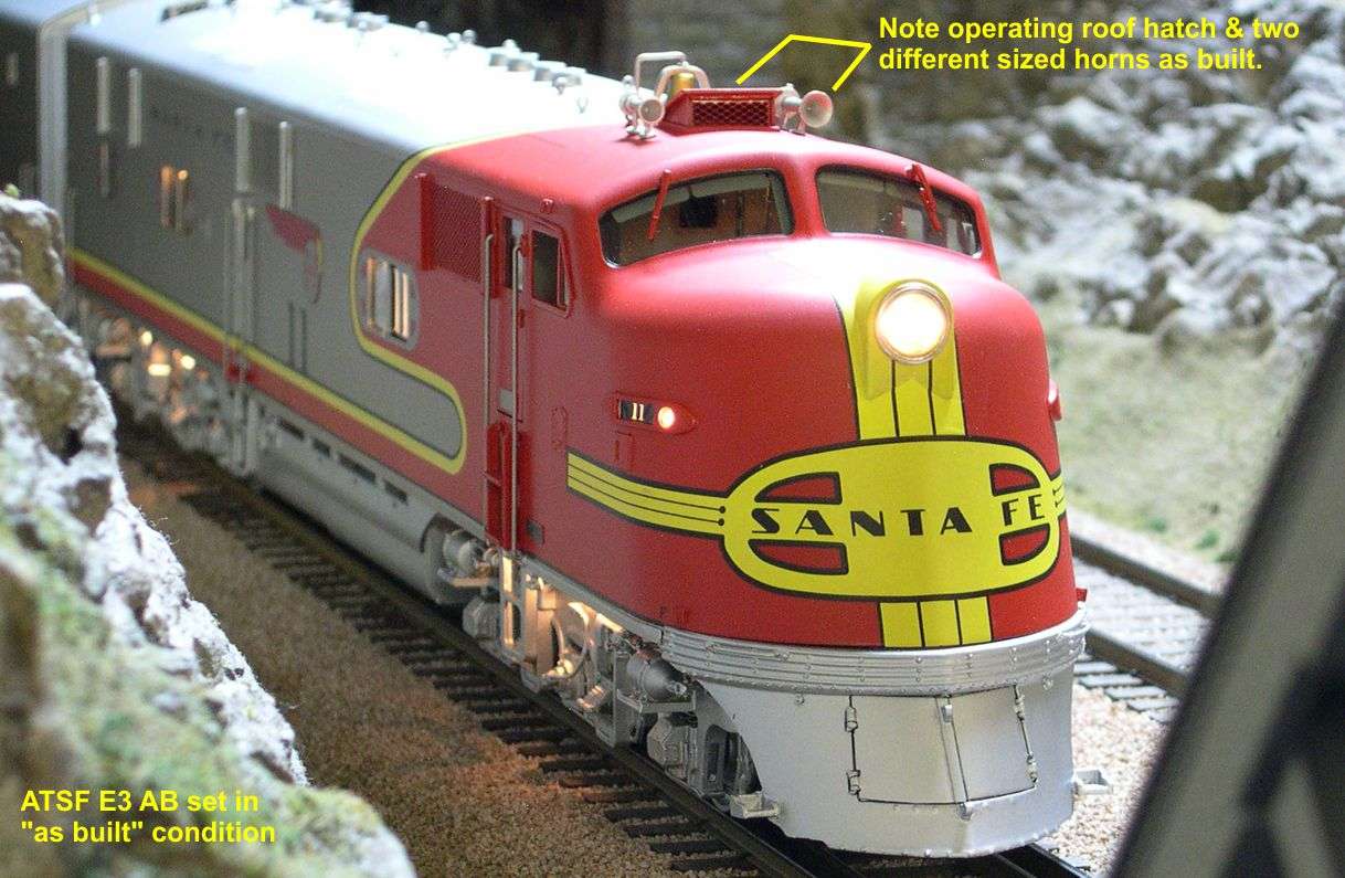
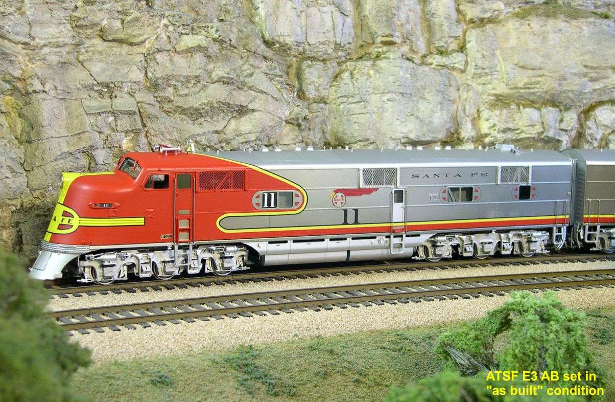
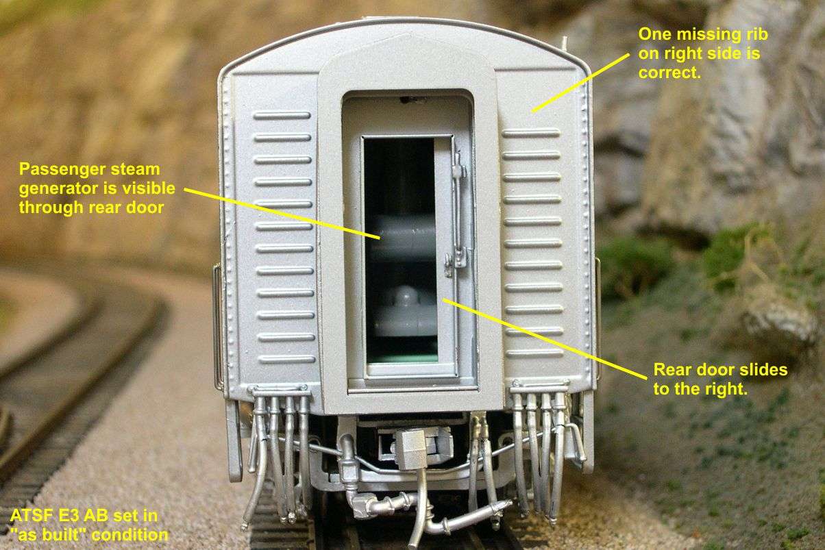
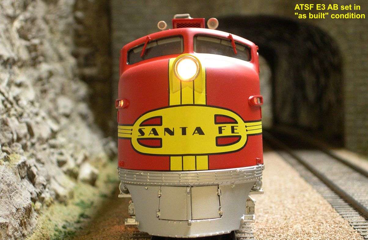
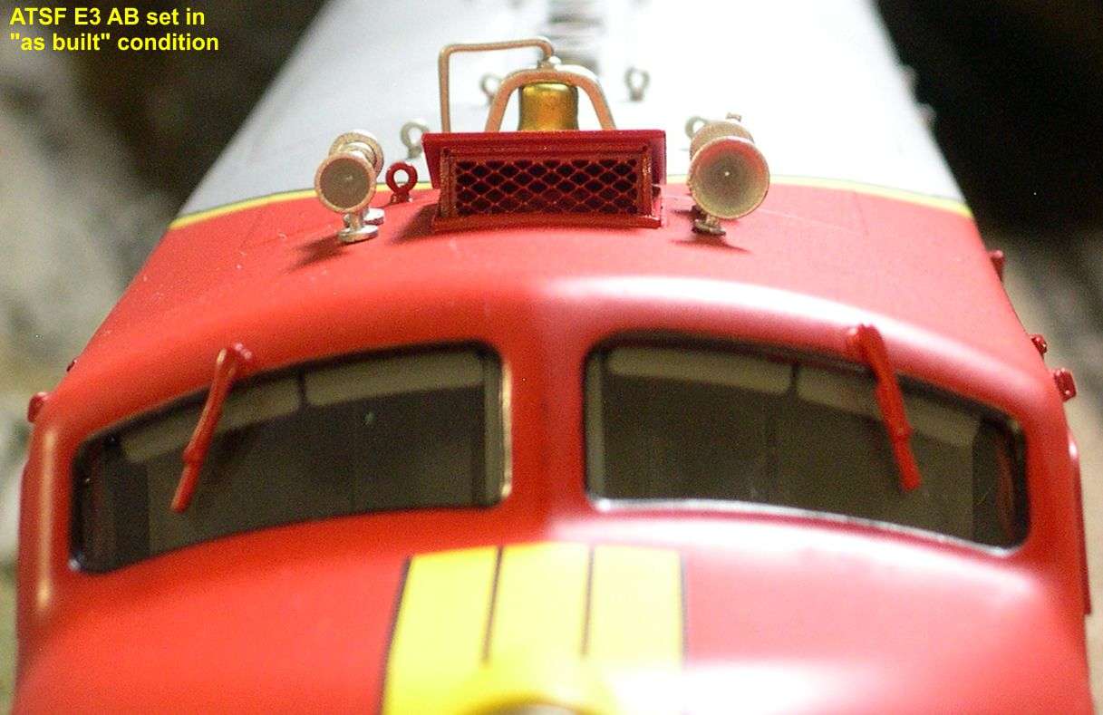
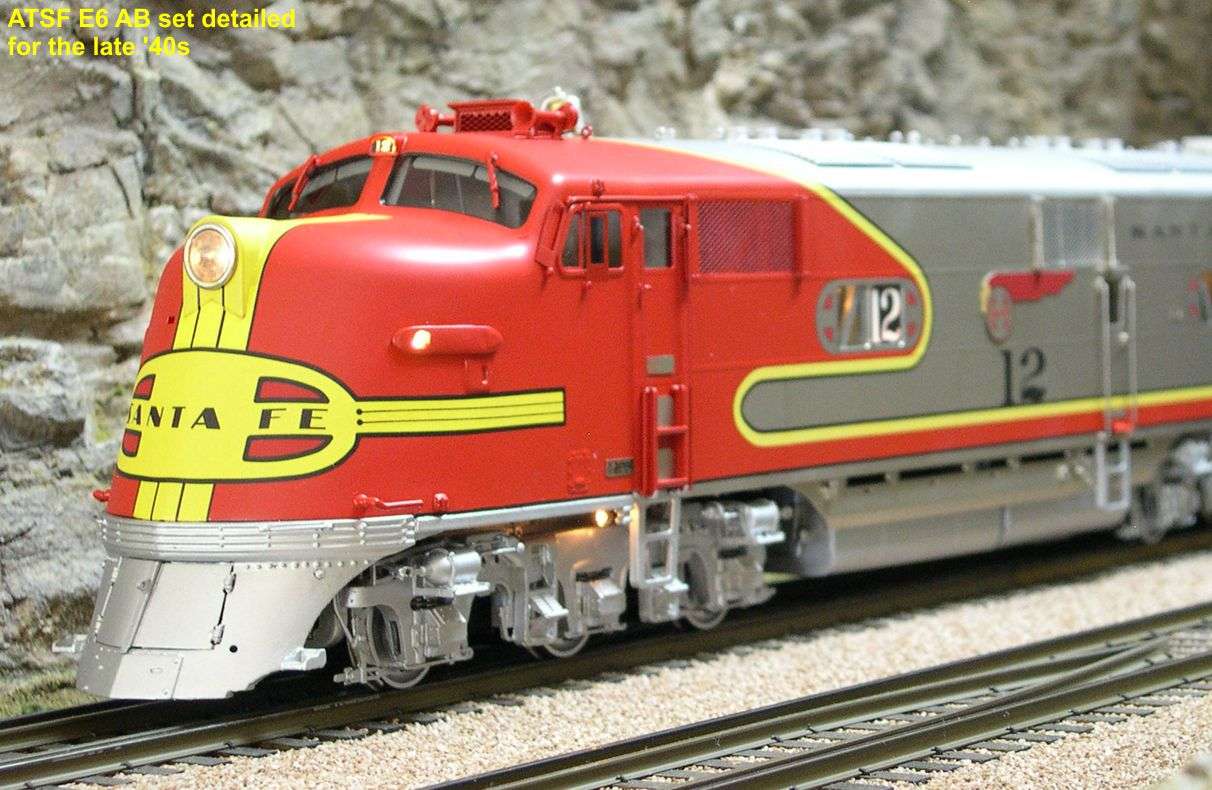
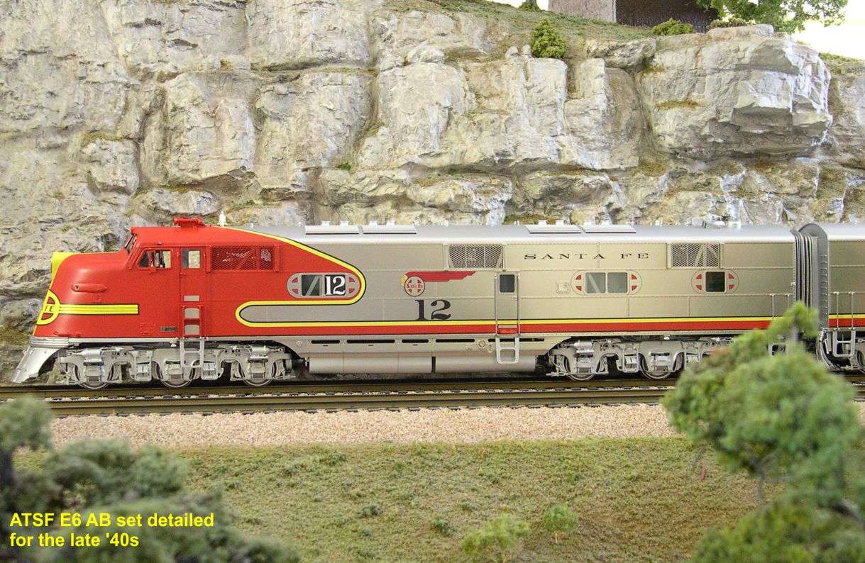
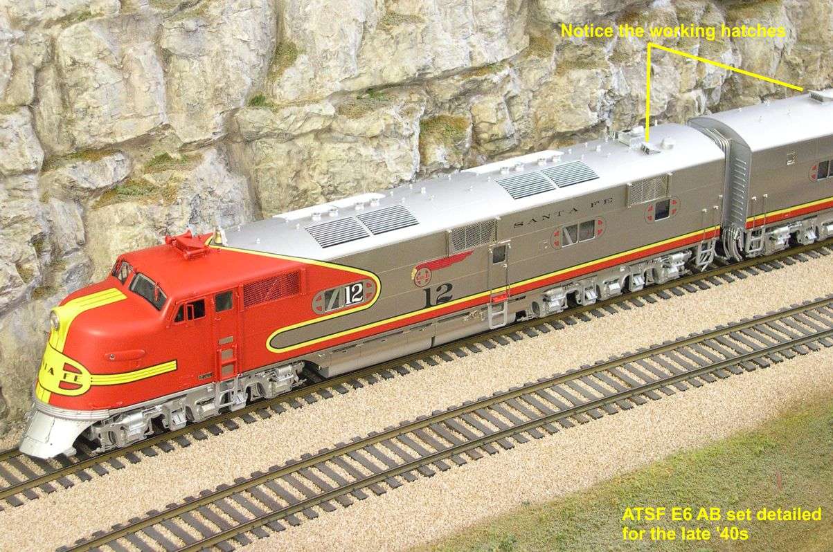
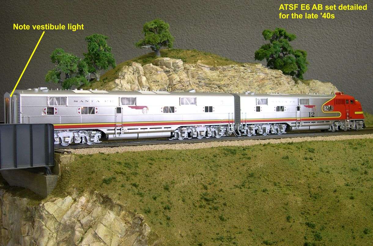
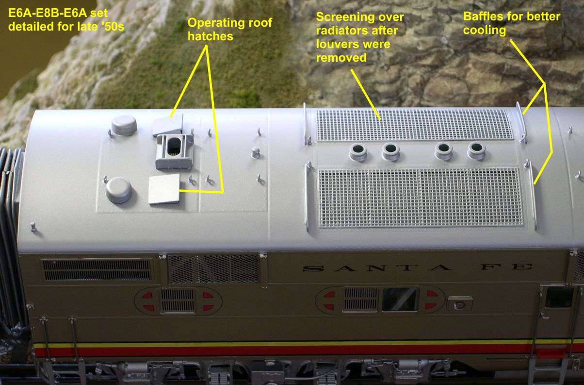
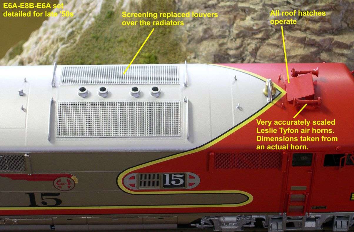
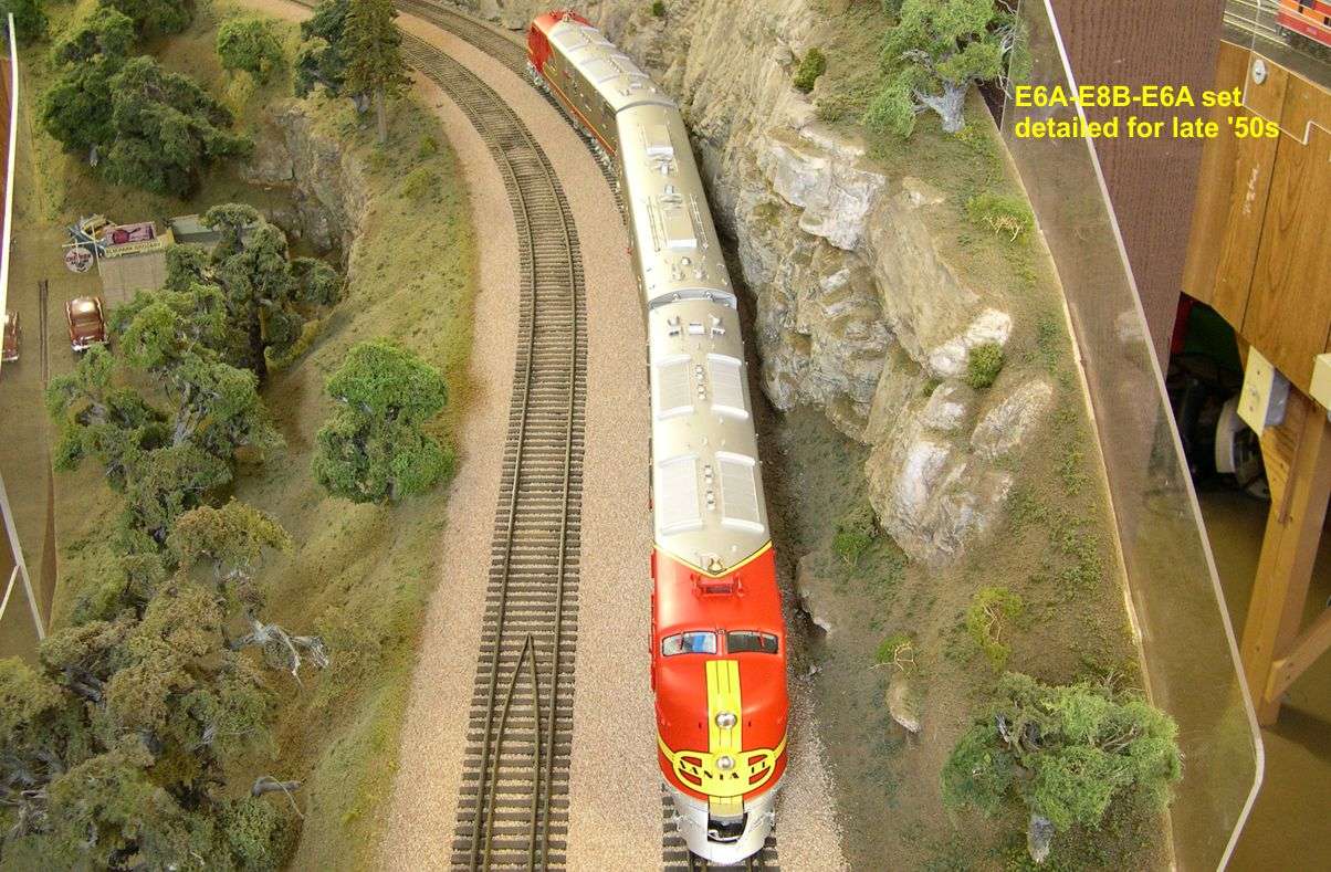
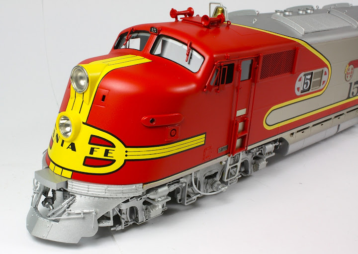
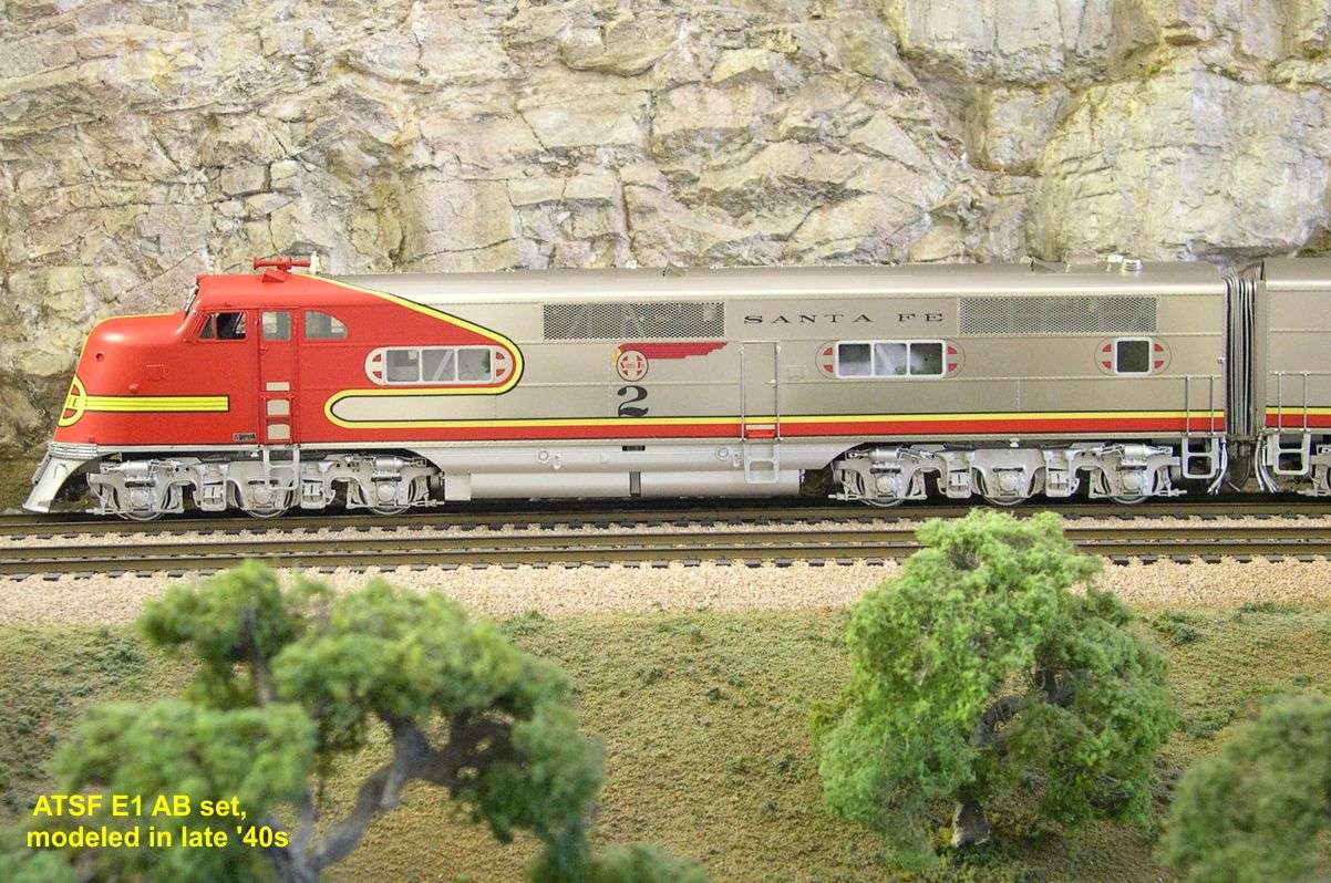
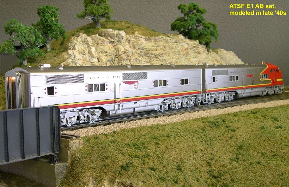
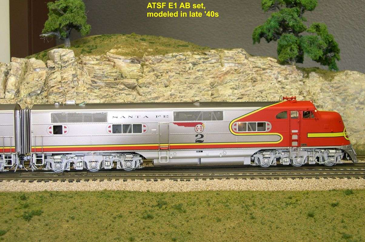
As you know, Key has just delivered the early E Units in many road names. The AT&SF units have just arrived, and I am going to cover them in some detail, since I did most of the detail research on these units. there are some interesting differences as one progresses from the initial E1s up to the E6s. Key did four versions as explained below.

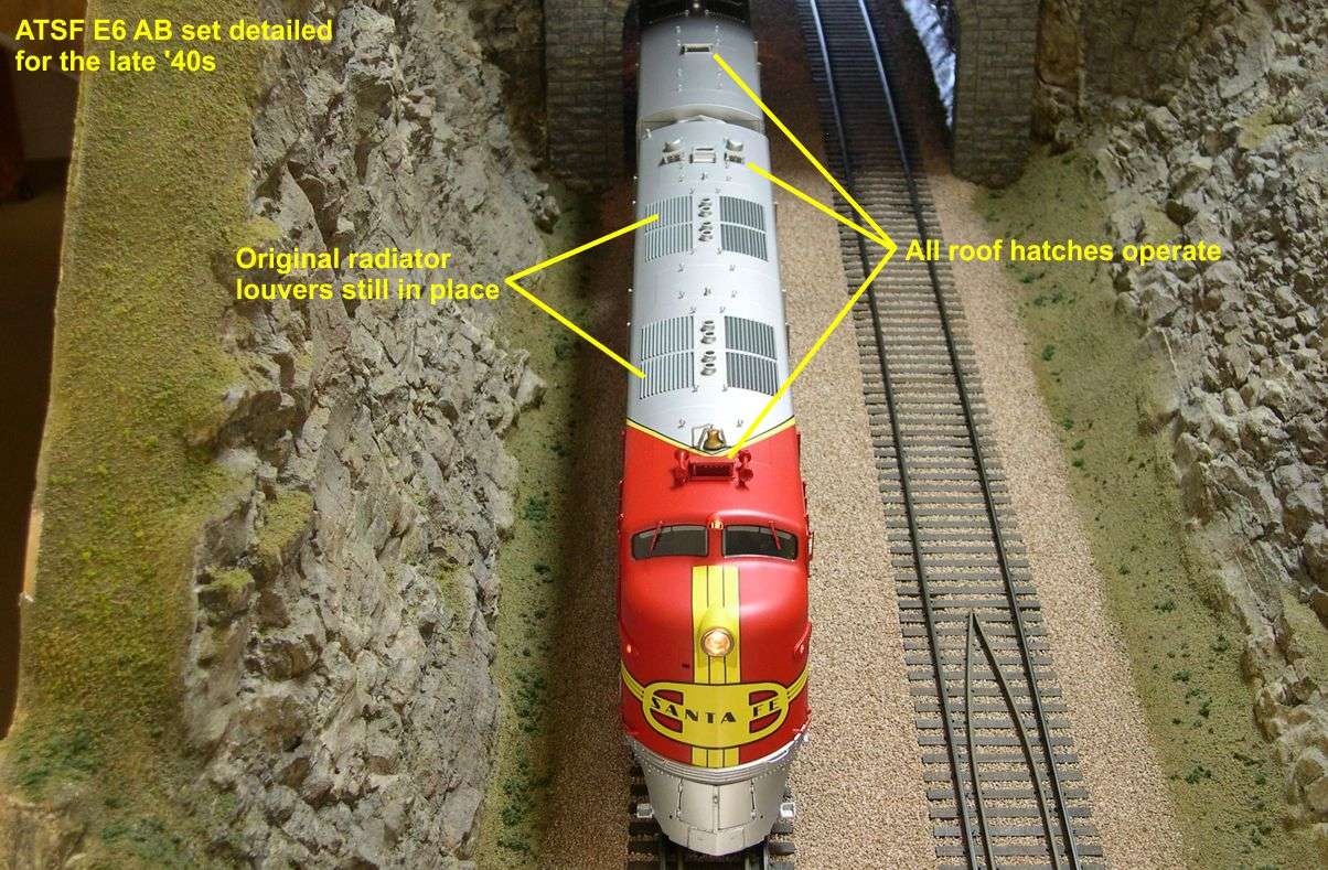
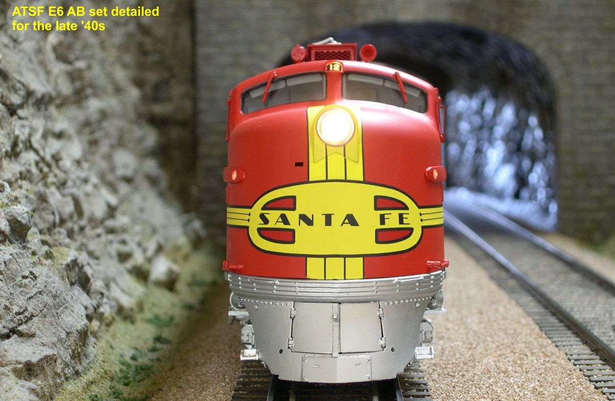
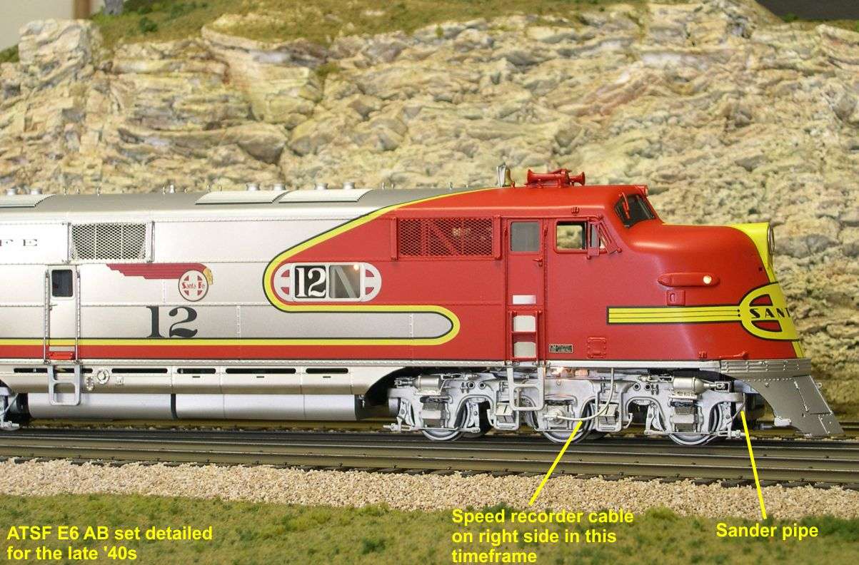
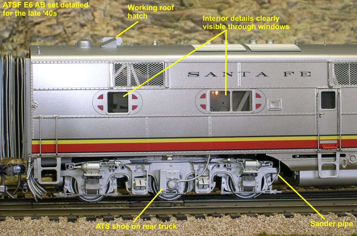
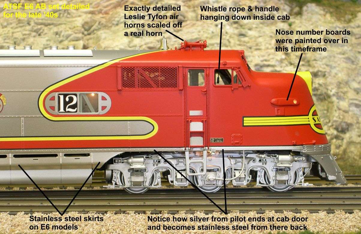
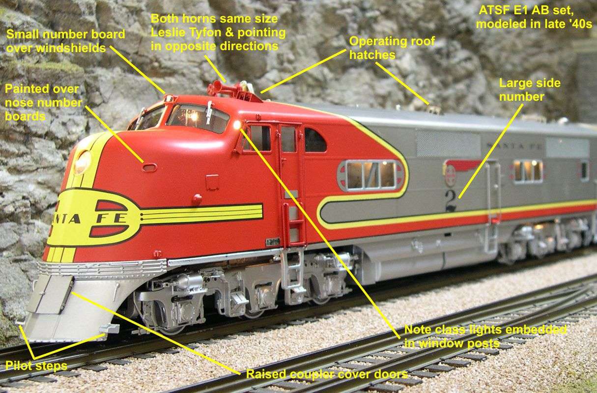
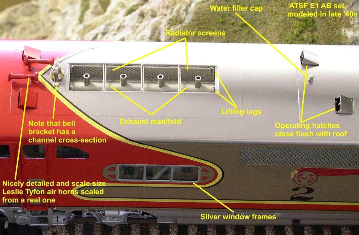
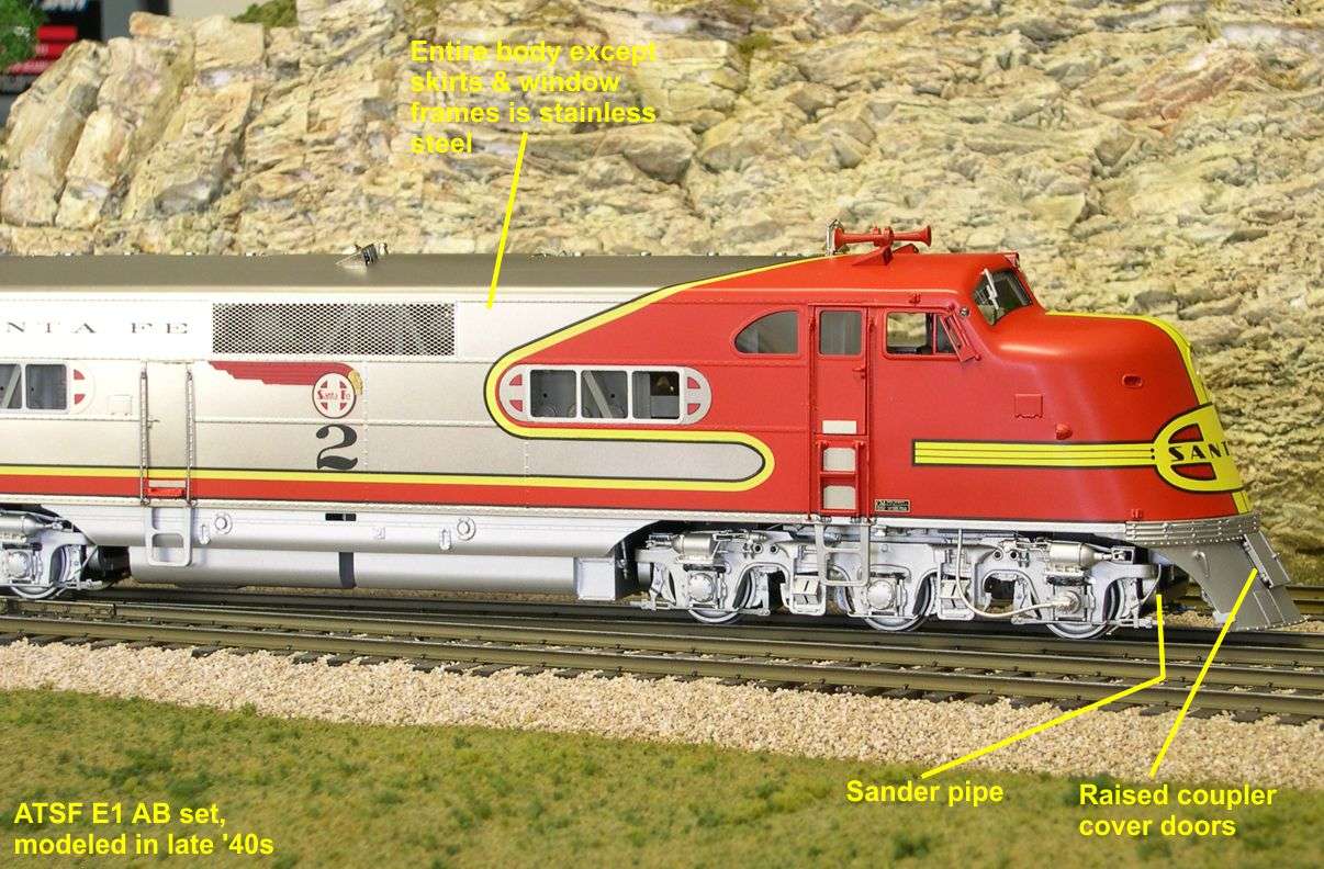
The E1 A and B Units were modeled representing the late 1940s through early 1950s before they were rebuilt into E8m's in 1952-1953. From right after delivery in 1937 until about 1942, there were minor cosmetic changes to these units every year. Modeling anything before 1942 would have restricted their accuracy to a year or less. After 1942, few changes happened except for the wartime headlight shields during WWII. The post delivery changes incorporated into these models are as follows:

1. The first two variants on the coupler cover doors were replaced by a raised box with the doors on it.
2. Pilot steps were added.
3. A pilot hatch was added to allow access to the passenger steam line.
4. A small number board was added over the windshields.
5. The small nose number boards were painted over.
6. A large engine number was added to the side of the A Unit.
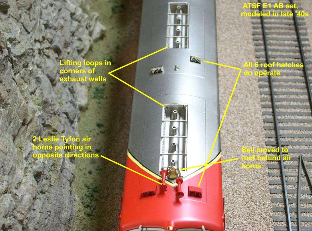
7. The smaller air horn was replaced by a second large Leslie Tyfon air horn pointing to the rear.
8. The bell was moved to the top of the roof behind the air horns.
9. Small wind wings were added to the side of the cab just ahead of the side windows.
10. Cut lever handles were added to the pilot.

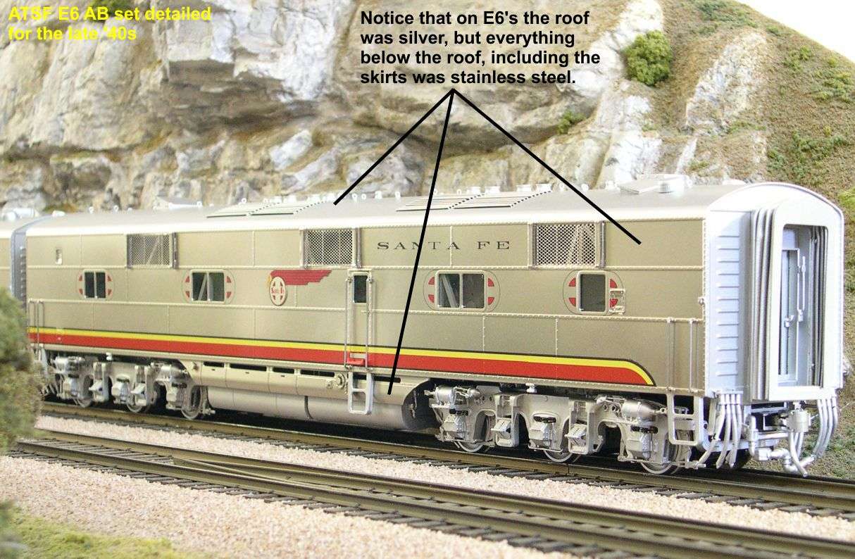
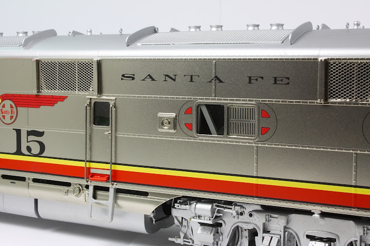
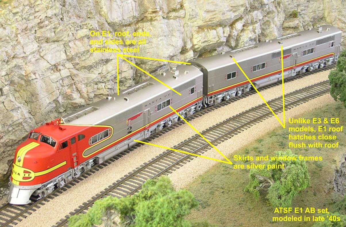
Coloring schemes were particularly hard for the builder to keep straight as the Santa Fe kept changing what they wanted with each new model. The Warbonnet stayed pretty much the same except for the longer horizontal bands of the cigar band herald on the E1, but each model saw changes to what was silver painted vs what was stainless steel.

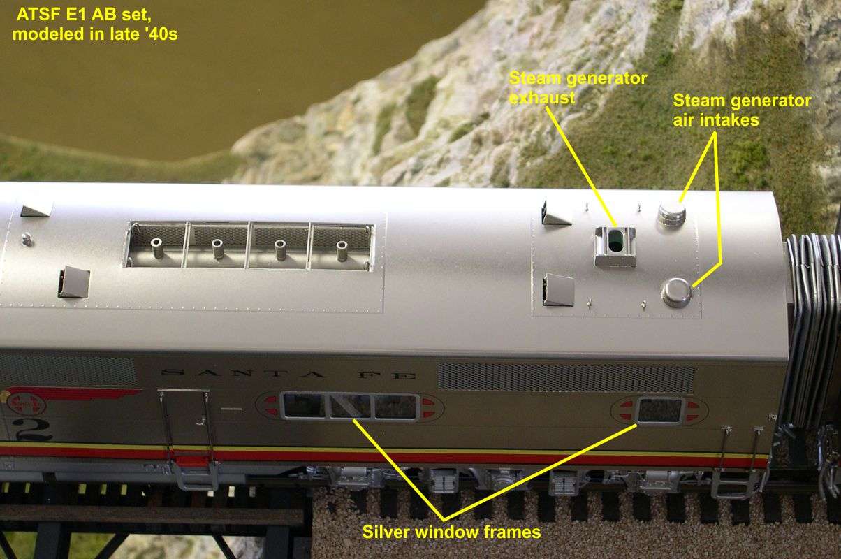
E1 - All stainless steel body with silver skirts and window frames.
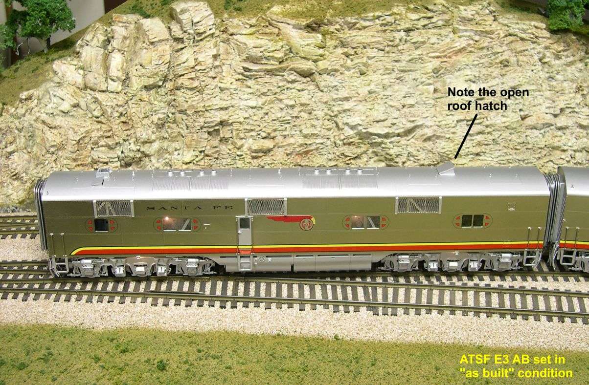
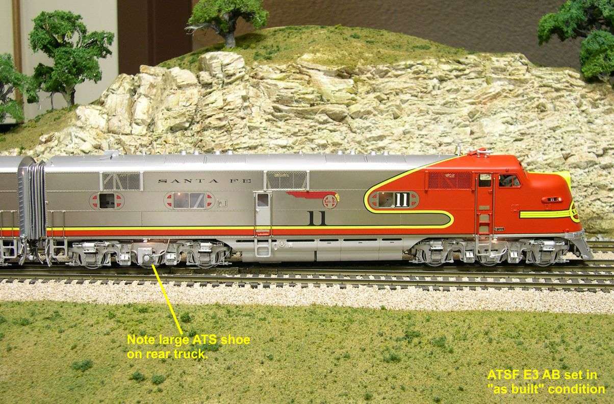
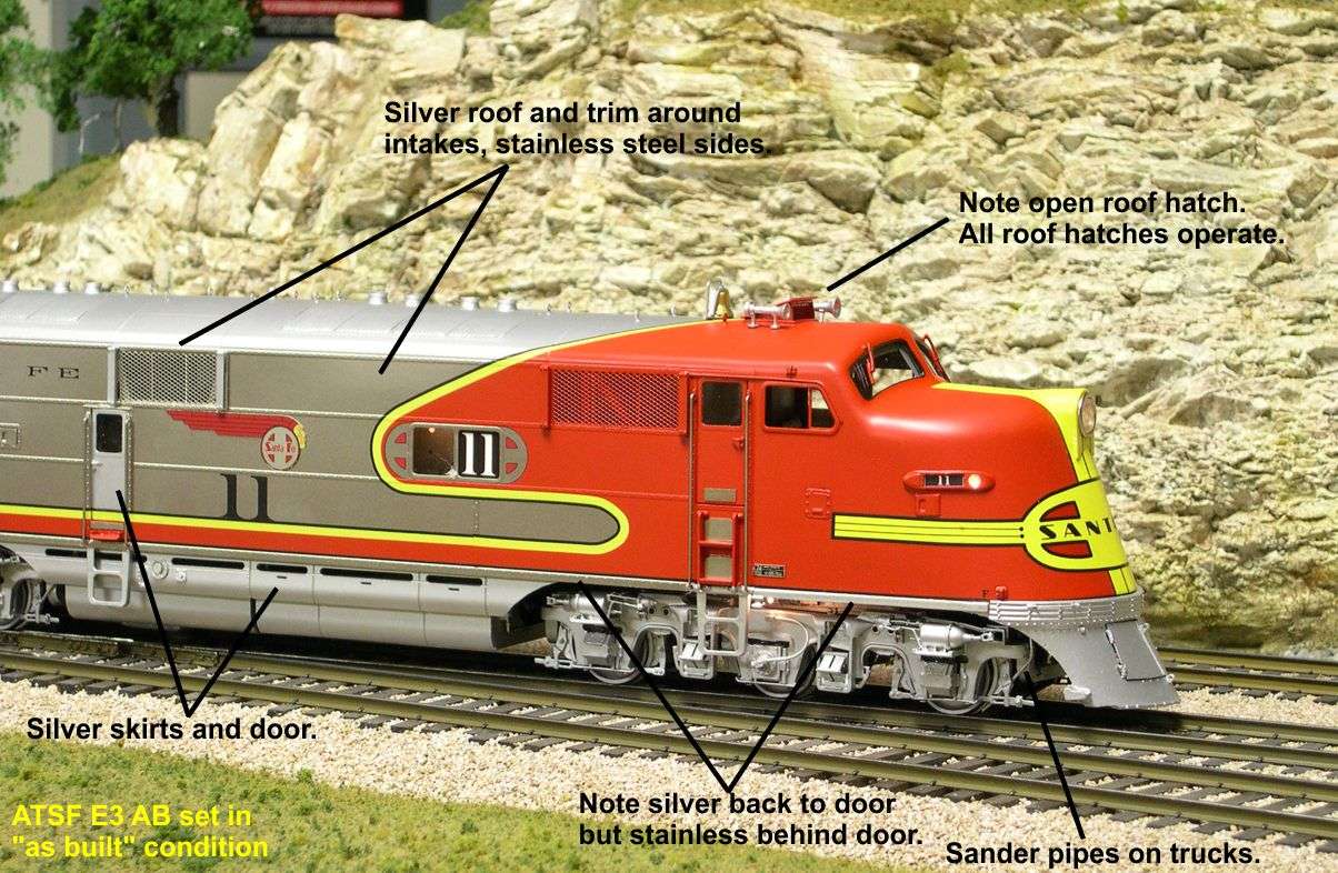
E3 - Stainless steel sides and window frames with silver roof, ends, side doors, intake vent trim, and skirts.
E6 - Stainless steel sides and skirts with silver roof and ends.
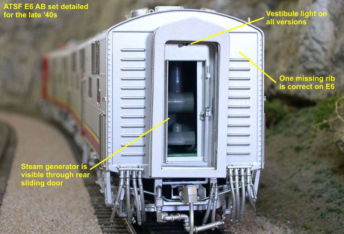
All these differences are pointed out on the photos.

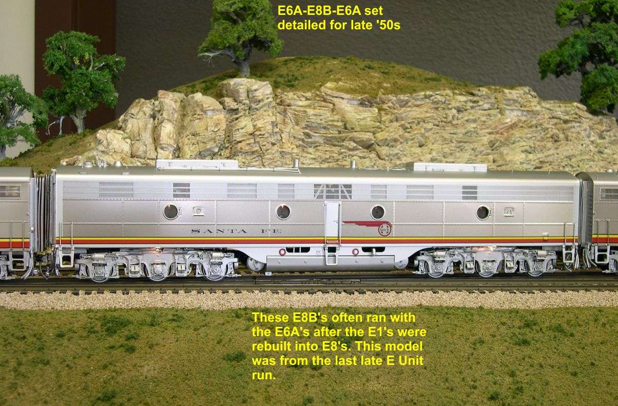
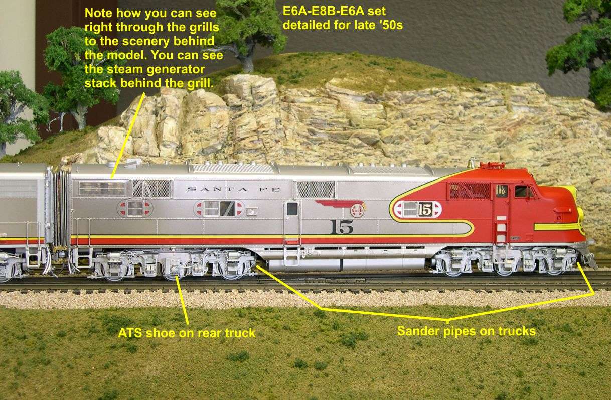
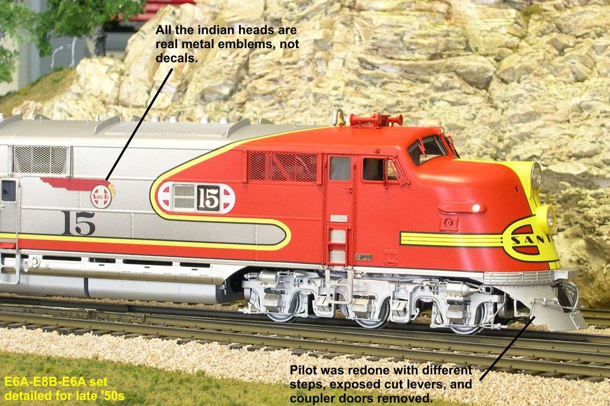
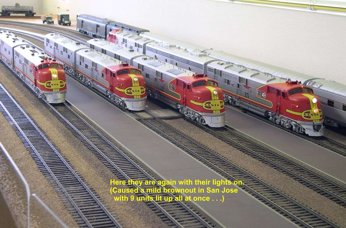
Since there are so many photos, I will send 4 emails covering the 4 versions. This email will include 10 photos of the E1 AB set and a couple of photos showing all 4 versions lined up on my layout. That's enough to give us Warbonnet fans sweet dreams.

Gary


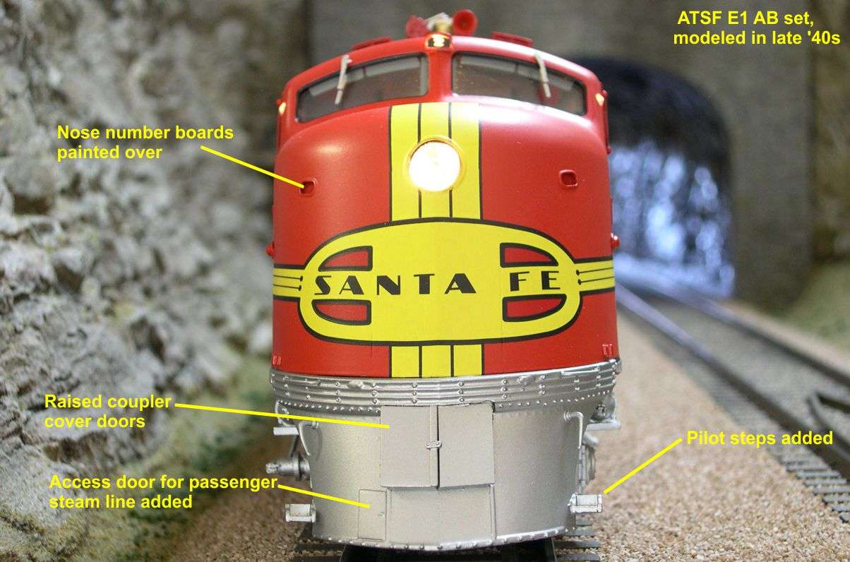
Next...the E3 units.

Original Post

Replies sorted oldest to newest

All,

Continuing with the new Key early ATSF E Units, this email will cover the E3 AB set. There are 12 photos of the E3 set attached.

The E3 set was modeled as built with one exception. The pilot steps were added so soon after delivery that it made sense to include them. The E3A was delivered with the ATS shoe on the right side of the rear truck that allowed speeds over 79 mph. That same shoe appeared on the E6 as well. The speed recorder cable on the right front truck sideframe was a bit unusual in that it curled up to a junction box on the sideframe instead of up to the underside of the body. Presumably, an unseen cable carried the signals into the body from a point inside the truck. That was later changed to a more normal arrangement.

One detailing item a lot of people miss on the E3 is the louvers over the radiators on the roof. Note that they run side-to-side on the E3 instead of front-to-back as on E6s and E7s. This changes the look of the roof quite a bit, so it is not true to say that the E3 and E6 are essentially identical. In addition to that, the E3 had silver skirts, side doors, and intake opening trim. On the E6, all those were stainless steel. By the late '40s, the E3 had gotten the same boxy arrangement of coupler doors as on the E1. The E6s never got those because they had an extending buffer in the center of the anticlimber that would have interfered with that box. So that is another spotting item. The E3 has no buffer in the center of the anticlimber.

Gary


Next... the E6s.....

All,

We will now take a look at the late '40s E6 AB set, which happens to be mine along with the previously viewed E1 set. The E3 set belongs to Chris Cinque. This late '40s E6 set is numbered 12 and carefully detailed after the actual number 12 in the late '40s. There are 11 photos attached on this set.

By the late '40s, there had been a number of changes to the E6s, just like the earlier Es. The E6 had gone for a bit more stainless steel than the E3. Only the roof and ends were silver on this model. Here are the changes from as built:

1. The small number board over the windshields was added.
2. The small nose number boards were just painted over and no longer used.
3. The smaller second horn was removed and replaced with another larger Leslie Tyfon air horn.
The pilot steps and top mounted bell appear to have been as built or added very shortly after, so that is not a change on these units.

Gary


Next, the Late E6's.....

All,

The last of the 4 versions is the mid-to-late '50s E6 AB set. Turns out, I did not get to photograph an AB set, but an AA set instead. As an extra added bonus, the two A Units were paired up with an E8m B Unit from the last run of late E Units by Key, making an ABA set. This was not fictional. The Rebuilt E1's, which became E8m's, were often seen in the company of E6's. This ABA set was supposed to be Dave Devita's display and personal set. However, as usually happens, one of his good buddies cried on Dave's shoulder until he agreed to part with it. It does make a striking looking set. There are 8 photos attached.

The E6 AB set numbered 15 was modeled as a mid-to-late '50s engine. This was before the radio antennas, grabirons up over the nose, and twin sealed beam headlight; none of which did much for the look of the units in my opinion. Here are the additions since the E6's were first built:

1. One of the most obvious changes is the headlight being moved farther down on the nose to make room for a Mars light in the original headlight housing. This was still a standard single beam headlight.
2. The pilot steps were removed, the sides of the pilot changed, and new strap type steps installed on the new sides.
3. The coupler doors were removed and the buffer and coupler permanently fixed in the extended position. (The couplers on the models are in the retracted positions to avoid damage during shipping.) 4. The air hoses and cut levers were permanently mounted on the outside of the pilot.
5. The louvers over the roof top radiators were removed and replaced by screenwire.
6. Baffles were added on either end of the radiator openings to create more turbulence for better cooling.
7. The smaller of the two original air horns was replaced by a second Leslie Tyfon larger air horn that faced to the rear. By the way, these Leslie Tyfon air horn castings are the best ever made. Mike Mangini has an actual one. He photographed and measured it for this project so we could have really realistic air horns. The Koreans did a good job reproducing it in 1:48 scale.
8. Three windows on each side of the body were replaced with steel vents.
9. New intake vents were cut into the upper rear portion of the bodies as shown in the photos. (Think maybe they had some cooling issues inside the engine compartment?) 10. Both windscreens and mirrors were added just ahead of the cab side windows.
11. The small number board over the windshields was added.
12. The nose number boards were painted over and no longer used.
13. The speed recorder cable was moved to the left side of the front truck.
Note that number 15 has two MU doors on the nose, one on either side of the headlight housing (now Mars light housing). Number 12 only has the one on the right side of the housing. For some reason, 15 got the two MU doors right from the get go, while none of the others did.

Well, that wraps up the Early E Unit project by Key. Now it's on to FTs and SP ACs. Somewhere in there he has to finish the Cal Zepher project, too. By the way, I just received the SP AC-12 pilot model today so I can start working on mods to it. Even if we did absolutely nothing to it and went right into production as is, it would still be the best AC model ever done. It is really fabulous already, but we want even more . . .

Gary


Hope you enjoyed all this War Bonnet galore!

Yves

Chris, thanks man! Lighting can either take away or distract from a subject. I try to pull off the Lionel advertising photography without the surreal effect of light from every direction thing. In the photos above I use 4 light sources and move them around and or change the angles of the bounce cards to get the most realistic light that enhances the most detail in one shot. Sometimes I need to layer multiple photos together but in this case these are one layer. 

Photo courtesy (c) Key Model Imports 


I think the ATSF units are simply marvelous ( I am a sucker for that Knickerbocker paint scheme). I personally think all the E units were all the best. 


The cab forwards Key Models is doing right now are incredible. PSC did them about 15 years ago to a level never thought passable; they did it. 


Thanks Chris have a good Memorial Day.


We all show our respect to those who have served today. Thank You! 

Something not mentioned so far is the color red used by Key on these units.  IMHO it is the best representation I have ever seen on any model of a Santa Fe cab unit!  


None of the pictures has captured it accurately.  I don't feel it is a function of the photographer, but a function of the limitations of photography.

Marker- These issues directly-play in the "perceived" color seen on your computer screen. 


Firstly- are you color blind or color hyper-sensitive? A professor I had; a woman that helped develop the Pantone Matching System told me in experiments in Europe in the 1970's they estimated that women see colors on average at 40-70% more intensely then men. Like anything we all get used to what we see; can you imagine stepping into a woman's eyes for say 10 minutes? The world would look like a Monet painting I am sure. I would guess this has a lot to do with a woman's love of flowers. 


When it comes to perceived colors, the digital camera:


1- Digital Camera sensors, Canon, Nikon, Olympus, Kodak, etc, etc all see color differently based on the people that write the firmware that tells the sensors (CMOS, CCD etc) to "imitate" film based on a gamut of professional photographers.

2- Computer monitors are "all" different, no two are exactly the same add your personal settings such as contrast, brightness and its all a crap-shoot

3- Computer video cards also can have an affect on color temperature and range, cools to warms. 

4- Is a digital image edited with a photo editing program, color saturation added or removed, etc, etc. 


When it comes to analog color slides these issues guarantee serious trouble when trying to come up with a match.


1- Certain brands of color film use different dies that in time blend or combined or faded with one another to shift the percieved color(s). Computer models have been developed to correct a lot of these issues based on each brands tendencies to color-shift. Still they are all somewhat speculation and not 100% dependable.

2- Time of day the photo was taken, cool morning light, warm evening, warm Summer light, cool Fall light in the warm hot morning sunrise.. All of these dynamics directly change how a color looks to the human eye.

3- Paints fade fast, especially reds, yellows, any color with a warm color range tends to desaturate the fastest. When photographed depending on the time of day or year the odds that color is what the paint manufacturer wanted us to see is null at best.


When it comes to color sample chips:


1- Was the chip stored correctly away from UV damage?

2- Was the chip stored in high heat that can change the color based on a chemical reaction due to heat?

3- Was the chip correct? Serious- who sprayed it? Was the paint really correct? authentic records kept for where the paint chip originated? Was it a shop in Barstow guessing at the right color in 1956 based on a faded sample and hand mixed based on trial and error? 


In the end the odds of getting a color exactly correct is next to impossible, it is right or wrong to everybody depending on who is looking at it and when. So if we all agree a color looks good that is really rare and outstanding! 


Funny but true story, in the antique car hobby I had a buddy with a 1952 VW beetle in L-11 Pastel Green. A 50,000 odd mile unrestored original car, absolutely perfect. At a concours show he was judged for having mixed and applied the wrong color that did not match the chips the judges used to compare; obviously the judges did not know it was factory applied paint. It was an argument that lasted for hours. Finally after word got to the judges this was an original car they seriously began to doubt the records they were using in the color samples. My guess is the car is faded? Or are the samples right? It is a terrible conundrum to be in.


In the graphics and arts business we developed the Pantone (tm) system of matching colors. A 4 digit code that tells everyone in the world what the color should be. The ATSF model along with all the models colors based on research were matched to a Pantone number so the builder would get it exactly right to the decisions made about the colors. It all lands in the laps of the experts; and are the experts right? God only knows.


I agree this color used on the ATSF units is dead on. The previous runs KMI has done have also been right. Certainly a warm punchy yellow/red. Just as Mr Knickerboker wanted it.


As typical my statement was over simplified.  I have read and studied just about all you graciously took time to write.  I didn't mean to put you through that, but it does present good education and a great read as to what is involved in reproducing color.  I have read similar discussions like debates about the the boiler fronts on ATSF steam engines, and how the Tarpon Gray may or may not have been captured in a B&W photo.


I do have color correction software to get an accurate match from camera to computer screen to print, for what it's worth.


My point was you have to see one of these engines in person to appreciate how well the red paint was done. 


My take is that the red captures a recently painted engine, that has had a little time to age in the sun, but not so much that it takes away from the way it came out of the shop.  Anyway, it is the best Santa Fe red I have ever seen.  (I am not familiar with the KMI units.)  As you stated, "I agree this color used on the ATSF units is dead on."


Erik, because my statement came after your photos, in NO way was any reference to your photography.  I hope you didn't take it that way.  I appreciate everything you have posted anywhere, amongst the best and always a joy to see!


I recommend anyone with an interest in accurate prototype color matching read your post above. 


Wow Erik great information on color and lighting...thank you I learned alot.  And it gives a glimpse at what goes into great photography.  


Marker great point on the paint...to my eyes it is dead on and does look amazing.  The more I keep looking at these the more the details jump out.  As I mentioned the visors are a nice touch, but the cab roof vent, removed front coupler doors,bell bracket and all the lift rings and the ATS shoe and on and on just push this model over the top. 

Last edited by N&W Class J

I had no idea - I just thought there was a logic mismatch between boys and girls that intensified with the moon.


Very Informative -nomatter what triggered the discourse, it was worth reading.


Ok, so how close does Scalecoat come?  And more relevant for me, is Scalecoat Daylight Orange or Grande Gold close to accurate for SP?  I use the ATSF red and Daylight red interchangeably, as well as the above two orange colors - maybe I don't see colors so good any more.

Originally Posted by bob2:

I had no idea - I just thought there was a logic mismatch between boys and girls that intensified with the moon..

I think that's only currently relevant regarding werewolves, Bob,


Excellent point however regarding the individual perception of color and a numbers of variables that come into play.  Some one ought to save that bit of text for the next time a discussion on PRR green gets going,

Originally Posted by mwb:
Originally Posted by bob2:

I had no idea - I just thought there was a logic mismatch between boys and girls that intensified with the moon..

I think that's only currently relevant regarding werewolves, Bob,


Excellent point however regarding the individual perception of color and a numbers of variables that come into play.  Some one ought to save that bit of text for the next time a discussion on PRR green gets going,

PRR Green would really start a long thread.  Or how about Union Pacific Yellow?  Problem with UP Yellow is it has changed many times over the years.  Everyone has an opinion what is looks like.  


Originally Posted by splitwindow:
Originally Posted by mwb:
Originally Posted by bob2:

I had no idea - I just thought there was a logic mismatch between boys and girls that intensified with the moon..

I think that's only currently relevant regarding werewolves, Bob,


Excellent point however regarding the individual perception of color and a numbers of variables that come into play.  Some one ought to save that bit of text for the next time a discussion on PRR green gets going,

PRR Green would really start a long thread.  Or how about Union Pacific Yellow?  Problem with UP Yellow is it has changed many times over the years.  Everyone has an opinion what is looks like.  


All would initiate excellent entertainment value,


Opinion.

A story from Bill Wade of B.T.S. is worth repeating:


Bill once owned a hobby shop in Florida and one of his customers who worked for the Seaboard had an HO E7 shell painted Seaboard light mint green in the Seaboard shops by a Seaboard employee using the Seaboard's own paint.


All the "experts" who viewed the model in the store said the color was all wrong...


Rusty

Same issue- Ron Kieser of our club painted a set of All Nation f units with the last gallon of Rio Grande paint; same response- wrong color.


Originally Posted by Rusty Traque:


         class="quotedText do_rounded_div_css_ffsafari_tl do_rounded_div_css_ffsafari_tr do_rounded_div_css_ffsafari_bl do_rounded_div_css_ffsafari_br">
       

A story from Bill Wade of B.T.S. is worth repeating:


Bill once owned a hobby shop in Florida and one of his customers who worked for the Seaboard had an HO E7 shell painted Seaboard light mint green in the Seaboard shops by a Seaboard employee using the Seaboard's own paint.


All the "experts" who viewed the model in the store said the color was all wrong...


Rusty

What I find fascinating is the people who will look at Rusty's pics and argue they are not the same unit and that the color on pic A is totally wrong the color on pic B is too gray and pic C is too light, or whatever, and then go on this tirade about why can't manufacturers get colors right and if they can't they are too incompetent to be in this business.  The thread about the Lionel GTW F3s went on for pages.


Richard

Originally Posted by Erik C Lindgren:
Same issue- Ron Kieser of our club painted a set of All Nation f units with the last gallon of Rio Grande paint; same response- wrong color.
Originally Posted by Rusty Traque:
 

A story from Bill Wade of B.T.S. is worth repeating:


Bill once owned a hobby shop in Florida and one of his customers who worked for the Seaboard had an HO E7 shell painted Seaboard light mint green in the Seaboard shops by a Seaboard employee using the Seaboard's own paint.


All the "experts" who viewed the model in the store said the color was all wrong...


Rusty

The paint used from the real full size engines may be 100% correct, but it will never look "Correct on a 1/48 model.  This is very simple, you cannot take the paint used on the full size engines and use it on 'O' Scale models.  It will never look correct, the colors will almost always look too dark and incorrect. I wish Dan Pantera who is the last of the custom passenger car builders would address this subject, but he too busy building and painting his beautiful passenger cars.  Almost all paint has to be made a shade of two lighter to look correct on 'O' scale models.

I think Erik can "shine" some light on this subject. 

Roger- If only I could find the various articles on this subject, size ratio to color proportion etc. From my memory a certain English trick that really works in my opinion. The exact match concept too often used in all scales these days is the toy train thing with the exact match. I guess it all depends on the collector or modeler to what he or she prefers. I prefer to lighten a bit and weather them while some like to pull it out the box and display. I will dig and find the articles I have read. Neat stuff; some of these modelers in Europe are simply amazing. 1 Spur, ahem I mean Gauge is just wow. scale 1:32 like we do P-48 has got to be the cats meow. 


Post

OGR Publishing, Inc., 1310 Eastside Centre Ct, Suite 6, Mountain Home, AR 72653
800-980-OGRR (6477)
www.ogaugerr.com

×
×
×
×
Link copied to your clipboard.
×
×