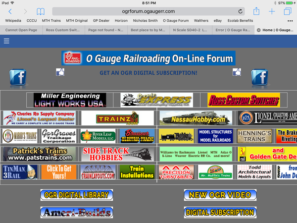
I have to agree with the consensus. It looks terrible on my Android phone (using Firefox) and is forcing the RSS feed bar to appear without an option to disable it. It looks just as bad on my PC using Firefox. Too much white space. No grid lines between posts. No order really which is needed in a forum type setting to differentiate between posts and categories, etc. on the page.
Very hard to read, too much white space feels like I'm constantly scrolling to read a single post. Tried with my tablet & andriod phone, painful on both. will definitely limit my tome spent here.
Kevin
I'm looking into some of the issues that have been presented here. I don't understand the "squeezed to the left" comments because the forum looks essentially the same as it did before on my machine. A little more white space and different fonts, but the overal layout is the same. Odd. The improper display on a wide-screen is disconcerting. That's also on my list.
I would appreciate it if all of you would just cool your jets for a couple of days and let me sort out the issues. We'll get to them one by one, just as we did when we originally moved to the Hoopla platform a couple of years ago.
Oh, good. I wasn't hallucinating. Carry on! ![]()
Mitch
The forum is still the best as the input is not from the webmaster but from all of the forum members. I m sure that the webmaster will listen to all and try to correct the complaints. The site just takes a bit longer to search and there is a need for a lot of scrolling and you must be patient in searching. The othet item I do not like is if uou open a post and get back out the color of the font should change to show you already looked at it. The new upgrade do not alow this.
I should have read this thread earlier! I thought my computer was whacked.
Hey, all of a sudden this section has widened out on my monitor from about 4" wide to abbout 7 1/2" . Now very readable.![]()
Rich,
I was about to add my complaints to this thread, but out of respect for your recent post that you will be working to get some of these problems resolved, I will hold off....for now. ![]()
I am disappointed with your comment in your initial post about the "upgrade" that for desktop users "overall the site will look and feel much the same as it does now." Sorry, it does not.
I have a tablet and it looks fine...at first I couldn't figure how to add attachments, but I see that.
Not sure how one adjusts things like using italics, using bold face, etc.
I could see how the new format might be confusing to some of the more elder members.
Rich, maybe a YouTube video of how to navigate around might be helpful.
Tom
PS- Again, I have a tablet, I tried turning it sideways and found the look a bit more reminiscent of the old format, where you can see the trending topics on the right (which I could not see when the tablet is vertical).
Just logged in for the first time today and was very surprised to see the new layout - I saw the heads up about the change but didn't think too much of it at the time and didn't bother to read up on exactly what was changed.
On a positive side, the actual messages seem at first glance easier to read with the font change. To reiterate some of the complaints on this thread, an awful lot of lost space on large screens and using the same font for the signature as the text body seems aesthetically off for some reason.
Yet to be determined are some of the functionality changes, such as the ability to 'follow forums' as well as topics... The lack of pop-up contextual help on something like this has me confused, and no help options easily accessible from the forum pages (main on down) to these features is not particularly user friendly.
Honestly, I'd like to see the ability to create a customized forum page organized by what *** I *** want to see, such as mixing the two 3-rail forums, the real trains forum, and anything mentioning the PRR on any forum, and maybe restrict some particular posts. That would be more useful to me than any of these device optimizations.
And since the browsers offer a hint as to which browser is being used anyways, why the one-size-fits-all methodology for programming the web site?
I remember what the forum looked like before the last change, where the most recent posts were not on the right side of the screen. At first I didn't like it, but as time went on, I preferred it. The new format is different with fewer lines which can take some getting used to, but I think we are more able to adapt to change that we give ourselves credit for. Once we become more familiar, I think it will be business as usual. Let's give Rich and the staff a chance, and see what happens.
Andy
As Bob Dylan said back in the 60's "The Times They are Changing".
I'm sure this will be all worked out for the best.
tone the white white background down about a dozen shades of gray.
very hard on the eyes.
I am having trouble going into my profile and locating my last posts, or is it just me. Also, I could not figure out how to change the order of my pics as they automatically load in numerical order. Used to be able to drag into the order you wanted. As time goes on I assume we can help each other figure these things out.
Please stop sending me copies of others email. You are jamming my emails.
Syd
Syd posted:Please stop sending me copies of others email. You are jamming my emails.
Syd
The forum is sending you emails because you are following it. Go up to the top left and uncheck the following box....
I just deleted a LOT of posts from this thread. It serves no useful purpose to tell me that "This sucks." or "It's awful." and generally complain about this without offering any suggestions or input as to how to make it better.
There are legitimate complaints within this thread that I am already addressing. However, if all you want to do is complain without offering any construcive criticism, just keep those useless comments to yourself.
I hope you read em first, there was a lot of good input there
Rich, the two biggest issues I have with the new format is the fact that it's streatched vertically and squished horizontally. The net effect is you get very little content on one page and you're scrolling up and down way more than is comfortable to read a thread.
Suggestions?
1. Expand to full width of the monitor.
2. Remove much of the added white space that doesn't seem to serve any function.
3. Change the backtround to something other than bright white.
Matt Makens posted:I hope you read em first, there was a lot of good input there
Yes, I read them.
When all that's in the post is "This Sucks" or "It sucks on my iPad" (sound familar?) the post serves no useful purpose whatsoever, other than to get more people upset.
If you want to help CHANGE IT instead of just COMPLAINING about it, that's fine. If all you want to do is complain about it, then I DON'T want to hear it.
Anyone who knows me knows I hate to complain, but I intend this to be constructive. I haven't been on long enough to check out all the changes, but I must say after about 10 minutes my old eyes hurt. I don't have an analysis as to why, maybe some Website guy can see why. Thanks.
OGR Webmaster posted:I just deleted a LOT of posts from this thread. It serves no useful purpose to tell me that "This sucks." or "It's awful." and generally complain about this without offering any suggestions or input as to how to make it better.
There are legitimate complaints within this thread that I am already addressing. However, if all you want to do is complain without offering any construcive criticism, just keep those useless comments to yourself.
Rich, it's your show and you will do what you want, that's cool, but you have made a couple of comments that seem a little harsh coming from a guy who needs our money...
How's about we all play nice.
OK, Rich you got me I dont think I used those terms exacly but it is cutting off the sides of the ad banner
Hi Rich,
I do see that the ads on top are being cut off on the right side of my iPad in both horizontal and vertical format. Other than that, the page looks good.
Andy
Rocky Mountaineer posted:P.S. J Daddy, I'm with you... I have no idea where the H#!! we are, but I know we're sure not in Kansas anymore!!!
Unfortunately, I am still in Kansas and it looks just as bad here as it does where you are (wherever that might be) ![]()
Now the post blocks have a darkened background so the whole post looks like a quote, and it's getting worse...
I sure hope they are not finished with this upgrade.
Hey, the grey background is a nice contrast
I agree Matt, the gray is easier on the eyes...
Andy
Looks like the boxes have already been changed to a darker shade of gray! Much easier to read!!!
Hope this doesn't boil down to anyone that doesn't like it being accused of fear of change. I could see 15 or more topics at once on my monitor with the old format. Now I only see 3 at a time. Seems like a waste of space. I only view it on my cell phone when I am bored and trapped somewhere I don't want to be. However, I did just test it on my cell phone. Seems like I have to do a bit more screen touching to navigate the site. Not thrilled with trading down on desk top quality for cell phone viewing.
Attachments
Matt Makens posted:Hey, the grey background is a nice contrast
Have to agree with that.
It might be just a little dark... Looks to me like it's washing out some of the ads.
Despite popular belief, I'm not a complete jerk
ogaugeguy posted:Okay, Rich, I've searched, and maybe it's staring right at me but with this new upgrade I can't find the SEARCH button. Can you please tell me how and where to locate it? Thanks.
Look for the little magnifying glass in the menu bar. Oh my, it's just like the new Lionel site...
Matt Makens posted:OK, Rich you got me I dont think I used those terms exacly but it is cutting off the sides of the ad banner
Now THAT is something I can use constructively! Thanks!
Now the gray background is gone but the format is still way too narrow. Makes reading through the site more difficult. I bet the other forum is laughing.
OGR Webmaster posted:Matt Makens posted:OK, Rich you got me I dont think I used those terms exacly but it is cutting off the sides of the ad banner
Now THAT is something I can use constructively! Thanks!
To expand on that, everything right of the last s in the Ross custom switches banner is chopped off at said s. Oops device is a 7 inch tablet
Ted
RadioRon posted:Gee, it seems that re-do this was totally for the benefit of hand held device users (of which I am not one) at the total expense of those using laptop and desktop computers.
Not so. The forum still looks essentially the same as it did before on my machine, while others are having issues. However, almost HALF of our traffic is now tablets and other hand-held devices.
We'll figure it out.
Even on a phone, I think this layout is inefficient.
When browsing a forum, at best, maybe 20 percent of the screen space is taken up by the content that matters - thread titles.
The other 80+ percent is occupied by marginal content, such as how many 'likes' the thread has. Maybe the millennials care more about that.
Also, at least on iOS 9 on an iPhone, the text display does not scroll when you reach the bottom of the text entry window. All the typing I am doing right now is invisible unless I manually scroll down.
Having trouble posting images and basic operations now on iPhone 6S Plus. Still not successful in posting further updates to my ongoing thread over in 2 rail land.
This is my first successful post since change.


