Many of you have commented that this forum is difficult to use on smaller tablets and phones.


THAT IS ABOUT TO CHANGE!


Hoopla Version 2 is a major upgrade to this forum software. The upgrade will change this forum to a "Responsive Design" which means it RESPONDS to the screen size you are using to view the forum and displays the pages properly on your smaller device. Using the forum on smaller tablets and phones will become MUCH easier.


If you typically use this forum on a desktop or laptop computer, not much will change for you. The look will be slightly different and some of the buttons and tool bars will have moved, but overall the site will look and feel much the same as it does now.


This site upgrade is scheduled for December 2, 2015 between 11:00 AM and 9:00 PM Eastern Time.

During this time the forum may be down for up to 2 hours as the Hoopla Tech staff performs the upgrade.


NO CONTENT WILL BE LOST IN THIS UPGRADE!

All the existing posts on the forum at the time of the upgrade will be saved.


I hope you enjoy the new "look and feel" of the OGR On-Line Forum!

Last edited by Rich Melvin
Original Post

Replies sorted oldest to newest

Dave, all web sites are going to responsive design. As more and more people use tablets and smart phones for their internet browsing, this evolution gains more and more momentum.


I have seen what the new pages look like on a computer. They are not that much different than what we have now. The presentation is a little cleaner, that's all.


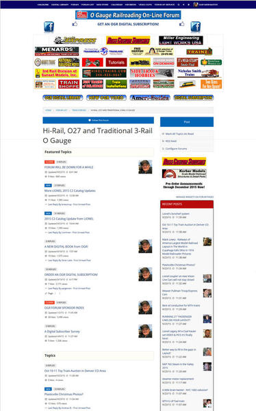
Here is a screen grab from the new layout as it will look on a typical computer monitor. Click on the image to see it full size.


Hoopla Ver 2 Screen Grab

Attachments

Images (1)
  • Hoopla Ver 2 Screen Grab
Last edited by Rich Melvin

Times are changing for the better. Rick, great move. When I travel I no longer take a laptop, use a tablet (Apple iPad, Kindle Fire or a smartphone) in most cases the smartphone is a pain to use, requires you to use the full version and then hunt around on the screen.


Great Idea, Great move to keep pace with the technology.


K

Rich, this migration to Responsive (or Relative) Web Design is definitely good news - I look forward to experiencing it for the OGR Forum.  With more than half of all internet traffic now being conducted via some type of mobile phone or tablet device, it's time has come. Bring it on!

This new upgrade will be very interesting to try.  I'm open to seeing what it will be like -- primarily because we have no choice in the matter.  It will be what it will be.    Sigh...


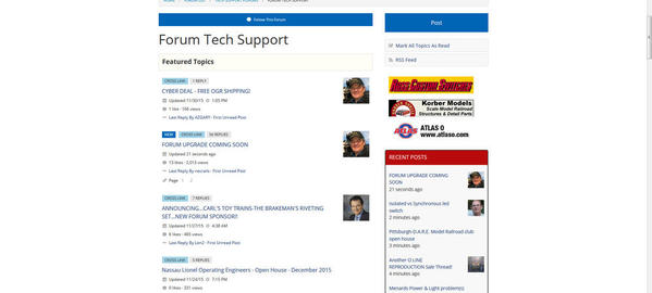
But I'll admit I've noticed I haven't openly embraced the directions I see software development heading in recent years WRT display/layout design.  For example, when I look at the screen-shot that Rich provided, I "get" the increased white-space thing, but there's a tremendous amount of wasted space because of the fact that so much stuff is "duplicated" on each entry.


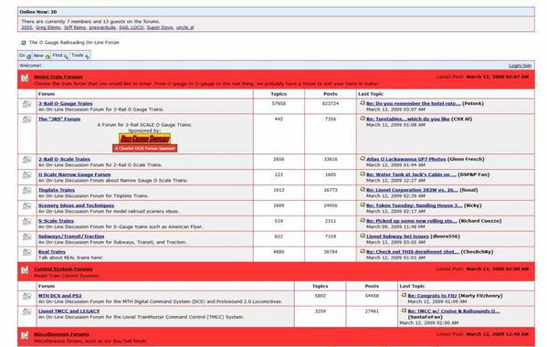
Years ago, the more "appropriate" design would be to have tables/rows/columns with appropriate headings.  Then beneath those headings we'd find the respective content information.  With the "new" approach , EACH ENTRY has what was formerly heading text... so all that stuff is repeated and makes for a very inefficient use of display space.  But I see this happening more frequently nowadays.  And of course, the look-and-feel to Facebook continues, which I don't blindly think is a good thing "just because" somebody thinks it's good to look like Facebook.  Quite the contrary, I'm more inclined to think the opposite.


Then of course, there's this whole movement to try and make stuff that looks fabulous on 27-inch and 30-inch desktop displays look/operate "equally good" on small iPhones (as smart as they are).  I just don't "get it".  If you have an iPhone 4 and prefer a larger display, just get a 6-plus.  Don't re-invent the app so iPhone 4 users think they're gonna get all the functionality that desktop user have.  Ain't gonna happen without some sacrifices along the way. 


Some things are meant to be done on desktops, and other things are meant to be done on smart-phones.  Truth be told, I've HATED "special apps" on smart-phones, and I've much preferred using the main browser-version to access content on those devices... then just enlarge the portion of the screen I need to read content accordingly.  All too often, these special apps don't allow the content to be re-sized.  So the text size "is what it is" for the device's display layout.  Perhaps it's just my eyes as Father Time ticks on by. 


A lotta of this stuff comes from the very nature that some folks feel the need to do EVERYTHING on every single device they can... i.e., desktop, iPad, mobile phone, etc...  OTOH, I'm more of the ilk that some things are better done on a desktop, while other things are best done on smaller mobile devices.  But I don't need to do everything on all devices.  My iPhone works great (usually) for a phone conversation, but I seldom use it to post entries on the OGR Forum. 


If I'm in the minority, that's fine.  I appreciate the fact that the world is changing all around us, and my preferences are fading into the dinosaur realm.  So be it.  I come from the professional IT days of years/decades gone by where things were done VERY differently.  For example, we'd NEVER perform an upgrade like this during  prime-time or peak consumer (end-user as it was once called) times.  That was unheard of for gosh sakes!  Application or system software upgrades of this type were done in the wee, early-morning hours of the day when most folks were sleeping.  9AM Eastern Time was never even an option for mission-critical apps.  These upgrades were often reserved for off-peak times of the year as well... for example between Christmas and New Year's when the rest of the world was "on vacation".     I remember those days fondly.  


Nowadays, a lot has changed.  Software developers think nothing of taking the system down during prime-time hours, and they think it's "OK" to do that just because they announce ahead of time that it's gonna happen... like "What's the problem?  We TOLD you the system would be unavailable for a few hours?" 


OK... off to watch a movie on DirecTV... but wait,  I just turned on the satellite tuner and it's telling me it's gonna do a firmware upgrade now (which will take several minutes)... just when I want to watch something. 


Ugghhh... maybe I'll just go to sleep instead. 


David

Last edited by Rocky Mountaineer
Richard thank y for looking into the pictures down loading for me. Never had problems with text size could read all fine. Just could not post pictures from phone. Witch makes it hard to show what your doing. And describe in to detail what your doing. Pictures are a good part of a story and help to define what your doing.
Hopefully it will included this in an app.
Thank you!!!!!

Nowadays, a lot has changed.  Software developers think nothing of taking the system down during prime-time hours, and they think it's "OK" to do that just because they announce ahead of time that it's gonna happen... like "What's the problem?  We TOLD you the system would be unavailable for a few hours?"  


David,

You are correct.  For the most part, years ago, a change like this would have been done on a weekend or off hours during the week or both - on a weekend and during off hours - off hours = God's time zone ET .  Today there really is no off hours because of the pervasiveness of the Internet and the devices that access it.  Impact could still be limited by doing it on a weekend but for a large change that would mean "all hands on deck", meaning developers, system admins, architects and database admins.  


Today hardware is a lot cheaper, especially if you move your application to the cloud, so having another instance is not that much more expensive or maybe equal to the older on premise model (in some cases cheaper).  You could even have more than one instance running on the same hardware utilizing virtualization and promote code without experiencing an outage.  This is a topic that could have multiple scenarios and permutations.   


All this said for us here on the forum an outage on a Wednesday late morning to early afternoon may be the best time to do something like this.  I would bet that is one of lowest traffic/visit times of the week - the weekend is probably the busiest.       


Last edited by NYCGreg68

Oh no !!  Another change !!  Whatever. I only use my laptop sitting on my desk and a flip phone occasionally. If the "system" goes down I go run trains or grab a book to read. Haven't watched much TV at all for the last 8 years and don't really miss it. A lot of the electronic stuff is a huge waste of time. Lived for a long time without all this stuff and can do it again. So go at it and upgrade !!  Hope it works out. Now where did I put that transformer ??

Folks,

Responsive design will also work on a desktop/laptop with any browser on any operating system.  So if you don't have your window maximized and grab it from the right or left and move it in you will see the responsive design in action.  I think the image Rich posted may have been "moved in" to show how the screen layout will change with less horizontal space.  Just a guess .....   

Originally Posted by gunrunnerjohn:

Rich, that "typical" display looks to be on an odd aspect ratio monitor.  Most folks nowadays have wide screen monitors, any preview of how that will look?

John, that image is a composite of THREE images stacked vertically. That's why it has a "portrait" format as opposed to a "landscape" format. I took a screen shot, scrolled the page vertically, took another shot, etc. I did it that way so you could see more than just the header and the banner ads. I should have explained that in my post and on the page itself. I'm going to add that text to the web page.


The format of the forum will automatically adapt to whatever screen you are using to view it. If you are using a tablet, for example, turning it between portrait and landscape will automatically for mat the presentation to give you the best possible viewing experience. If you use a desktop or laptop computer, it will look very similar to the way it looks now, just a little cleaner.

Last edited by Rich Melvin
Originally Posted by Big Jim:

Is the desktop version actually going to have all of that wasted space on the sides showing some out of focus train layout?

No it will not. That image is just the background image we use on our web pages.


The left and right edges of the white area shows where the actual edge of the forum page is.

Last edited by Rich Melvin
Rich,

Great news and thanks for investing in this wonderful forum and keeping it going!

May I make one request please - I mainly view the forum from my iPhone, when the upgrade comes can I please be able to post pictures from iphone when I reply to a topic?

Currently I can only post pictures or attachments on iphone when I start a topic (which is still a great feature!) but it would be nice to be able to include photos on someone else's thread such as Weekend Photo Fun.

If it can't be done no big deal and thanks for hoopla's and OGR's hard work!

Good on the Upgrade. My programmer son said "upgrade, eh, you mean, they're fixing their site".

I think it's "upgrade" and thank you.

I am finding out that much of the difficulty in using iPads, tablets, etc. has to do with just being comfortable with the way I have been doing it for the last 40 years...since the IBM AT came out. I have made some effort learning how to do the same things I do easily on a desktop, on a tablet. For example, I responded to a question on terminal strips last evening and felt that the desktop with mouse would be a lot easier to scan a drawing and upload. But then found I could just take a picture with my iPhone, and the resulting upload is actually faster and easier. How about that?

And...for what it's worth, I am getting around on the Lionel site much easier now than when it was newly changed. I had to learn a few secret words to search  manuals, but it's not as daunting as I first thought.

Having been through it with my bank and a couple of utilitiy's web pages, part of me wants to cringe when I hear, "Will improve the iPad, tablet, etc., experience of the site." It may have, but it sure made it more awkward to get around on a PC without a touch screen.


Guess we'll have to wait and see.

Last edited by Len2

All change is a little disconcerting, but as always we learn to accept it and then in brace it. I was a little fearful when Hoop La came along but you know I can't even remember the old format. I remember the conversations but how the page was constructed back then is now a non issue. 

I'm sure it will be for the best.

Alibatwomble posted:

I thought it my computer upgrade to windows 10 that caused the formate to change , looks like 200% zoom in & all squshed to the left of my screen & large white area on the right.

James

James, just a thought but since you are in win 10 go to Desktop --> Display Options and make sure the first setting sets the font to 100%... 

Ted

Well, this is one of many web upgrades I've seen over the years (work and play), and very few users over those years have initially liked the upgrade.  This one is no different.  Like all the other upgrades I assume I will get used to it over time.  


What I will miss is the ability to run the curser over the generic Avatar in "Recent Posts" to see who did the post.  I used that function all the time because it allowed me to skip over posts from members whose posts never interested me.

Well, it better than Lionel's...

It was a shock to the eyeballs after looking at the old format earlier today.  Looks like the spellchecker doesn't work on Firefox, either.  Got 3-1/2" of empty white space on both sides of my monitor.

Thumbs sideways until I drive it around a little.

Doesn't seem to be a way to jump from forum to forum without going through the directory.

Rusty

Last edited by Rusty Traque
Bob Rumer posted:

My mom always told me, if I don't have anything nice to say remain quiet.

...

And that, Bob, would be doing the the folks at OGR a HUGE disservice in this case!

But to play by your Mom's rules... I will say something nice.  On an iPad, it does appear that we now only need to click on thread titles ONCE to get to that thread.  But if it takes this forum upgrade to deliver that feature, I'll gladly roll back to the former version of software where we needed to click on thread names twice (on mobile devices).

And now that we're on the topic of iPads... I'm noticing a slight DELAY when I swipe my finger over the screen to scroll up/down.  Not a long delay, but enough to be noticable.  Yet when I switch to another tab in the same browser instance, it scrolls just fine.  Just the hoopla OGR Forum tab encounters this sluggishness while swiping.  Very annoying.

David

Last edited by Rocky Mountaineer

I agree with the foregoing "less than pleased" comments. Big problems:
----The type should be black, not blue. ---Too much open white space, and everything takes up way too much room. ---Takes much longer to go through the contents. ---It's hard on the eyes. ---Oh, and the editing function is screwed up so your changes are not properly reflected in the revised version.

-- Overall much more difficult to use, tiring on the eyes, and plain irritating.

Last edited by breezinup

Now i think it looks weird but I'll get used to it. My real question is this, how would everybody be reacting if this is how it looked since day one and the upgrade made it look the way it used to? Curmudgeny ol train guys just dont like change.

More importantily, whta heppanrd too the speel chekc

I'm using the iPad.

There are a few things I like - the add reply box at the bottom of the screen and the take action drop down using words instead of confusing icons. 

Things I don't like - too much white space, lack of contrast between the white and the light blue/gray blocks, and the way everything kind of runs together. 

I'm confidant Rich will read our comments and continue to work with hoopla to see what can be done. The last thing he wants is for members to be upset and leave the forum - if members exit, advertisers and their dollars will likely follow.


I don't like it either, but I'm willing to give them some time to change things to make it readable, like the colors, font size, spacing, etc. I now have to page down 4 times just to get past all the stickied topics. I get all the advertising, but I never have understood all the stickies appearing on every forum.

I have to agree with the consensus.  It looks terrible on my Android phone (using Firefox) and is forcing the RSS feed bar to appear without an option to disable it.  It looks just as bad on my PC using Firefox.  Too much white space.  No grid lines between posts.  No order really which is needed in a forum type setting to differentiate between posts and categories, etc. on the page.

I'm looking into some of the issues that have been presented here. I don't understand the "squeezed to the left" comments because the forum looks essentially the same as it did before on my machine. A little more white space and different fonts, but the overal layout is the same. Odd. The improper display on a wide-screen is disconcerting. That's also on my list.

I would appreciate it if all of you would just cool your jets for a couple of days and let me sort out the issues. We'll get to them one by one, just as we did when we originally moved to the Hoopla platform a couple of years ago.

The forum is still the best as the input is not from the webmaster but from all of the forum members. I m sure that the webmaster will listen to all and try to correct the complaints. The site just takes a bit longer to search and there is a need for a lot of scrolling and you must be patient in searching. The othet item I do not like is if uou open a post and get back out the color of the font should change to show you already looked at it. The new upgrade do not alow this.

Rich,

I was about to add my complaints to this thread, but out of respect for your recent post that you will be working to get some of these problems resolved, I will hold off....for now.

I am disappointed with your comment in your initial post about the "upgrade" that for desktop users "overall the site will look and feel much the same as it does now."  Sorry, it does not.

I have a tablet and it looks fine...at first I couldn't figure how to add attachments, but I see that. 

Not sure how one adjusts things like using italics, using bold face, etc.

I could see how the new format might be confusing to some of the more elder members.

Rich, maybe a YouTube video of how to navigate around might be helpful.

Tom

PS- Again, I have a tablet, I tried turning it sideways and found the look a bit more reminiscent of the old format, where you can see the trending topics on the right (which I could not see when the tablet is vertical).

Last edited by PRR8976

Just logged in for the first time today and was very surprised to see the new layout - I saw the heads up about the change but didn't think too much of it at the time and didn't bother to read up on exactly what was changed.

On a positive side, the actual messages seem at first glance easier to read with the font change. To reiterate some of the complaints on this thread, an awful lot of lost space on large screens and using the same font for the signature as the text body seems aesthetically off for some reason.

Yet to be determined are some of the functionality changes, such as the ability to 'follow forums' as well as topics... The lack of pop-up contextual help on something like this has me confused, and no help options easily accessible from the forum pages (main on down) to these features is not particularly user friendly.

Honestly, I'd like to see the ability to create a customized forum page organized by what *** I *** want to see, such as mixing the two 3-rail forums, the real trains forum, and anything mentioning the PRR on any forum, and maybe restrict some particular posts. That would be more useful to me than any of these device optimizations.

And since the browsers offer a hint as to which browser is being used anyways, why the one-size-fits-all methodology for programming the web site?

I remember what the forum looked like before the last change, where the most recent posts were not on the right side of the screen. At first I didn't like it, but as time went on, I preferred it. The new format is different with fewer lines which can take some getting used to, but I think we are more able to adapt to change that we give ourselves credit for. Once we become more familiar, I think it will be business as usual. Let's give Rich and the staff a chance, and see what happens. 


Andy

I am having trouble going into my profile and locating my last posts, or is it just me.  Also, I could not figure out how to change the order of my pics as they automatically load in numerical order. Used to be able to drag into the order you wanted.  As time goes on I assume we can help each other figure these things out.

I just deleted a LOT of posts from this thread. It serves no useful purpose to tell me that "This sucks." or "It's awful." and generally complain about this without offering any suggestions or input as to how to make it better.

There are legitimate complaints within this thread that I am already addressing. However, if all you want to do is complain without offering any construcive criticism, just keep those useless comments to yourself.

Rich, the two biggest issues I have with the new format is the fact that it's streatched vertically and squished horizontally.  The net effect is you get very little content on one page and you're scrolling up and down way more than is comfortable to read a thread.

Suggestions?

1. Expand to full width of the monitor.

2. Remove much of the added white space that doesn't seem to serve any function.

3. Change the backtround to something other than bright white.

Matt Makens posted:

I hope you read em first, there was a lot of good input there

 Yes, I read them.

When all that's in the post is "This Sucks" or "It sucks on my iPad" (sound familar?) the post serves no useful purpose whatsoever, other than to get more people upset.

If you want to help CHANGE IT instead of just COMPLAINING about it, that's fine. If all you want to do is complain about it, then I DON'T want to hear it.

Last edited by Rich Melvin
OGR Webmaster posted:

I just deleted a LOT of posts from this thread. It serves no useful purpose to tell me that "This sucks." or "It's awful." and generally complain about this without offering any suggestions or input as to how to make it better.

There are legitimate complaints within this thread that I am already addressing. However, if all you want to do is complain without offering any construcive criticism, just keep those useless comments to yourself.

Rich, it's your show and you will do what you want, that's cool, but you have made a couple of comments that seem a little harsh coming from a guy who needs our money...

How's about we all play nice.

Rocky Mountaineer posted:

P.S.  J Daddy, I'm with you...  I have no idea where the H#!! we are, but I know we're sure not in Kansas anymore!!! 

Unfortunately, I am still in Kansas and it looks just as bad here as it does where you are (wherever that might be)

Now the post blocks have a darkened background so the whole post looks like a quote, and it's getting worse...

I sure hope they are not finished with this upgrade.

Hope this doesn't boil down to anyone that doesn't like it being accused of fear of change. I could see 15 or more topics at once on my monitor with the old format. Now I only see 3 at a time. Seems like a waste of space. I only view it on my cell phone when I am bored and trapped somewhere I don't want to be. However, I did just test it on my cell phone. Seems like I have to do a bit more screen touching to navigate the site. Not thrilled with trading down on desk top quality for cell phone viewing.

OGR Webmaster posted:
Matt Makens posted:

OK, Rich you got me I dont think I used those terms exacly but it is cutting off the sides of the ad banner

Now THAT is something I can use constructively! Thanks!

To expand on that, everything right of the last s in the Ross custom switches banner is chopped off at said s. Oops device is a 7 inch tablet

Ted

Last edited by 027Ted
RadioRon posted:

Gee, it seems that re-do this was totally for the benefit of hand held device users (of which I am not one) at the total expense of those using laptop and desktop computers. 

Not so. The forum still looks essentially the same as it did before on my machine, while others are having issues. However, almost HALF of our traffic is now tablets and other hand-held devices.

We'll figure it out.

Even on a phone, I think this layout is inefficient.

When browsing a forum, at best, maybe 20 percent of the screen space is taken up by the content that matters - thread titles.

The other 80+ percent is occupied by  marginal content, such as how many 'likes' the thread has. Maybe the millennials care more about that.

Also, at least on iOS 9 on an iPhone, the text display does not scroll when you reach the bottom of the text entry window.  All the typing I am doing right now is invisible unless I manually scroll down.


I appreciate the gray in the content area, and the expansion of the thread area horizontally.

Main thing I'm having a problem with now is the recent posts. Sometimes it shows just sort of a random selection - newest might be 12 or 20 minutes old, but a reload or click on a particular forum results in the correct display. This didn't happen previous to the redesign.

Perhaps this is just while work is still being done on the site.

David

I appreciate the hard work and best intentions that went into this upgrade. However, this new format requires a scroll-wheel marathon. My fingers are totally exhausted! This upgrade creates more work to do or say the same thing as before, like translating to ten sentences in Spanish instead of three in English.  Specific constructive suggestion: Remove all the unnecessary spaces.

Rich,

I apologize if I disappointed you with my last post. I'm at a loss of what to say in response to being accused of saying, "this sucks" as I said no such thing. This will be like the other changes in the past. Everyone moaned, groaned, beeched and complained for the first two weeks. After that everyone toned it down for the most part never to utter another foul word.

I have but one gripe. Please hear me through. Surely you can do something about all the wasted space on each page? I'm showing a 2.0" margin on the left and a 5.50" margin on the right side of the page.

Last edited by Prewar Pappy

I've found it easy to navigate as the old forum.  Some buttons are in different places, but easy to find.  

Basic functions work OK.

I checked the search function and it worked OK.  Will have to give it more investigation as some of the results didn't pull up the threads.  Probably just old threads that have timed out.  Verdict to be determined.

An improvement would be alternating the color highlight of the replies.  For example, odd post numbers are white, even post numbers are grey.  Similar to the old set up.

All in all, it could have been much worse.  Much worse.  

It's still a fun place to talk trains, and that's what matters to me.

WOW!

Just came on the website for the first time since this afternoon to look up the Camera Trainspotting thread and saw the difference.

I would say that my visits to the forum are 70% Smart Phone/30% PC, however, while using my smart phone on any of the various websites that I frequent, I expect to have the display compromised to fit the screen and am comfortable with that.  

Be that as it may, I'm NOT happy with the squeezed display and the acres of empty white space.  Not to mention that with all that white space instead of text or images that used to be in that area, the computer screen is more blinding to look at.  Heck, now I don't need to have any of the lamps on in the room when I'm on OGRR.  The screaming white acreage lights up the room enough.

Mark me in the not impressed camp.  

>Insert thumbs down Smiley here, as it's not one of the options provided<

This looks ok on my computer (at least it fills the screen), but it looks awful on my phone (iphone6s). There's no delineation between topics on the boards, or between the posts in the threads, its nearly impossible to figure out who's posted what. Additionally, the topic titles are now huge, only a few fit on the screen before needing to scroll. So much more scrolling the screen is now necessary to read the forum. The only improvment I see is the addition of thread page numbers on the phone, so you dont need to wait for threads to progressively load. 

I hope some of this is just early glitches, and settings can be adjusted to make it work. Right now, this upgrade has made the forum almost unreadable on my phone.

Last edited by Boilermaker1
MartyE posted:

Interesting. Rich is 100% correct about offering constructive criticism and help. I've had the same gripe with operators on the broadcast trucks. They'd say "this sucks". It's hard to fix "sucks".  ...

Marty, I don't envy the position Rich is in right now.  Allan was frank enough to respond earlier in this thread and give us the sobering news that this upgrade was a one-way street... No chance of a roll-back.  That is sad, because this version of software from a design, presentation and functionality standpoint is clearly not ready for prime time across the broad audience of users it's meant to serve -- at least not from what we saw when Hoopla went "live" with the upgrade.

We're where the rubber meets the road, so to speak.  Some folks like desktops, others spend all their time on mobile devices.  But it's not easy designing for a gazillion different environments.  The irony here is the panacea of client/serving computing back in the 1990's was supposed to solve all these issues by having different software layers be independent of presentation logic.  Well, ya know what they say about the best laid plans. 

That's what I LOVED about apps that were based on the web browser interfaces.  The apps didn't need to worry about screen sizes and what-not.  And if I was on my iPhone, iPad, or desktop,  the presentation looked the same!  Nowadays, with this responsive design nonsense, the application logic is back worrying about how the presentation looks on the user's end -- depending on which device is being used.  So the APP is now making the decision of how the presentation looks on different devices.  But what if I don't WANT the presentation to look differently on different devices?  Or what if my preferences are different than that of the app developer?  Why should he or she determine those things?  That's SO not progress for the better.

I "get" that what we have here is what we're gonna need to live with if we want to stick around.  We're all big boys and girls here, and we'll decide what's a deal-breaker and what we can live with.  But by the same token, hearing the numerous usability concerns raised here in a manner of overall discontent should be a strong enough message to Hoopla that the software upgrade has missed its mark.

I just hope that hoopla has given Rich enough parameters to make this "new design" workable for most of us here.  I can only imagine Rich is gonna have a LONG night ahead for himself, because he's conscientious about how his brand "looks".  I'd be the same if this were my baby.

David


Last edited by Rocky Mountaineer

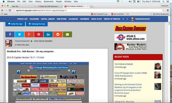
Here is some constructive input from a Gen X'er.  Not a Millenial nor the Greatest Generation.  I primarily interact with OGR on my 17" Macbook Pro via Chrome.  The revised layout is attractive from a change perspective, however, the dead space on the right & left margins is difficult to adjust to.  There is "A Lot" of washout in the dead space from the white background.  My brightness is about 50% and is set via calibration.  The 18% Gray works well to contrast from the dead areas, but why is there so much dead space?  My eyes are not screaming too bright, but same token they are wondering if there is another option for the white that is filling the dead space.  I understand the desire to offer more functionality for mobile devices, but at what sacrifice for Desktop/ Notebook users?  I had no issues opening up OGR on my iPad Mini in Safari, and I never needed to scroll nor increase the font setting.  

Screen shot 2015-12-02 at 11.03.01 PMI definitely dig the "Replies per page" option.

Attached is a Screen Capture of what I'm seeing on my Macbook Pro.

Attachments

Images (1)
  • Screen shot 2015-12-02 at 11.03.01 PM

It seems like OGR is trying some adjustments.   I noticed the message area is expanding as I increase the window size vs. what was happening a few hours ago.  Tried this on a laptop, and 27 inch monitor at a almost full size.  I noticed less white space.     I think we need to wait and give OGR a chance to make more adjustments.

 I do like the option allowing the users to pick how may replies visible per page 20, 40, 100, 200.    

PatapscoValleyRR posted:

It seems like OGR is trying some adjustments.   I noticed the message area is expanding as I increase the window size vs. what was happening a few hours ago...I noticed less white space.     I think we need to wait and give OGR a chance to make more adjustments. 

Yep...we are tweaking things based on the feedback we're getting from people who have posted on this thread. The page can now be made wider (up to 1920 pixels wide - the HD standard) and we're going to tweak the colors a bit more to make it more pleasing to the eye.

Within a day or two, spell check in the posting window will be working again.

Progress...small steps.

Last edited by Rich Melvin
OGR Webmaster posted:

Yep...we are tweaking things based on the feedback we're getting from people who have posted on this thread. The page can now be made wider (up to 1920 pixels wide - the HD standard) and we're going to tweak the colors a bit more to make it more pleasing to the eye.

Within a day or two, spell check in the posting window will be working again.

Progress...small steps.

Rich, the forum is now making excellent use of widescreen desktop displays.  Nice column of forum content down the center, a list of sub-forums in the left-most column, and the list of recent topics in the right-most column.  Then when viewing individual threads, the display opens up to two columns... the left-most two thirds contain forum thread content, and the right-most third contains the recent thread list.  The width of the display is completely untilized with NO white-space.  Nicely done!!!  I think I've already forgotten how poorly things looked on my desktop when I signed on to the forum late this afternoon!!!    Definitely moving in the right direction... at least my brain doesn't hurt (as much) when looking at things now.

David

Last edited by Rocky Mountaineer
Richard Gonzales posted:

Well, I just now signed into what I thought was the OGR fourm.  A friend warned me about the new forum upgrade a little over an  hour ago.

Why do some folks insist on fixing things that are not broken?

Where is the spell check function? Did is lose it when I I had to remove the OGR URL from the EI compatability mode list?

This was a bad choice OGR staff, and reading David's note, there is no going back!!


Richard


Rich, they may not have had a choice!  upgrading....But, There are other choices and other places to go that may offer a simple format....if you can't handle this one.

I'm very sure that "RICH MELVIN" isn't 100 percent pleased with the product...

I'm also sure he will do what he can....to make it better.

So, I'm going to hang in....even if I get a headache.

Well........some of it works....and some don't.......

My career was in the IT biz. All us old guys are retired and you can tell. I have some mild color blindness and macular degeneration......combine the two and these 'new age' graphics of a light gray background with medium gray fonts is AWFUL hard on my eyes. And it is not here only but what I see as a 'Trendy' twenty-something 'ain't it cool' look that folks with good eyes (today they do.....years from now they will suffer like me) force on us all without consideration to any one but themselves. I almost feel we need a ADA act for the net. Thanks.

Steamfan77 posted:

Rich,

I see that the body of the reply boxes are back to white. I think it's easier on the eyes if the boxes are a light gray like before. Just my preference...

guys, see my previous reply on the search and other functions at the top left corner of the page where the three horizontal lines are...

Andy

I would respectively concur with this.  The bright white text boxes have my eyes hurting after just a few minutes.  Even on a MAcBook Pro retina.  If there's a way to soften this, it may help a lot of us.

THank you for taking this on, Rich!

The changes I see (since the initial upgrade this afternoon) are a great improvement. The gray background (on my iPad) makes everything much easier on the eyes. The boxes around the posts are also very helpful. 

One additional comment... when I looked at the new version on my PC easier, like the old site, if the poster used an avatar other than the generic one, it appeared next to the post. I found that to be helpful under the old version, but it does not appear on my iPad now. Any chance we'll see that back.

Rich and the staff all get gold stars for the prompt way they have addressed the expressed concerns.

OGR Webmaster posted:
Laidoffsick posted:

So how do you find the "recent discussions"? I don't want to search every catagory to see the recent stuff.

Same place as before, on the right at the top. That didn't change.

Not on my phone its not. Samsung Note 5. There is no option for "Classic View" and there's nothing on the right. 

Ok with my phone in the upright position, I have no "Recent Posts" menu. There is a drop down arrow on the top right. If I hit the arrow I get 2 options. 

1. Mark all as read

2. RSS Feed... clicking that gives me a whole page of HTML code

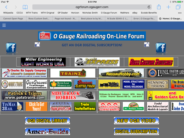
If I rotate my phone, the view changes and I get the "Recent Posts" on the right, but all the banner at the top are cut off on the right side of the screen.


Looks fine to me...

Norm posted:

Hi Rich,

Your plate is full right now for sure.  The colors and contrast seem to be more in synch,it is easier to read.

I am not sure if there is a method to contact the webmaster.  Please put this on you list sometime:  my avatar is terribly distorted.

Can you fix it for me?

Norm

I don't know Rich.  I think you're fixing things to fast.  I suspect some other places will only get a day worth of activity over the change before they have to go back to discussing the weather.

Also I noticed the Avatars on the main pages, not within a thread, are rather large.

Last edited by MartyE

Rich, can the forum drop down menu be restored.  You no longer can select from a drop down box.  Instead you have to click the forum list and go to a page.

Also, would be nice if the last reply and previously read information was larger.  Seems harder right now to determine what was read and what wasn't.  I do see the New box.   G

Okay, Rich, today the format looks much improved on both my Win 8 and Win10 laptops over what was presented yesterday. Huge white margins are gone and forum screen is no longer squished / compressed towards center of screen. A dramatic and definite improvement over yesterday's forum screen. Should forumites assume what we had yesterday was a beta version subject to modification and refinement? If so, is what we now see on laptops the final configuration of the new look or is this also a beta version and we should expect additional refinement and enhancement?

Just logged in this morning to check it out again.  On my laptop and desktop it looks a lot better now, using the full width of my screens!  And here is my biggest wooo hooo  ... On my Galaxy Phone I can now navigate using post pages!  Prior to this I used to have to change to desktop view on my phone and pick a page to get to the end of long posts that I was following.  This made everything a lot smaller .... But now it works great and is a lot easier to read - the exact way responsive design is supposed to work.  Thumbs up! 

Drop the Avatars, take up too much room and I really don't think they're THAT important, or even that accurate.  I mean, I could put a picture of anybody up and not more than 2-3 people on here would know it's not me.  And for those that do know each other, well then the avatar isn't needed is it.

Look how many don't use anything but the fake profile avatar.  Things run just as well without as with and the space could be put to better use.

New background is much improved , maybe a "sea foam green" would be nice

It is much better this morning, my eyes really enjoy the gray back ground much better than the white, it was too bright then.  I would also like to add myself in there for a return of the drop down if that's possible.  I guess I jumped the gun yesterday a bit, in all fairness it like anything will take some tweaking to get things dialed in, thanks Rich for taking the time to adjust things the best you can.

I think a lot of folks are missing some points.  While the change wasn't great on the roll out, it has been improving as Rich tweaks it and works on some of the constructive points made by members.  The change for the sake of change is probably a pretty inaccurate statement that is being tossed around freely this past few hours.  We don't know what else this change enables the forum to be capable of.  Unfortunately we are seeing the front end results that obviously Rich is working on.

Also some of the changes may be needed to add features and other behind the scene features that may not be obvious right now.  It's easy to get frustrated but giving specifics and letting Rich work them out is key.  Who knows the new software may give you a feature that you've been craving.  With a little patience and time I'm sure we'll all be talking about trains again rather than this upgrade.

Last edited by MartyE

It is working wide screen desktop and laptop this morning but still choppin ads off using a tablet.

Here is a suggestion that will really help in this new scroll marathon vertical world... Get rid of the rediculous signatures. I mean really, ten lines to say what amounts to "I fix trains". How about one sentence, normal font, no graphics? It will shorten this up considerably for those of us that go mobile.

Ted

Last edited by 027Ted

Add Reply

Post

OGR Publishing, Inc., 1310 Eastside Centre Ct, Suite 6, Mountain Home, AR 72653
800-980-OGRR (6477)
www.ogaugerr.com

×
×
×
×
Link copied to your clipboard.
×
×