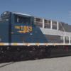
Looks like CSX has produced another heritage unit about three days ago. Not sure of posting links , but it's very easy to find. Striping great, but be sure to note the lettering font. SMH!!!
Replies sorted oldest to newest
I'm not sold on the CSX nose- heritage rear. Works better with some schemes like the B&O unit.
The two "halves" just don't go together. Metro-North has recently done a gorgeous NYC stripe heritage unit.
Jump to 10:42
@RSJB18 posted:I'm not sold on the CSX nose- heritage rear. Works better with some schemes like the B&O unit.
@Scotie posted:The two "halves" just don't go together.
AMEN!

Keeping the CSX livery on the front of the loco and adding the heritage scheme on the rear half looks AWFUL.
This is how you should do a "Heritage" unit...

Attachments
At least they gave up on fading the CSX nose paint into the heritage scheme. That never looked good.
If you think the NYC heritage unit looks bad, take a look at the ACL unit.
https://heritageunits.com/locomotive/photo/70988
Ken
Font doesn't seem right for NYC two tone grey lightning stripe era either -- actually looks like SP! I agree -- ditch the modern CSX nose paint and go all in on the fallen flag liveries. NYC is a classic scheme and should be easy to get right.
I saw this several days ago and also questioned the font used for "NEW YORK CENTRAL". A bit of a hodgepodge of ideas here on this one. Steam era font, lightning stripes and the awkward transition to the CSX nose.
However, I still have to give credit to CSX for doing heritage units in general.
@kanawha posted:At least they gave up on fading the CSX nose paint into the heritage scheme. That never looked good.
If you think the NYC heritage unit looks bad, take a look at the ACL unit.
https://heritageunits.com/locomotive/photo/70988
Ken
Hideous! 😆 Count me in as another who dislikes the “jamming -two-halves-together” approach to graphic design.
@GG1 4877 posted:I saw this several days ago and also questioned the font used for "NEW YORK CENTRAL". A bit of a hodgepodge of ideas here on this one. Steam era font, lightning stripes and the awkward transition to the CSX nose.
However, I still have to give credit to CSX for doing heritage units in general.
Well, considering that they have the ugliest scheme of any of the Class 1's, we shouldn't expect miricals.....🤣🤣🤣
Still not sure it would work but I think the locomotives might look better if they just had the front of the nose with the CSX logo and literally the rest of the locomotive in the heritage scheme. Still would have some color clashes.
Of course, there are rumors that these will make an appearance this catalog from the Big L. I for one, do not think these units are attractive.
@GG1 4877 posted:However, I still have to give credit to CSX for doing heritage units in general.
Yes. I agree, Jonathan. I always say that there's nothing like spending about an extra ten thousand dollars in painting a locomotive to memorialize a legacy railroad and then having us criticize it. Let us be kind. It is not exactly the way I would have designed it either, but the gesture by CSX and the hard work of the paint crew are certainly appreciated.
Probably none of the people involved in this project are old enough to have watched a parade of NYC lightning stripe diesels -- both cab and booster, as well as road switcher units -- pass by.
And New York Central was a railroad definitely worth remembering.
Maybe it will wander off line and make an appearance out here in the wind, on our treeless, grassy, plains one day.
I must be the odd one out that actually likes the split scheme, especially since they seem to have dropped the fade and gone to a simple split.
I have no info on how they decided to do the split scheme, but one thing they may have considered is how the locomotives would be viewed by non-railfans, i.e. the communities they are trying to built rapport with. WE know that NYC trackage became CSX and NS, but to the casual viewer, a full heritage scheme probably looks the same as any other run-through power. By splitting the scheme, it is more clear to the casual viewer that this is a CSX locomotive that is specially painted for some reason. Perhaps they go look up why, perhaps they go "oh I remember that name", perhaps they go "oh that's cool" in a way that a full heritage scheme might be missed, or seen as the same thing as seeing a UP or NS or BNSF in the midst of a CSX consist.
Again, no clue if that was their reasoning, but the marketing side of my brain thinks that's a really good reason to do the split scheme, even if it annoys railfans.
I sure hope Lionel, MTH, Atlas etc do not make any of these half and half heritage engines. Don’t know what CSX is thinking
Tom's (Number 90) point is well taken but if spending the extra money to re-paint an engine including the design fees, because you know a guy in the paint booth didn't come up with this, one would believe they would get the colors and the font correct. Even if the company insists on including the current identity in some way.
The people have spoken...CSX,are you listening...
@Number 90 posted:Yes. I agree, Jonathan. I always say that there's nothing like spending about an extra ten thousand dollars in painting a locomotive to memorialize a legacy railroad and then having us criticize it. Let us be kind. It is not exactly the way I would have designed it either, but the gesture by CSX and the hard work of the paint crew are certainly appreciated.
Probably none of the people involved in this project are old enough to have watched a parade of NYC lightning stripe diesels -- both cab and booster, as well as road switcher units -- pass by.
And New York Central was a railroad definitely worth remembering.
Maybe it will wander off line and make an appearance out here in the wind, on our treeless, grassy, plains one day.
@coach joe posted:Tom's (Number 90) point is well taken but if spending the extra money to re-paint an engine including the design fees, because you know a guy in the paint booth didn't come up with this, one would believe they would get the colors and the font correct. Even if the company insists on including the current identity in some way.
Right after I invest my billions in owning a railroad.......I'll make sure they get the heritage scheme's right.....![]()
As the old saying goes YRRYR.....
Bob
While not a big fan of the way CSX has done their heritage units, if instead of the "split scheme they were to do them as complete in their parent colors, then what would make them any different from the Norfolk Southern heritage fleet?
Stuart
How about a big yellow nose with CSX and sides complete in correct heritage scheme?
I’m seeing all the criticism of CSX’s NYC heritage livery. While some of you might not like it, remember that CSX is a for profit entity. Be glad that they did it at all.
Norfolk Southern's take;
@Jim S posted:I’m seeing all the criticism of CSX’s NYC heritage livery. While some of you might not like it, remember that CSX is a for profit entity. Be glad that they did it at all.
US trademark law mandates that they have to keep using their trademarks in commerce as well as renew it every 10 years or it reverts to the public domain. Nothing against CSX (or NS, for that matter, or UP), but no, this isn't only being done out of the goodness of their hearts to make a bunch of railfans happy.
@Stuart posted:While not a big fan of the way CSX has done their heritage units, if instead of the "split scheme they were to do them as complete in their parent colors, then what would make them any different from the Norfolk Southern heritage fleet?
Stuart
The individual fallen flags are all unique to either CSX or NS with just a few exceptions. There are only a couple of shared east coast liveries -- NYC, Conrail, Penn Central, and Monongahela I think. E.g. CSX can't do a Virginian engine. It all goes back to the asset division during the Conrail split to CSX and NS, of which the liveries were a part. NYC and Monongahela are shared because (I think) either they share trackage rights today, or the system was split and each railroad got a part.
But, for example, both railroads already do their own Conrail schemes on various equipment (often just the plain bright Conrail blue with the same white all caps, sans serif font), and it works just fine.
I am definitely supportive of CSX taking action and producing these engines. They didn’t need to do this, but it is good PR. I understand that there may be some difference between the originals and these heritage, but I am glad to see them.


