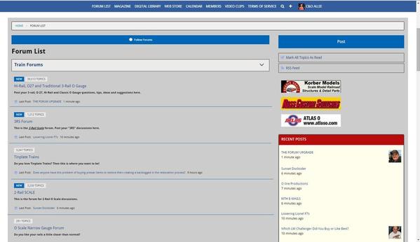
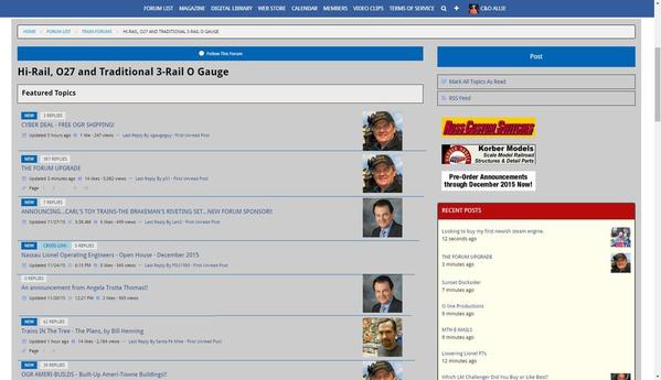
I love the new site on my mobile applications. Prior to the new site I couldn't post anything from my mobile devices. It was too much of a pain and I had to use the laptop. Now it looks great on my phone. Like the new Responsive Design! Yes, there are some bugs but I know you'll get them fixed. The front page seems "off" on my desktop using IE. Not sure why I used IE first! LOL. I'll try it on a few other browsers.
Improved this morning, with a ways to go. Obviously, the comments conveyed dissastifaction and enough constructive ideas to lead to change.
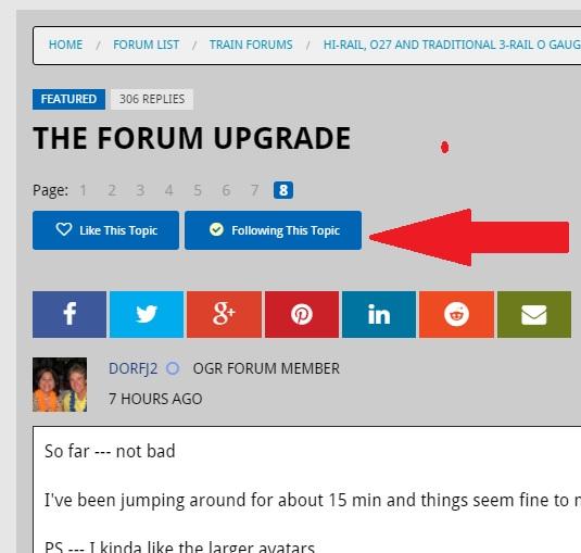
Meanwhile, I'm going to have to stop following this thread; my inbox is too full.
HELP!!! Where the "follow thread: check box?
the grey background is much better than the white from yesterday.
How do you stop following threads? My inbox was too crazy this morning as well. I see a link to stop ALL notifications from this site, but don't want that. Just want to stop this one.
Thanks
TOP LEFT, UNCHECK FOLLOWING THIS TOPIC...
Ted
Much better than yesterday.
Dave 
Thanks. Found the spot. Good-bye.
MattR posted:How do you stop following threads? My inbox was too crazy this morning as well. I see a link to stop ALL notifications from this site, but don't want that. Just want to stop this one.
Thanks
There are also more options to choose from in your profile under Notifications.
Rusty
Much improved this morning over last evening. The forum is now actually useable for us 'puter folks. Glad I waited before flipping my lid. ![]()
Pete
Rich,
Just getting use to using the new format for the OGR sight, so far I do like it, people need to give themselves a chance to learn how to use it before saying negavite things about it.
There is one technical thing you need to change/refine however. When you try to add another picture via the edit function, it posts the picture above not below the one already posted, and your printed post ends up between the pictures instead of at the head of the edited post. Not a complaint just letting you know.
PCRR/Dave
so...how do we post pics?
Steamer posted:so...how do we post pics?
You'll want to use the "Add Attachments" link underneath the text box for your reply.
I love it! Posting pictures from my iPhone is possible now and the presentation on mobile devices is superb! Thank you!!
Attachments
Thanks to the upgrade I can post these much easier from my iPhone.
The biggest issue I have is that all the lines of text look like they are double spaced. I feel like I'm in constant scrolling mode trying to read the posts. It would really help if everything could be compressed vertically.
Thanks for the info on following it. Right in front of me the whole time. Like I'm sure this next question is: Where is the SEARCH box?
OGR Webmaster posted:I don't understand the "squeezed to the left" comments because the forum looks essentially the same as it did before on my machine. A little more white space and different fonts, but the overal layout is the same. Odd. The improper display on a wide-screen is disconcerting. That's also on my list.
The overall layout looks pretty much the same to me too, Rich. The only real difference I see is all the white space caused by the use of a larger font size, perhaps a larger spacing between lines and it appears the font itself is a shade of gray vs black. Both of those together make it more difficult to read and causes eye-strain. FWIW, the font size used for quotes is the size I think it should be throughout. It's almost half the size of the font used for the body of the post. At this point in my reply I'm almost at full screen with just this and the short quote. I don't mind that so much for composing comments, but for just reading, the font size requires a LOT of scrolling. For some reason the while space does look brighter, but I'm not sure that's not caused by the large font and spacing being used.
I do like the new compact formatting bar. At first I couldn't find the fonts, underline, etc., settings, but I see they're under the "Formats" submenu. I also like the "Action" menu for commenting, quoting, etc. I just noticed where the "Follow" button is, so that's okay too.
I also figured out how to add attachments and resequence them in the order I want by scrolling down to the attachments management section below the post and clicking the "arrows" to the upper right for the one I want to move. At first I thought I just needed to click the up/down arrows, but soon found I needed to grab and move the attachment where I wanted it in the sequence. The old way was to simply grab the attachment in the body of the post to move it.
One irritant is that when you press Enter/Return while composing, it automatically double-spaces and starts a new paragraph. I don't always want that, like when I'm listing a few items. For example:
- item 1
- item 2
- item 3
All that does is waste space and makes the post look brighter that it otherwise might be. I know I , can use the "bullet" tool, but that requires extra steps and if it's a long post, takes a lot of scrolling to turn on/off.
- item 1
- item 2
- item 3
DoubleDAZ posted:OGR Webmaster posted:I don't understand the "squeezed to the left" comments because the forum looks essentially the same as it did before on my machine. A little more white space and different fonts, but the overal layout is the same. Odd. The improper display on a wide-screen is disconcerting. That's also on my list.
The overall layout looks pretty much the same to me too, Rich. The only real difference I see is all the white space caused by the use of a larger font size, perhaps a larger spacing between lines and it appears the font itself is a shade of gray vs black. Both of those together make it more difficult to read and causes eye-strain. FWIW, the font size used for quotes is the size I think it should be throughout. It's almost half the size of the font used for the body of the post. At this point in my reply I'm almost at full screen with just this and the short quote. I don't mind that so much for composing comments, but for just reading, the font size requires a LOT of scrolling. For some reason the while space does look brighter, but I'm not sure that's not caused by the large font and spacing being used.
I do like the new compact formatting bar. At first I couldn't find the fonts, underline, etc., settings, but I see they're under the "Formats" submenu. I also like the "Action" menu for commenting, quoting, etc. I just noticed where the "Follow" button is, so that's okay too.
I also figured out how to add attachments and resequence them in the order I want by scrolling down to the attachments management section below the post and clicking the "arrows" to the upper right for the one I want to move. At first I thought I just needed to click the up/down arrows, but soon found I needed to grab and move the attachment where I wanted it in the sequence. The old way was to simply grab the attachment in the body of the post to move it.
One irritant is that when you press Enter/Return while composing, it automatically double-spaces and starts a new paragraph. I don't always want that, like when I'm listing a few items. For example:
- item 1
- item 2
- item 3
All that does is waste space and makes the post look brighter that it otherwise might be. I know I , can use the "bullet" tool, but that requires extra steps and if it's a long post, takes a lot of scrolling to turn on/off.
- item 1
- item 2
- item 3
Dave, you could try something when posting but I don't know if it will work. LOL Call it a test.
Try SHIFT + ENTER when you want a new line in the post box. It works in some text editors and not in others.
YUP IT WORKS LOL!
Ted
Looking really good this AM on my desktop computer!
The boxes around each post really separate them and make them easy to read. That was the main problem for me yesterday with the first version.
Having the blue menu bar always visible at the top also makes it easy to jump back to the forum directory page without needing to scroll up first or use the back button.
Thanks, Rich.
Jim
Thank you for the modifications that you have done and are doing. Using the forum and getting use to it. Just takes a bit longer on some of the functions
Suggestions:
1: Could you change the drop down menu add the list of all of the forum categories, Reason is that it takes less time then scrolling down the forum directory.and still using the drop down menu with the two catagories.
2: Could you also change the delete the spacing for when you press enter when writing a post? This spacing is force upon a post entry when dropping down to another paragraph. If needed a space, one could always add the space. You can see the spacing as I go.
3: It would be a great idea to highlight a post in a different color once read. This way one could see what they already have opened up and read.
4: Spell check would be nice when entering a post. If the spell check is not added I will first write my post in word then check the spelling and do a copy and paste.
I know that you probably have a list of priorities that you are doing and hope that you will consider my suggestions.
Still this is the best forum with the best forum members.
Thank You
Rich, would it be possible for the Recent Posts box on the right to grow with the length of the Forum Body?
Once the topic has more than 10 or so posts, you kinda scroll past the Recent block leaving empty space. That or maybe have the entire box tag along?
It does look great on a wide screen though!
Ted
027Ted posted:Dave, you could try something when posting but I don't know if it will work. LOL Call it a test.
Try SHIFT + ENTER when you want a new line in the post box. It works in some text editors and not in others.
YUP IT WORKS LOL!Ted
Thanks for reminding me, Ted. I remember that being a temporary fix when another forum did a similar upgrade. Hopefully Rich will change it though so pressing "Enter" single spaces like it used to. ![]()
DoubleDAZ posted:027Ted posted:Dave, you could try something when posting but I don't know if it will work. LOL Call it a test.
Try SHIFT + ENTER when you want a new line in the post box. It works in some text editors and not in others.
YUP IT WORKS LOL!Ted
Thanks for reminding me, Ted. I remember that being a temporary fix when another forum did a similar upgrade. Hopefully Rich will change it though so pressing "Enter" single spaces like it used to.
Anytime Dave. It seems that this is an issue with lots of forum text editors but they all get worked out in time.
Ted
Awesome, I say I don't like it, and my post gets deleted.
Anywho, Firefox's spell check doesn't work with the new site. It did work fine with the old site. Might want to look into why that is.
sinclair posted:Awesome, I say I don't like it, and my post gets deleted.
Last night I posted here that if all you want to do is complain by just stating "I don't like it." that doesn't help me make this change better. I deleted a LOT of posts like that in this thread because they serve no useful purpose. This isn't a poll on whether you like it or not...this is a thread where I want to read about problems and issues that I can fix.
If you want to post something constructive, such as mentioning the font size (which I just changed) or some other form of constructive criticism, I'll be happy to read your post and take some action on it if I can.
Test"" I've typed in test and now have changed my mind... How do i get out of it without posting I see no cancel portion. Never mind I found it..Take action.
Rich, lots of progress I see. It's filling the screen and the bright white is greatly reduced. And here we didn't think you listened. ![]()
I agree with the previous post, spell check stopped working with my Firefox, that would be nice to get back. Some of us get tangle finger and don't speel so well. ![]()
Another suggestion. Chop the white space from the bottom of posts. If I happen to put a couple extra <enter> keys in, I get a big chunk of totally useless space. Once the content is done, there's no reason for a lot of white space at the bottom of the post, see below for example.
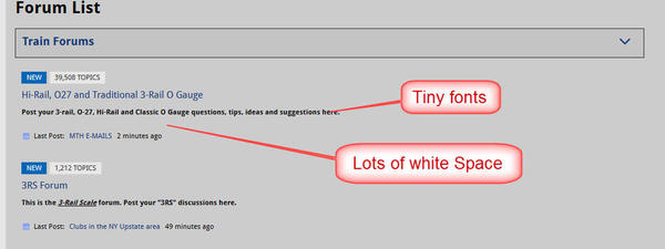
One more point. See the sample below, the forum list suddenly exploded vertically, but the fonts are tiny with lots of totally worthless space. How about larger fonts for the topic list and less usless white space? Also, the reply box no longer has a text size option.
Note forum index example below, I don't understand why on a wide screen that these have to go to multiple lines, more useless white space.
Finally, what happened to the HTML edit? When formatting gets screwed up posting a message, it's very useful to be able to go in and fix it.
Attachments
Rich,
Thank you for your tireless efforts. The forum now looks great on both PC and MAC.
Please add the following to the Hoop.la suggestions:
Please bring back the lines or some sort of deliniation between topics in the forums.
While it looks and scrolls fine on OS devices, having no lines, is very odd, and not fluid.
Again, thank you!
I also just notice you can't select what is a quote and what is not. For instance I just tried to Reply with a Quote to GRJ about the spell check coming back soon but couldn't place my response before his quote as I've done in the past. The quote box is all the way at the top with no way to insert before it. I could of swore I did it this morning though.
And multiple post quotes was a nice feature. Is there a way to do that as well?
Hello Gunrunner john. The post edit is still there it is under the "Take Action" on the lower right just click on it for the pull down. I m still fumbling around getting used it. But the forum still works. Thank you Rich.
Taking a look this morning, I'm glad to say that the wide screen issues have been taken care of even on a 27" 2560x1600 monitor.
The grey backgroup helps a bit on the eyes, but as a result the page numbers are now fading into the background - the grey worked against a white background, but they now should be made darker or a different color.
On a widescreen display, the horizontal space is at the premium. Given the Avatars have been stretched to meet all the information that's presented in a topic header, the avatar would need to shrink for any optimization on the space. I'd be inclined of moving the 'New' and reply count to the left of the avatar rather than taking a separate horizontal line...
Since changes are being discussed, I'd like to request a change to the email follow-ups. Currently the subject of any update consists of the poster and the forum topic which is being replied. The newer email clients that attempt to thread related emails don't do the threading since the subject changes with each new poster. Would it be possible to remove the poster from the subject? Ideally the subject would contain the match of what is being followed, whether it be an individiual or a topic or what have you...
gunrunnerjohn posted:Rich, lots of progress I see. It's filling the screen and the bright white is greatly reduced. And here we didn't think you listened.
I agree with the previous post, spell check stopped working with my Firefox, that would be nice to get back. Some of us get tangle finger and don't speel so well.
Another suggestion. Chop the white space from the bottom of posts. If I happen to put a couple extra <enter> keys in, I get a big chunk of totally useless space. Once the content is done, there's no reason for a lot of white space at the bottom of the post, see below for example.
- I listen...to my wife...all the time.

- Spell check will come back.
- I think I have to edit some CSS to alter the page layout and change the line spacing. That gets way out to the edge of my knowledge envelope. But the Hoopla tech staff has been phenominal. All of the css I added last night to widen the screen and make other changes came from them.
- The HTML Source Code edit function is linked to the little <> icon at the right end of the tool bar above.
Can you put the forum list back as a drop down menu? It is a bit difficult to navigate around the different forums right now
Gee Rich,
We are your customers. When my customers complain I have to limit my coments to"I will take care of it,", or I will get back to you with a solution."
Thanks,
Richard
Thanks for listening, I guess is I don't just say it sucks, I get better reactions? ![]()
I saw the <> and it said source code, silly me, I didn't click on it.
Other than previously mentioned, the one gripe I have, especially with the forum list, is the explosion in the vertical direction, you have to do a lot of scrolling to get to the bottom of the list. I have to admit, it looks a whole lot better today than yesterday! ![]()
Rich:
There appear to have been improvements made since I was on the Forum last evening - all for the better!
The background is easy on my eyes, the functionality all seems to be there and navigation around the site is good.
I've visited both from my laptop and from my iPhone, from which this post is originating and, things look great on both devices.
Count me in as preferring the new format over the old!
Curt
Rich,
Just my preference, but I liked it better last night when the body of the reply box was light gray, and the main page was white. Now it's opposite. Is there an option to change that?
Thanks,
Andy
it seems on the PC that I am only able to read the posts and topics in a small column on the left side. cant blow up to ful screen to read posts. Is there a way to expand the column?
If you go up to the FORUM LIST and click on ALL TOPICS that is a very nice view . IMO.
Larry
It looks as if the "post a reply" box automaticly appears at the end of a topic when you open up the post to read it - correct?
Thanks,
Richard
And after I submit my reply the a new reply box appears under my previous reply.
interesting.
Richard
Rich,
No more complaints for my side of the tracks. The new format will take some getting used to as did all of the changes in the past.
Richard Gonzales posted:And after I submit my reply the a new reply box appears under my previous reply.
interesting.
Richard
You can simply keep replying until your fingers fall off. ![]()
![]()
You can simply keep replying until your fingers fall off.

Some do and take it to extreme limits, ![]()
The modifications made after the update make it great for me on all the mediums.
Rich:
One comment - there is no easy way (like the old drop down menu) of going from forum to forum w/o going back to the forum list page and scrolling for the next forum.
Joe
Model Structures posted:Rich:
One comment - there is no easy way (like the old drop down menu) of going from forum to forum w/o going back to the forum list page and scrolling for the next forum.
Agreed. I have asked Hoopla Tech Support if the drop-down menu can come back. No answer on that yet.
There is a new way to see all the forums and that is to click on the Forum List in the blue tool bar at the top of the screen.
Rich
Did the sponsor banners go away a the top of the page? I am not seeing them. Oops I am at work maybe they will be there at home.
Would be really nice if could toggle the entire recent post column on or off. Usually once reading a specific post dont usually look at it, especially if its a long post then the right 1/3 off the screen is blank.
OGR Webmaster posted:There is a new way to see all the forums and that is to click on the Forum List in the blue tool bar at the top of the screen.
The tool bar is also at the end and depending on where you are in a thread, it's probably quicker to scroll/page down. And don't forget the Home and End buttons on your keyboard.
Richard Gonzales posted:And after I submit my reply the a new reply box appears under my previous reply.
There is a Reply box at the end of every thread. After you post, it's just taking you to the end of the thread since yours will be the last comment.
Well you can get your reply in before the quote if you use the "Source Code" option. It would be nice if we could place the cursor infront of the quote box and just start typing. Nice work Rich on addressing the issues.
MartyE posted:I also just notice you can't select what is a quote and what is not. For instance I just tried to Reply with a Quote to GRJ about the spell check coming back soon but couldn't place my response before his quote as I've done in the past. The quote box is all the way at the top with no way to insert before it. I could of swore I did it this morning though.
And multiple post quotes was a nice feature. Is there a way to do that as well?
I am pleased that the "reply with quote" box got slightly more difficult to use. I get really, really confused with these folks who have to repeat all preceding posts in order to make a comment.
It woll take a while to retrain myself to not use double clicks on almost everything.
Thanks for the forum. See possible improvements below:
Topic Titles would be nice in Bold type. (for faster scan through list)
The light blue highlighted text for links is not showing well with the faint black text.
How do I tell (by highlighting or whatever) whether I've been following a forum or topic as I scroll through forums and topics?
Getting better. The thread tittles need to be a darker color for better contrast from the background. Before the upgrade I was just fine the way it looked on my PC and Ipad, with it sucking on my phone. Now after the upgrade things were reversed with the phone looking great and the Ipad/PC sucking. But with that said and just logging on for lunch I see Rich is sorting things out.
Wow - I use an iPad for viewing and this upgrade has really made a big difference in readability and page layout.
Thanks for the big improvement.
Ed
MartyE posted:Well you can get your reply in before the quote if you use the "Source Code" option. It would be nice if we could place the cursor infront of the quote box and just start typing. Nice work Rich on addressing the issues.
MartyE posted:I also just notice you can't select what is a quote and what is not. For instance I just tried to Reply with a Quote to GRJ about the spell check coming back soon but couldn't place my response before his quote as I've done in the past. The quote box is all the way at the top with no way to insert before it. I could of swore I did it this morning though.
And multiple post quotes was a nice feature. Is there a way to do that as well? ...
When forums and bulletin boards first started, the "more typical" protocol was to first post the excerpted quote and THEN follow that with one's commentary. I always found prefixing the excerpted quote with one's comments causes some minor confusion, because readers don't always know what the post is referring to until seeing the original excerpted quote later. ![]() Only then does the poster's commentary make sense. I know a few folks prefer prefixing excerpts with their comments, but I think the majority are still very accustomed to the older way of posting the excerpt, then posting one's thoughts afterwards.
Only then does the poster's commentary make sense. I know a few folks prefer prefixing excerpts with their comments, but I think the majority are still very accustomed to the older way of posting the excerpt, then posting one's thoughts afterwards.
David
Getting use to the new layout, working good.
I have a relatively new IPad, two years old I believe, and the Forums list, viewable on the left side of the screen on my MacPro, is not visible on the IPad. For me, I now cannot use the Forum unless I am at the computer. Hopefully, this gets fixed.
Scrappy
I just figured out how to access the Forum list using the IPad, but it is not viewable unless I click "Forums." No big deal, just annoying. I could not figure out how to edit my post above.
Sigh . . . progress.
I took action !
Scrapiron Scher posted:... I could not figure out how to edit my post above.
Sigh . . . progress.
Eliot, in the lower right-hand corner of each post is a "Take Action" hot-link. If you click on it, a pop-up box appears with options. If you're the author, one of the options is "edit" which allows the author to edit the post. Another nuance to the new software. ![]()
David
Interesting Scrappy. I have an old iPad, and i can see all of that. What i did have trouble with on the iPad, was that I couldn't write a reply. I came over to the work computer to do that. However, as I told my wife, a relatively new iPad user, some web pages won't let you click on or write where you can on the computer. ![]()
Rich and staff, I'm getting used to the new format already. It doesn't seem so white as last night. Maybe a change has already been made. I didn't read through all the messages. I just selected the topic again to say I'm getting used to it.
Thanks! ![]()
Rocky Mountaineer posted:When forums and bulletin boards first started, the "more typical" protocol was to first post the excerpted quote and THEN follow that with one's commentary. I always found prefixing the excerpted quote with one's comments causes some minor confusion, because readers don't always know what the post is referring to until seeing the original excerpted quote later.
Only then does the poster's commentary make sense. I know a few folks prefer prefixing excerpts with their comments, but I think the majority are still very accustomed to the older way of posting the excerpt, then posting one's thoughts afterwards.
David
David,
If the quote is done as above, I can't see why people are confused. Isn't it obvious what is happening?
gunrunnerjohn posted:David,
If the quote is done as above, I can't see why people are confused. Isn't it obvious what is happening?
John, I guess it's a matter of how one's brain is accustomed to thinking. I was always of the ilk... here's something that was stated earlier, and here's my commentary on it. That's how my brain works. I guess for other folks, they'd rather give us their perspective on something and THEN post the excerpted quote... which is like saying, "And oh by the way, here's why I just posted what I did." Sorta backwards to me.
Different strokes for different folks. But with the new forum software version, it appears the developers have made it less straight-forward to post one's comments BEFORE the excerpted text except for folks who like to dig into the source-code editing to do it their way. These days, I stay as far away from source-code editing as I can. ![]() Given a choice, I like to take the straight-forward route.
Given a choice, I like to take the straight-forward route. ![]()
David
Yikes, I typed a reply on my IPad and hit the "Post Reply" button.
Nothing.
Hit it again. Nothing.
Waited a minute. Nothing
One minute later I was at the "Buy Ameritowne Buildings" page. Bugs?
Sorry, but I'm disappointed. The text is all similar in size and it is hard to describe, but the posts all seem to run together. With all of the capabilities of modern web design, I think this one misses the mark on "operational comfort"
Better on a small screen (perhaps), but it feels awkwardly big on my 22" PC monitor.
I would suggest that the RECENT POSTS list makes the post title bigger than the "... hours ago" part.
Then again, I'm sure it's not going to change back, so I guess I'll wait for the next "upgrade?" and hope I like it better.
In any case, I still appreciate what OGR provides for us all!![]()
Well I hate to confuse all the forward thinking people so I'll just go with the flow...
Rocky Mountaineer posted:gunrunnerjohn posted:David,
If the quote is done as above, I can't see why people are confused. Isn't it obvious what is happening?
John, I guess it's a matter of how one's brain is accustomed to thinking. I was always of the ilk... here's something that was stated earlier, and here's my commentary on it. That's how my brain works. I guess for other folks, they'd rather give us their perspective on something and THEN post the excerpted quote... which is like saying, "And oh by the way, here's why I just posted what I did." Sorta backwards to me.
Different strokes for different folks. But with the new forum software version, it appears the developers have made it less straight-forward to post one's comments BEFORE the excerpted text except for folks who like to dig into the source-code editing to do it their way. These days, I stay as far away from source-code editing as I can.
Given a choice, I like to take the straight-forward route.
David
And start posting my comments at the end of the quote. I'd hate to have anarchy everywhere. People will start talking bad about me somewhere. ![]()
Scrapiron Scher posted:Yikes, I typed a reply on my IPad and hit the "Post Reply" button.
Nothing.
Hit it again. Nothing.
Waited a minute. Nothing
One minute later I was at the "Buy Ameritowne Buildings" page. Bugs?
Scrappy, I might have a little advice on this. I too notice the same thing on a tablet but after a couple attempts I simply held post reply for a second or two as opposed to tapping the button and hoping. I does work for me...
Ted
I have a newer iPad and it posts a reply by just a touch to the post reply button. Could be an iPad compatibility issue?
Ed
Ok. New pad...gonna just touch...
Worked!
One more post on this then I'll stop complaining. I went back and read the rationale for the change on Rich's first post. Essentially, " there are more mobile users so we need to make it better for them."
On other forums I frequent, there is a forum website for PC users and a separate forum (same info) for mobile/tablet users. And, you get to pick - use the mobile view or switch to desktop view.
It appears that Hoopla took the easy way out! Just for the record - One Size Does NOT Fit All !
This reminds me of the Windows 8/9/10 "upgrade". Microsoft decided to develop a format that works on everything from a 3.4" phone touch screen to a 27" PC non-touch monitor. The result (in both cases) is an awkward downgrade in use-ability, IMHO.
ps. Suggestion: in the Recent Posts column, how about Title, days ago, and WHICH FORUM for each item?
Uh oh . . . . The new Forum page sucked all the power out of my IPad battery. What's going on? ![]()
Hmmmmmm, maybe I didn't have any power to begin with . . LOL
Rich, the new Forum upgrade makes me want to buy more trains. What's the story?
Hey Rich . . . . Will this upgrade enable me to run the #765 again?
Scrapiron . . . A name with a reason
Mark Boyce posted:I have an old iPad...
I had to laugh at what an oxymoron that sounds like...an old ipad. Aren't they all new?
What's funny is saying my iPad is only 2 years old. I have a 3 plusish year old one that won't upgrade past iOS 5 something.
How do you find the different forums like before? The for sale items. Also how do you log out?
Lee Fritz
Scrapiron Scher posted:Yikes, I typed a reply on my IPad and hit the "Post Reply" button.
Nothing.
Hit it again. Nothing.
Waited a minute. Nothing
One minute later I was at the "Buy Ameritowne Buildings" page. Bugs?
Eliot, you are not alone here. I've encountered several strange "touch screen" glitches/bugs that make the iPad experience less than optimal. I've already mentioned the scrolling delay, and I've also encountered times when I touch an area of the screen to edit something I'm typing, and the cursor won't move to where I'm touching. Sometimes it's taking a half-dozen touches in the text block to get the cursor to move where I need to type. After a certain point, I just forgettaboudit... and move on to something else (off the forum) I should be doing instead. ![]()
I will say this... these latest software mods (I've stopped calling it an "upgrade") make me less inclined to WANT to visit here. Just don't need the aggravation.
David
OGR Webmaster posted:Many of you have commented that this forum is difficult to use on smaller tablets and phones.
THAT IS ABOUT TO CHANGE!
Hoopla Version 2 is a major upgrade to this forum software. The upgrade will change this forum to a "Responsive Design" which means it RESPONDS to the screen size you are using to view the forum and displays the pages properly on your smaller device. Using the forum on smaller tablets and phones will become MUCH easier.
If you typically use this forum on a desktop or laptop computer, not much will change for you. The look will be slightly different and some of the buttons and tool bars will have moved, but overall the site will look and feel much the same as it does now.
This site upgrade is scheduled for December 2, 2015 between 11:00 AM and 9:00 PM Eastern Time.
During this time the forum may be down for up to 2 hours as the Hoopla Tech staff performs the upgrade.
NO CONTENT WILL BE LOST IN THIS UPGRADE!
All the existing posts on the forum at the time of the upgrade will be saved.
I hope you enjoy the new "look and feel" of the OGR On-Line Forum!
How do you sign out?
phillyreading posted:OGR Webmaster posted:Many of you have commented that this forum is difficult to use on smaller tablets and phones.
THAT IS ABOUT TO CHANGE!
Hoopla Version 2 is a major upgrade to this forum software. The upgrade will change this forum to a "Responsive Design" which means it RESPONDS to the screen size you are using to view the forum and displays the pages properly on your smaller device. Using the forum on smaller tablets and phones will become MUCH easier.
If you typically use this forum on a desktop or laptop computer, not much will change for you. The look will be slightly different and some of the buttons and tool bars will have moved, but overall the site will look and feel much the same as it does now.
This site upgrade is scheduled for December 2, 2015 between 11:00 AM and 9:00 PM Eastern Time.
During this time the forum may be down for up to 2 hours as the Hoopla Tech staff performs the upgrade.
NO CONTENT WILL BE LOST IN THIS UPGRADE!
All the existing posts on the forum at the time of the upgrade will be saved.
I hope you enjoy the new "look and feel" of the OGR On-Line Forum!
How do you sign out?
On computer, hover your cursor over your name up top. The drop down menu appears. Bottom of menu "Sign Out"
and on the iPad, your name is in the menu that looks like a very short 3 rail track![]()
OGR Team, I'm sure this update has created a lot of work for you.
What I appreciate most in this update is that one thing didn't change...it's still FREE and still continues to be a place where I find great deals and a place where I can sell without paying commissions or service fees.
There is no single interface that will meet everyone's approval or be perfect in every way so I have no complaints. Thanks for your efforts.
What about desktop models? I had to look around and search for almost ten minutes to find out how to sigh out! It is the three little things that look like train tracks.
Maybe it is just me but I am finding the site super difficult to use now.
Lee Fritz
Rich, et all
Add me to the "Thanks but NO THANKS" column.
It is VERY hard on these old eyes as it is not easy to read without squinting.
What happened to the "Print entire thread" anyways? That was such a welcomed addition; I absolutely cannot believe whoever "proofed" this release let that one slip by.
Line spacing is horrible and leads to way too much "white space" (see my greeting and salutation for an examples of this). Reminds me of "letting" in newer versions MS Word; which I don't care for either!!!
Any chance you could get this ROLLED BACK TO THE PRIOR VERSION and re-release it once it is truly ready for prime time? If it doesn't happen I won't be surprised - I wrote a letter to Billy Gates regarding the poor user control of letting and you see what a profound impact my request had there ![]()
Just my 2 cents worth...
Best,
Dave
Rich, I'm having a hard time reading the new format with my mac (Safari). When I increase the page size, the type is still too small, and the recent posts window disappears. Can this be adjusted somehow?
While it's clear that there have been a lot of changes since it went over, and I give props for the complaints being listened to, I really can't much out of it on my cell phone at all, and it no longer gives me the option of seeing the desktop version on my cell.
Everything is still more difficult to navigate and needs more steps to do anything than before.
Sadly, I know I won't be spending as nearly much time here as I used to, directly related to the redesign...
Volphin posted:Rich, I'm having a hard time reading the new format with my mac (Safari). When I increase the page size, the type is still too small, and the recent posts window disappears. Can this be adjusted somehow?
Volphin:
What Mac are you using. Since last evening's fixes that Rich got, it started showing fine on both my 2011 iMac 21", and my 2014 Macbook Pro 13" Retina. Granted I don't use Safari, i can test that for you later. I use Firefox.
Also, it works fine now, on the PC I use for other things, both IE and Firefox.
Rich,
First off, thanks for working on this - I know it's a big job when upgrades such as this happen. Would it be possible to put dividers between the Forum Lists as well as the different topics, maybe like below? I think it would help greatly with the readability of the forum and finding information.
Attachments
Great job Rich!
The forum looks awesome on both my iPad and desktop wide screen computer.
I hope you can now get some well-deserved rest.
Earl
Well today it looks better than yesterday. I guess that's good.
Looks oK now on MacbookAair. Gray is better than all that white.
Still need to get used to it.
EscapeRocks posted:Volphin posted:Rich, I'm having a hard time reading the new format with my mac (Safari). When I increase the page size, the type is still too small, and the recent posts window disappears. Can this be adjusted somehow?
Volphin:
What Mac are you using. Since last evening's fixes that Rich got, it started showing fine on both my 2011 iMac 21", and my 2014 Macbook Pro 13" Retina. Granted I don't use Safari, i can test that for you later. I use Firefox.
Also, it works fine now, on the PC I use for other things, both IE and Firefox.
I'm using a 17" MacBook Pro with Safari 6.2.8 Usually I have to triple tap the command + to get it where I can read the text comfortably.
Spell checker is back on Firefox. I'm saved! My wife is tired of me asking her.![]()
Now if we could just get that activity feed back on.
C&O Allie posted:Rich,
First off, thanks for working on this - I know it's a big job when upgrades such as this happen. Would it be possible to put dividers between the Forum Lists as well as the different topics, maybe like below? I think it would help greatly with the readability of the forum and finding information.
I would like to 2nd that request, I also think it would really help.
Rich,
I know I'm not the first to say it but I'd like to add to the other comments;
Thanks for all the work you are doing. Things are looking so much better!!! I'm definitely on the side that likes this version.
I do have a couple of suggestions that may help. A few have mentioned adding a faint dividing line to help separate the topics. I concur...that would make it much easier to browse the lists. Also, the blue box that says "NEW" and the white box that says "REPLIES" distract from the actual topic. I would experiment with 2 different design changes. First, make the 2 boxes 1 or 2 sizes smaller. Second, move the topic title (header) above those 2 boxes.
Dave Garman posted:What happened to the "Print entire thread" anyways? That was such a welcomed addition; I absolutely cannot believe whoever "proofed" this release let that one slip by.
Just go to the top post in a thread and print it. It will now AUTOMATICALLY PRINT in a PRINTER FRIENDLY format.
Line spacing is horrible and leads to way too much "white space" (see my greeting and salutation for an examples of this). Reminds me of "letting" in newer versions MS Word; which I don't care for either!!!
Working on changing this...
Any chance you could get this ROLLED BACK TO THE PRIOR VERSION
No.
It's getting better.
Rich, thanks for great followup.
RickM46
This is AMAZING on my Android! Thank you!
Jon ![]()
Looks great on my Iphone, however I can no longer get the forum at work when I go to look at it on my break, it says I need to upgrade to Internet explorer 10. Unfortunately with many agencies IT is the only one with administrator authorization to do that. O well I guess I will use the old Iphone.


