I wish that they would get the colors right, but I can live with it being off, its not going to kill me. They do need to get the colors right though. If they can get the clown Challenger right, they should be able to get graphite correct(it's just one color to apply, not fifteen).
Thanks, JohnB and you truly have a good and reflective perspective. To be clear, I didn’t buy the C&O versions, but did another road name. I have a great dealer who is gonna make it work. In truth, I’m frustrated because it’s a lingering problem that should be easy to fix, but you’re right, it certainly isn’t the end of the world. Have a good one.
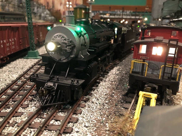
I'm a big fan of the NYC Putnam Division, known as the "Ol' Put," and the new 10 Wheeler was a must have. I also collect photos of the Put, especially color photos. I would have liked Lionel to have used graphite paint on the smoke box, but there was apparently several shades in different photos. Very hard to tell what lies under the soot dirt and grime on some of these babies. Looking at #1274, I'd have to think this started out somewhat lighter.
Most thought Lionel did a good job on the previously issued #1258. I didn't hear any complaints.
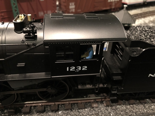
A shade or two can make a big difference in our perception. Lionel should pay more attention to this detail. But, I am enjoying this locomotive, #1232 and the great Legacy features.
Attachments
Another thread about Lionel screwing something up again. When will it stop???? Well at least it isn't mechanical. I like the graphite paint from the offerings from the 2000's. Skip, nice photos, thanks for sharing.
The model itself is beautiful and seems to be a good representation of a New York Central F-12 - as run on "The Put." However, in my opinion, this is a toy train color that has no place on a costly, scale-sized, scale-detailed Legacy model which is shown with the correct color in the catalog. The only exception to that should be a buyer who orders a fantasy paint scheme. This did not happen with MTH. I'm disappointed in what I will be receiving. I hope you enjoy the model, Skip.
MELGAR
I know the smokebox gray color is a bit of a downer, but at least that can be fixed relatively easy.
How are the sounds on these locomotives, though? I think Lionel's 5 whistles/bells has the potential to really satisfy those who are very picky about these things (myself included).
@MELGAR posted:The model itself is beautiful and seems to be a good representation of a New York Central F-12 - as run on "The Put." However, in my opinion, this is a toy train color that has no place on a costly, scale-sized, scale-detailed Legacy model which is shown with the correct color in the catalog. The only exception to that should be a buyer who orders a fantasy paint scheme. This did not happen with MTH. I'm disappointed in what I will be receiving. I hope you enjoy the model, Skip.
MELGAR
Thanks! I do agree with you 100%. For the price we pay for these models, They should at minimum stay true to the catalog depiction. I agree also that MTH did not usually let this happen, however, their first PS2 Dreyfuss Hudson was way too light, but they corrected that in the second release.
@MELGAR posted:The model itself is beautiful and seems to be a good representation of a New York Central F-12 - as run on "The Put." However, in my opinion, this is a toy train color that has no place on a costly, scale-sized, scale-detailed Legacy model which is shown with the correct color in the catalog. The only exception to that should be a buyer who orders a fantasy paint scheme. This did not happen with MTH. I'm disappointed in what I will be receiving. I hope you enjoy the model, Skip.
MELGAR
Melgar,
You must of missed MTH’s CP Army unit green paint. Instead of Olive Green they used snot green 😀. S happens to all the manufacturers some more than others at least the smokebox has a relative easy solution...........now the Lionel version of PRR Tuscan really chalks my que.
JohnB
The maddening part especially in the case of the NYC is that they got it spot on in the previous release. I was able to find the previous NYC version thankfully since I passed on this one because of the paint. I should have bought the NYC when it was offered new back in 2014-2015 but I must have had too many other irons in the fire then.
@Randy_B posted:The maddening part especially in the case of the NYC is that they got it spot on in the previous release. I was able to find the previous NYC version thankfully since I passed on this one because of the paint. I should have bought the NYC when it was offered new back in 2014-2015 but I must have had too many other irons in the fire then.
When it comes to this particular locomotive, Lionel seems to never get the production model correct and to match the catalog photo.
With the first NYC Legacy 10 wheeler in 2008, #827, Lionel screwed up the tender lettering adding the word "LINES." The catalog photo showed the correct "NEW YORK CENTRAL" lettering.
With the second Legacy 10 Wheeler in 2014, #1258, The font of the number 1258 is not correct. The catalog had it correct. Also, Lionel blackened the side rods on the production model. This change was ok with me but different from the catalog photo just the same.
And of course,
With the latest Legacy 10 Wheeler in 2021, #1232, Lionel painted the Smoke Box and Fire Box a light primer gray instead of dark graphite.
My other pet peeve is the horrifically "imaginative" paint job on the Vision Line Niagara.
I'd really be interested in where the process falls apart, causing these uninvited changes.
I noticed that the font used on the NYC 1258 seems a little too big - is that what you mean or the type of font is off? Don't get me started on the Niagara as I passed on that one because of the whitewalls. You think they could have made one or two road numbers without whitewalls to broaden the appeal but I guess not. I never even got to the paint as I couldn't get past the wheels. I'm coming around on the blackened side rods since most of my steamers seem to have them by now so I don't mind them as much.
Interested in seeing pictures of the Nicholas Smith Train's Exclusive Strasburg 972 if anyone here purchased it
I noticed that the font used on the NYC 1258 seems a little too big - is that what you mean or the type of font is off? Don't get me started on the Niagara as I passed on that one because of the whitewalls. You think they could have made one or two road numbers without whitewalls to broaden the appeal but I guess not. I never even got to the paint as I couldn't get past the wheels. I'm coming around on the blackened side rods since most of my steamers seem to have them by now so I don't mind them as much.
1232 has the correct Serif font, shorter and wider and you can see the correct shape of the numbers as they vary in thickness throughout the curves.
It's not the size alone. That's not the New York Central font on 1258. Compare the 1 and the 2 on 1258 to those on 1232 and 1297 which are the correct fonts. They never seem to get the font wrong on Hudsons, Mohawks or Niagaras but this locomotive is snake-bit. The only other example of the wrong font I've seen is the little 1662 switcher.
I hate the Niagara white walls. But, it's not so much that it has white walls, but if it's going to have white walls the drive rods should be shinny new too. White walls with blackened drive rods makes no sense. And as such, the white walls detract from being able to see the action of the drive rods. When in motion all you focus on are the glaring white walls. The silver smoke box was totally uncalled for and disappointing,
Here's the real 1274.
Attachments
When Lionel gets serious about decoration and getting the colors right I'll start buying again. Until then my money is going elsewhere. It's maddening that they can't get this right when others are able to get it right most of the time.
@NYC Fan posted:1258 has a differently shaped numbers. Look at the "2." San Serif font has the thickness of the number the same throughout and the numbers are taller and thinner.
1232 has the correct Serif font, shorter and wider and you can see the correct shape of the numbers as they vary in thickness throughout the curves.
Sorry to nitpick, but neither of those are serif fonts. They are both sans serif. Since we are talking about very specific paint details, I think careful use of those words is in order so as not to further confuse the manufacturer if/when they try to remedy the paint and lettering detail issues with the overseas factories.
Serifs are the little "feet" and "tails" that come off of the end of the letters.
Sans Serif
Serif
Too bad about the font. It is indeed wrong on 1258. I have yet to find transfers with the correct NYC font so decals would have to be used to correct this. Then you have deal with decal film and matching the sheen. Repainting the smoke box is trivial compared to renumbering.
Pete
If you want products to be correct, you are on the scene. If you are selling stuff, you do it this way. We just got 5 Sunset GP9s. Those $$$ used to go to Lionel. No longer do so. We have plenty of trains so no BTO, etc except with Scott.
This is a simple choice of supply methods. Buyers make their choice also and obviously the numbers must support things as they are. But, if you intend to get Harry or someone else to correct what you don’t like, then you better automatically include the cost in every buying decision.
That's unfortunate about the font but less troubling and obvious to me than the paint at this point. At least it's still a sans serif font which would have been a deal breaker had it not.
@NYC Fan posted:When it comes to this particular locomotive, Lionel seems to never get the production model correct and to match the catalog photo.
With the first NYC Legacy 10 wheeler in 2008, #827, Lionel screwed up the tender lettering adding the word "LINES." The catalog photo showed the correct "NEW YORK CENTRAL" lettering.
With the second Legacy 10 Wheeler in 2014, #1258, The font of the number 1258 is not correct. The catalog had it correct. Also, Lionel blackened the side rods on the production model. This change was ok with me but different from the catalog photo just the same.
And of course,
With the latest Legacy 10 Wheeler in 2021, #1232, Lionel painted the Smoke Box and Fire Box a light primer gray instead of dark graphite.
My other pet peeve is the horrifically "imaginative" paint job on the Vision Line Niagara.
I'd really be interested in where the process falls apart, causing these uninvited changes.
I have 827 myself, and didn't like "Lines" was on there either. GRJ said that the smoke units in that run of 10 Wheelers always blew after some time, which mine did. I have to ask him what all other options he had said to me other than fixing that with a Super Chuffed and such to go with it. I think the lights and resistor. I'll have to ask him for sure. I like that little engine, and got it for a deal at York in 2019 I believe.
@rplst8 posted:Sorry to nitpick, but neither of those are serif fonts. They are both sans serif. Since we are talking about very specific paint details, I think careful use of those words is in order so as not to further confuse the manufacturer if/when they try to remedy the paint and lettering detail issues with the overseas factories.
Serifs are the little "feet" and "tails" that come off of the end of the letters.
Sans Serif
Serif
I was under the impression that one of the characteristics os serif font was the difference in the thickness of the stroke as in calligraphy. Truth be told, I believe the font to be a mixture of Serif characteristics but without the feet and tails that came out of the Art Deco era. It has been referred to as Grand Central font.
Attachments
@NYC Fan posted:I was under the impression that one of the characteristics os serif font was the difference in the thickness of the stroke as in calligraphy. Truth be told, I believe the font to be a mixture of Serif characteristics but without the feet and tails that came out of the Art Deco era. It has been referred to as Grand Central font.
The changes in stroke width or weight are just that, stroke variations. There are several serif fonts like Rockwell and Courier that that serifs, but do not vary the stroke width.
Railroad Roman is a serif font and would have been correct for the pre 1940 era. Slight changes in Railroad Roman are not as obvious as the font used on 1258 vs actual NYC sans serif font. One option would be to backdate the engine as RR font is available in transfers from Woodland Scenics but again very tedious to get right.
This would have been correct for pre 1940.
Pete
Attachments
@rplst8 posted:The changes in stroke width or weight are just that, stroke variations. There are several serif fonts like Rockwell and Courier that that serifs, but do not vary the stroke width.
I agree. I read that the variation in width was one characteristic of Serif fonts. It is apparent that while it may be a characteristic that is prevalent in Serif fonts it can also be present in San Serif fonts as appears to be the case with the Grand Central font used on the 1940 and later New York Central equipment. So I stand corrected.
@Norton posted:Railroad Roman is a serif font and would have been correct for the pre 1940 era. Slight changes in Railroad Roman are not as obvious as the font used on 1258 vs actual NYC sans serif font. One option would be to backdate the engine as RR font is available in transfers from Woodland Scenics but again very tedious to get right.
This would have been correct for pre 1940.
Pete
I always liked the early Roman font like on the Mogul. It would also be correct of the F12e 10 Wheelers but, correct me if I'm wrong, they would have been numbered in the 800's. They were still numbered in the 800' at the time the font was changed so the later Grand Central font would have been used when renumbered to 1200 numbers.
Lionel correctly numbered the first Legacy 10 Wheeler 827 in the old Roman font.
Attachments
This is true. Likely RR is only correct for 800 numbered engines. Here is a set of CDS Pacemaker transfers. Looks close in size to the 827 ten wheeler. Actual height is .180". This is the 2000 Mikado which really is not a NYC engine. I may reletter it someday.
As for relettering with transfers, the old lettering comes off in seconds with lacquer thinner. I rarely coat transfers as they are fairly durable as long as you avoid handling the area.
These come up on eBay every once in a while. There is a set of black letters there now for second generation cars.
Pete
Attachments
Anyone see the CP version yet? I think I've seen every other version, and I was curious how the magnets look on the tender.
I ordered one, but have not heard anything about it yet.
@CarGuyZM10 posted:Anyone see the CP version yet? I think I've seen every other version, and I was curious how the magnets look on the tender.
I ordered one, but have not heard anything about it yet.
Not my video, but saw this earlier... It does not show the magnets.
@CarGuyZM10 posted:Anyone see the CP version yet? I think I've seen every other version, and I was curious how the magnets look on the tender.
I received mine today. It’s very good looking. The smoke box isn’t as light as the video above, mine is darker, much more normal looking, thank goodness.
I can’t say anything about the magnets, my train didn’t include them. Just wrote my dealer about it. I planned to run it as a CP, so it’s not a major issue, but I still want the magnets.
We got the Nickel Plate Road version from Mr. Muffins, my boys love it. Not sure how accurate the colors are. It is our first Legacy engine.
Is this a marketing strategy???
Does anyone think that perhaps Lionel deliberately screws up one aspect of a locomotive each time, so that the next time it's released the same people will buy it again in hopes they got it right?
I bought a Southern and liked it so well on my small layout I purchased a Texas & Pacific. As for the gray vs graphite, I bought mine to relax. My take is the locomotives produced in Korea are normally spot on. The locomotives produced in China are hit or miss. I am impressed with the sound, whistle smoke, pulling power, and ability to negotiate O36 curves. If they gray where to upset me, I would just weather. I remind myself this is one of my hobbies and if the model performs well I can modify or find a solution to a cosmedic issue. Hey I just got a 3rd rail missing a staton. Am I sending it back...not on your life. I wished we as hobbyist to appreciate how the locomotives have improved over the last 60 years and relax a little.

@Aldovar posted:We got the Nickel Plate Road version from Mr. Muffins, my boys love it. Not sure how accurate the colors are. It is our first Legacy engine.
Great video! The excitement in the engineer’s voice is awesome and what it’s all about! Enjoy and cherish your time with him on the layout - in my experience, your engineer will grow up way too fast.
These ten wheelers really are a great size for almost all layouts and are packed with lots of features.
@NYC Fan posted:Is this a marketing strategy???
Does anyone think that perhaps Lionel deliberately screws up one aspect of a locomotive each time, so that the next time it's released the same people will buy it again in hopes they got it right?
That is a great point Skip. With the Hudson's it should have been a no brainer on the colors, especially when the art released to Mr. Muffin's was spot on with everything we know. Plus the fact that everyone has been saying that they needed to remake the J3's like the 50th anniversary set. So what happens, way off on all counts except the shape.
@SouthernFan56 posted:I bought a Southern and liked it so well on my small layout I purchased a Texas & Pacific. As for the gray vs graphite, I bought mine to relax. My take is the locomotives produced in Korea are normally spot on. The locomotives produced in China are hit or miss. I am impressed with the sound, whistle smoke, pulling power, and ability to negotiate O36 curves. If they gray where to upset me, I would just weather. I remind myself this is one of my hobbies and if the model performs well I can modify or find a solution to a cosmedic issue. Hey I just got a 3rd rail missing a staton. Am I sending it back...not on your life. I wished we as hobbyist to appreciate how the locomotives have improved over the last 60 years and relax a little.
How about some pics of both of them? Would love to see all the different versions.
You also make a great point about all the impressive features - my gosh, the whistle smokes like a demon! I wonder if it’s a new design, none of my other Legacy steamers smoke like these do. Good stuff.
@Keith Crook 020419 posted:I received mine today. It’s very good looking. The smoke box isn’t as light as the video above, mine is darker, much more normal looking, thank goodness.
I can’t say anything about the magnets, my train didn’t include them. Just wrote my dealer about it. I planned to run it as a CP, so it’s not a major issue, but I still want the magnets.
Hopefully mine will be darker too. I hope you not having the magnets is a fluke. I planned to display mine with the P&R magnets.
@CarGuyZM10 posted:Hopefully mine will be darker too. I hope you not having the magnets is a fluke. I planned to display mine with the P&R magnets.
So Lionel forgot to make them. My dealer got this email from Lionel:
“They are aware and are making the plates now. They hope to have then in service in about a month.
The plates will come with both tape and magnets depending on how the customer would like to install them (put magnets inside the shell or put the tape on the back of the plates.) If customers call in to CS, we can get them on the list to mail these out when they arrive. If any dealers need these for product they may still have in store, they can also reach out and we can send them sets to put in the box before sale.”
@Keith Crook 020419 posted:So Lionel forgot to make them. My dealer got this email from Lionel:
“They are aware and are making the plates now. They hope to have then in service in about a month.
The plates will come with both tape and magnets depending on how the customer would like to install them (put magnets inside the shell or put the tape on the back of the plates.) If customers call in to CS, we can get them on the list to mail these out when they arrive. If any dealers need these for product they may still have in store, they can also reach out and we can send them sets to put in the box before sale.”
Don't hold your breath. You know what happened with the Hudson boiler fronts that were going to be coming.
That was the first thing I thought of Skip! ![]() I received my NYC 1258 today and I'm pleased. The font is a head scratcher but I can overlook that for the smokebox paint.
I received my NYC 1258 today and I'm pleased. The font is a head scratcher but I can overlook that for the smokebox paint.
@Randy_B posted:That was the first thing I thought of Skip!
I received my NYC 1258 today and I'm pleased. The font is a head scratcher but I can overlook that for the smokebox paint.
Great engine Randy!!! I've been able to overlook it too. But, when 1232 was announced, I have to admit I zoomed in on the catalog to check out the cab number.
Can someone please clarify about the "magnets" for me? I'm not aware of any magnets on these models. Where would they be and what would be their purpose?
MELGAR


