Great quote on your post...
Just gets better and better. Rich I've got to give you credit for the amount of change you have been able to make in a short period of time. Thanks for being so responsive.
Kevin
First time back since yesterday. Thank you very much for your time you have put into this upgrade. Looks great since then. I still don't like the location of the Likes. Looked better on the previous forum, Thanks for your Time
At the hospital with my dad - using an Android. I admit that the forum is much easier to view on a mobile device.
I use my PC 99% of the time to view the forum. I see here that spell check is now working on Firefox. Is spell check working on IE now?
Hopefully I will be able to check out the forum on my PC tonight and things will be better.
Richard
Just a outstanding look and setup. I like it very much. Thank you Richard. ![]()
Was weird yesterday but got used to it. I do like having the avatar pictures bigger.
In the old format, I could find threads that I had posted to They could be found by clicking on my profile. I can't seem to find this now. Can anyone help me on this? Thanks
Another item I noticed is when we are online next to our name we light up RED. can that be changed to Green?
Need help posting pictures. I go to attachment and put a list of pictures from my desktop. Then hit finished and nothing happens. thanks don
Super job Rich....well almost. You could have done away with the Featured Topics section which everyone scrolls through anyway. Other than that it's a job well done. Thanks.
wb47 posted:In the old format, I could find threads that I had posted to They could be found by clicking on my profile. I can't seem to find this now. Can anyone help me on this? Thanks
Click on the Member ID to get an options window. Click on the Member ID again in the window to open the member's profile page. You'll see the option to See All Posts off to the right.
scale rail posted:Need help posting pictures. I go to attachment and put a list of pictures from my desktop. Then hit finished and nothing happens. thanks don
Are you clicking the small box to "insert pictures" ? That will produce the large version as seen below, then click finish. Or if you skip selecting the small check box and click finish then just the small thumbnail appears.
Attachments
Starting to get used to it and agree that it is being improved as we watch. Thanks for your efforts to make this user friendly.
DoubleDAZ posted:wb47 posted:In the old format, I could find threads that I had posted to They could be found by clicking on my profile. I can't seem to find this now. Can anyone help me on this? Thanks
Click on the Member ID to get an options window. Click on the Member ID again in the window to open the member's profile page. You'll see the option to See All Posts off to the right.
Thanks Dave, I asked about this yesterday. It's just harder to find, but at least it's still there.
Sort of been holding off on posting here as with any major software update there is bound to be some glitches and things that were just not thought of until it goes live. Seems most things are up and running now, or have been addressed so it's time for my two cents.
As a note I primarily use a fairly old MacBook running safari 5.1.1 to read the forums and have not used my phone as of yet.
First, I agree that the line spacing is off, but Rich already has commented that that is being worked on.
Second, I'd like to see some better separation between topics on the list. maybe a bigger font for the title, or a line between them. they all just sort of run together to my eyes.
The third thing is a problem that carries over from the previous version, but has been amplified by the new format which is the massive mount of scroll to get past the sticky threads, and the habit this causes of never looking at them in the first place. Maybe these would do better if stuck to the top of the "recent posts" side bar instead?
It seems there are two camps when it comes to the replies in this thread. Many people are sharing what they find useful, and what they find difficult to use, these sorts of threads seem like they could be useful to the webmaster in addressing problems and getting things working as smoothly as possible. The second group seems to be a lot of "we don't like change" folks, but then that must, most certainly. have been expected in a community where half the members will shout from the roof tops " Two wires and a transformer" till the day they die. Improvements in functionality or lack of understanding of what is involved in a ground-up platform change are not considered by such folks, only that it is not the same as it was, there for, must be worse.
In the end, Keep up the good work, Rich, and don't forget to take a break, run some trains, pop open a beer if it's your thing, and give your mind a rest. Take a loot at what people like and don't, and do your best with it. Thanks for the work, and I'm sure, like many others we don't mind a bit of hassle learning some new things to make things better for everyone else.
Thank you for the updates to make the site more readable versus initial roll-out.
Paul
I only browse on a laptop or desktop so the changes don't benefit me, but I'm sure they will benefit many. Time marches on!
Admittedly, I'm joining this thread a bit late...but I think it looks pretty darn good on both my PC and my iPhone. Nice job, Rich!
WOW, eleven pages of replies to this thread. I don't understand what all the hoopla was about. ![]()
![]()
LOL Rich never did answer my question i posted last night.
OGR Webmaster posted:Just go to the top post in a thread and print it. It will now AUTOMATICALLY PRINT in a PRINTER FRIENDLY format.
Sorry, Rich - it only prints the first page of posts in a given topic. For instance, if Scott's WEEKEND PHOTO FUN happens to have four pages of posts for the week, you have to do this four times (once in each page of posts), and then you will get four pdf documents instead of one. I don't know how to combine multiple pdf files into one, and we did not have to do that with the prior version. Please try to get this fixed. Thanks much.
(I posted two other times on this - not trying for over-kill - the first on on page 6 didn't get your attention. Second one done about 1/2 hour ago up a couple of posts, also on page 11, because I wasn't sure I'd be able to locate this one.)
wb47 posted:In the old format, I could find threads that I had posted to They could be found by clicking on my profile. I can't seem to find this now. Can anyone help me on this? Thanks
I was looking for this too. It's still there. Go to your Profile page, then just below the avatar click on Activity for your posts.
Well Done Rich I have had too many go live days in my life so I understand the process. Looks good to me and I will be use to it by the time we get the weekend photo topic up tomorrow morning.
Sleep better tonight Rich you deserve it.
The contrast colors are much improved and considerably easier on older eyes - font sizes throughout are still too small in almost every area still making it a challenge. For example, all of the stuff in the Recent Posts column is too small. I've got a pretty large screen monitor and it's set at 130% and that helps on the actual posts.
Hi Rich,
Now I know why you get the “big bucks” and you are really earning them yesterday and today. Thank you for all of your efforts in refining the semi-disaster Hoopla created. I really appreciate all the effort you and your staff put into this site and the OGR magazine.
Please reinstate the ICONS showing each of the various forums. They are distinctive, standout, and are much easier to use than having to scroll through a list of “near look a likes” to find the forum you want to use. If they are there and I am missing them on a desktop, please advise. Thanks in advance.
BREAKING NEWS! Just got an email from the Pope. He says he can canonize and raise to sainthood any individual through whose intersession two miracles occur. He added that if through your intersession with the “Hoopla demons” and this site is “cured” - you only have one more miracle to go.
It's hard for me to get used to. Every time some programmer changes things to what they think is better, it seems worse for me. Now I have to make several clicks to edit a reply instead of one. I am not liking the look of the thing either. The text box is so small, you have to scroll to see your entire reply. ![]()
I'll admit, it does look and work better on my smarty-phone than the old forum.
As far as the desktop computer: Much better than yesterday afternoon, especially on the eyes. Even spellchecker is working now on Firefox.
Still not quite used to everything, but I'm working things out.
Rusty
For me the Blue text on a gray backround is hard to see. I suffer from AMD and the new format is definitely more difficult to see for me. Hope you can find a way to help
It looks good to me Rich! Though I would have to agree that the topic likes should be at the top of the page if possible.
Much improved, Thanks! ![]()
C&O Allie posted:Rich,
First off, thanks for working on this - I know it's a big job when upgrades such as this happen. Would it be possible to put dividers between the Forum Lists as well as the different topics, maybe like below? I think it would help greatly with the readability of the forum and finding information.
Allan, you nailed it! You put into visual form what I am suggestion is missing from the pages.
This simple thing of delineation makes a HUGE difference in ease of use and on the eyes when scanning the page for topics to read.
Again, thanks Rich for working your behind off to get Hoop.la to come around for all of us!
I like the overall format, like the font style and overall feel - Very Apple. Clean - simple - bright
Nicely done - Hey Lionel - Hey MTH - Hey Atlas - look at this site - one click
Thought I should take a minute and provide some positive feedback as I was very critical 24 hours ago. The boxes, gray background and the wider formatting are all notable user friendly improvements, Thanks very much Rich, for responding to our complaints so quickly. Chris A
Looks good to me!
I'm trying to keep an open mind about this, but tis difficult. If this question has been answered I missed it. Why aren't the posts marked as read anymore. It is quite frustrating trying to remember what you have seen and what you haven't. A bolder type face would not be unwelcome for older eyes.
Thanks,
George Lasley
Goerge I said the samething last night and have not got a reply from Rich yet!
Yes, it's all very pretty, are there any directions that come with this? Can anyone tell me where I can find the layout building section? Thanks, Rich
Just a side thought--anyway to increase the font size of the header/labels/subtitles/ whatchamacallits?
Is there a search feature? I cannot find it. Very useful.
I may have missed this - what is the significance of the red dot and blue circle next to our names?
Personally, I like the look of the old site much better. I think it was easier to navigate.
JDA posted:Personally, I like the look of the old site much better. I think it was easier to navigate.
I understand you are frustrated, but comments like this serve no useful purpose here. If you have something specific to share as to your preferences, what you like, what you DON'T like, etc. that's fine and I want to hear that.
Lionel Grandpa posted:I may have missed this - what is the significance of the red dot and blue circle next to our names?
It indicates if that member is on-line. Red Dot = On Line. Blue Circle = not on line.
George Lasley posted:I'm trying to keep an open mind about this, but tis difficult. If this question has been answered I missed it. Why aren't the posts marked as read anymore. It is quite frustrating trying to remember what you have seen and what you haven't. A bolder type face would not be unwelcome for older eyes.
This is something that was not included in this new design. I have contacted Hoopla tech about how to add CSS to put it back in.
chessie1971 posted:Goerge I said the same thing last night and have not got a reply from Rich yet!
Chessie, I guess I missed your post. Sorry.
Bob Shaw posted:Is there a search feature? I cannot find it. Very useful.
The search icon is just to the right of the Terms of Service item in the blue tool bar at the top. Looks like a little magnifying glass.
Rich, Two other suggestions for consideration..... I would like to see the Post Topic on the first line, and the "buttons" for Open, Closed, New, Replies underneath the Title... The Post/Thread Title would stand out better and be easier to scan with your eyes if it was BOLDFACE type... Also, I believe formatting each post with its own outlined box would also improve readability... If you could make the member photo slightly smaller, more like the size of the member's photos in the Recent Posts section on the right hand side and put it inside the box frame it would very likely compress the depth of each post reducing the amount of scrolling down required. I know I am suggesting format changes that make it more like the old forum format, but it really was easier on the eyes and easier to read/scan for posts. Thanks for all the work, and changes you have made in just the last 36 hours.
Hi Ad Man - I am glad that the new design did not bring in things like Pop-up Ads and Ghostery Ads. Those ghost ads can follow a user all over the internet and are very annoying.
Attachments
OGR Webmaster posted:Bob Shaw posted:Is there a search feature? I cannot find it. Very useful.
The search icon is just to the right of the Terms of Service item in the blue tool bar at the top. Looks like a little magnifying glass.
There's also a Search button on the blue bar at the bottom of each page.
On multi page threads there is an orange 'Next' button at the bottom right of the thread. On the listing of forum topics there is no button. Any chance one can be added?
PSU1980 posted:I like the overall format, like the font style and overall feel - Very Apple. Clean - simple - bright
Nicely done - Hey Lionel - Hey MTH - Hey Atlas - look at this site - one click
PSU1980 posted:I like the overall format, like the font style and overall feel - Very Apple. Clean - simple - bright
Nicely done - Hey Lionel - Hey MTH - Hey Atlas - look at this site - one click
ahh, this is so much better than yesterday, not so much "white noise" on either side of the screen. Well done Rich and the gang.
Rich,
I like the continuing tweaks to the new forum layout. Looks good on both my large monitor and nook hd+.
Just looked at the search feature and see that it does not include a way to search by forum member or by specific forum - I found both of these features to be most helpful when I did searches on the old site. Any chance you these additional search features can be added back to the search function?
- Nevermind, I just realized that all I needed to do was click on the down arrow beside the word everything at the top left of the search screen.
Ok, here are a couple of specifics. When one clicks on recent posts one gets a nice size presentation. When one clicks on the Forum topics you keep the same very narrow page. Why?
The sign in doesn't last very long. Why?
And it should help you to know many like the old font and web site. Why change? For a few that look at it on the phone?
Birwin posted:Rich,
I like the continuing tweaks to the new forum layout. Looks good on both my large monitor and nook hd+.
Just looked at the search feature and see that it does not include a way to search by forum member or by specific forum - I found both of these features to be most helpful when I did searches on the old site. Any chance you these additional search features can be added back to the search function? - Nevermind, just realized that all I needed to do was click on the down arrow beside the word everything at the top left of the search screen.
Not sure which you are using, mobile or PC, but on mobile the search function under the 3 lines top left has the advanced search parameters and on the PC view it's under the magnifying glass in the blue bar.
trainroomgary posted:Hi Ad Man - I am glad that the new design did not bring in things like Pop-up Ads and Ghostery Ads...
The OGR Ad Man had nothing to do with this format change.
Ron H posted:Ok, here are a couple of specifics. When one clicks on recent posts one gets a nice size presentation. When one clicks on the Forum topics you keep the same very narrow page. Why?
I do not see that behavior on any of the computers I have used to test this. That is five PCs, two iPads and an Iphone 6.
The sign in doesn't last very long. Why?
I don't know what you mean...
And it should help you to know many like the old font and web site. Why change? For a few that look at it on the phone?
Almost HALF of our traffic here is now on tablets and smart phones. That traffic segment is growing, while the number of people using a desktop or laptop computer is dropping.
PSU1980 posted:I like the overall format, like the font style and overall feel - Very Apple. Clean - simple - bright
Nicely done - Hey Lionel - Hey MTH - Hey Atlas - look at this site - one click
PSU1980 posted:I like the overall format, like the font style and overall feel - Very Apple. Clean - simple - bright
Nicely done - Hey Lionel - Hey MTH - Hey Atlas - look at this site - one click
Hey, don't knock the MTH site - it is the only revision that works 99% flawlessly - use all the time with ease. Lionel's site - 99% useless - stopped going there and blood pressure went down. This site will continue to improve - count on Rich to deal with the "Hoopla demons". If they don't get with the "program" he will see that they will have to go to a proctologist to have their heads retrieved.
Twelve pages. Tell you what - this needs to be split up, so folks can see answers.
For instance, how do we post photos - as of right now the old method worketh not.
I like the new single click stuff - now if I can just retrain myself.
And I like that the button for mindless repeating of others' posts is now two clicks away instead of one.
Nobody wants to read twelve pages just to get to an answer for a specific problem - well, at least not this nobody.
OGR Webmaster posted:Almost HALF of our traffic here is now on tablets and smart phones. That traffic segment is growing, while the number of people using a desktop or laptop computer is dropping.
How does OGR or Hoopla know what type of device we use to access the forum?
Bob Snyder posted:Sorry, Rich - it only prints the first page of posts in a given topic.
If you have a long, multi-page thread that you want to print, set the number of posts to appear on one page to the maximum of 200. In all but the longest of threads, all the posts will be on one page. Then print it and you'll have the whole thing in one file.
OGR Webmaster posted:Steamer posted:...the bright white background is hurting my eyes.
FIXED...with some further tweaking to come.
Thank you, it's SO much better!
OGR Webmaster posted:Bob Snyder posted:Sorry, Rich - it only prints the first page of posts in a given topic.
If you have a long, multi-page thread that you want to print, set the number of posts to appear on one page to the maximum of 200. In all but the longest of threads, all the posts will be on one page. Then print it and you'll have the whole thing in one file.
I feel bad continuing to bother you with this, and maybe someone else can reply. Still having a problem. I have tried three topics with multi-page threads. I scroll down to change the number of posts-per-page, but the higher number is always in "black" and does NOT permit me to click on it to change. Over on the right I have the option to go to the next page, but moving to the next page seems contrary to your explanation. I've logged off and back on, hoping this will reset something. No help. It seems to be consistently failing for me. I thought maybe it should be changed while in the "print" option, but that isn't possible. Most likely it is user error, but I've been fooling around with this for quite a while, and don't know where I'm going wrong.
I do agree that being able to print up to 200 posts in one shot will cover nearly all situations - if ONLY I can make it work for me. "nod"
Thank you.
Rich, I'm liking it now that the white is gone. Haven't tried it on my android today but I think the pictures on my home computer are better, easier to read text and I don't mind the spacing so i'm happy with everything so far and your earned a lot of people's respect with how you stayed on top of everything and keep upgrading your upgrade..... Keep up the good work....
A happy reader......
The November 3rd-4th look is much better. The more defined font is an improvement.
Looking a whole lot better! Question, does the Featured topic need to be in every
category of the forum it's kind of redundant. Perhaps it should stand alone.
Just a suggestion, thanks, Ed
Rich, It's taking some "getting used to" but so does life. It took me three tries to post a picture but I got it done... once I read the directions. At least you're trying something new to enhance our experience, therefore, I present you with a Laurel and Hardy handshake.
OGR Webmaster posted:I hope you enjoy the new "look and feel" of the OGR On-Line Forum!
This is a huge step forward. Now I can bring up the site anywhere instead of just my home office.
Your page views are going to jump up a lot!
Lionel Grandpa posted:OGR Webmaster posted:Almost HALF of our traffic here is now on tablets and smart phones. That traffic segment is growing, while the number of people using a desktop or laptop computer is dropping.
How does OGR or Hoopla know what type of device we use to access the forum?
Every website and/or website host collects tons of little tidbits as you surf the web. Some of it is necessary to deliver the content you request.
Look at the upside, what the website doesn't collect, your operating system does lol.
OGR Webmaster posted:The search icon is just to the right of the Terms of Service item in the blue tool bar at the top. Looks like a little magnifying glass.
Ok, the Search Icon does not show up at all on the tool bar on either of my computers regardless of browser in use. It and another function are present - just no visible icons to the right of Terms of Service
The Blue Tool bar is totally empty on my Kindle Fire and no functions are present or functional.
Also, the tool bar used for posting replies. etc. is missing almost all of the icons - the functions are present as your scroll over them - the icons are just not showing.
Things do continue to improve!
OK, it is looking a ton better now - great job!!
A question: I am accustomed to using the commands [quote] and [/quote] to do my own quoting in replies. This doesn't seem to work any longer. Are there commands available to allow us to continue doing our own quoting?
A question: I am accustomed to using the commands [quote] and [/quote] to do my own quoting in replies. This doesn't seem to work any longer. Are there commands available to allow us to continue doing our own quoting?
Testing Formats --> Blockquote
C.W. - You can use Blockquote from the Formats Menu --> Blocks --> Blockquote on the 'reply' text editor.
LOL OOPS - How to use it... Paste the portion of text you want to quote into the text editor. Highlight that text and select Format --> Blocks --> Blockquote. Viola!
To return to normal text, place the cursor at the end of the quoted text and click Format --> Blocks --> Blockquote once again.
This allows the user to only quote any portion of text that they desire.
Ted
C.W. - You can use Blockquote from the Formats Menu --> Blocks --> Blockquote on the 'reply' text editor.
thanks
Bob Snyder posted:I feel bad continuing to bother you with this, and maybe someone else can reply. Still having a problem. I have tried three topics with multi-page threads. I scroll down to change the number of posts-per-page, but the higher number is always in "black" and does NOT permit me to click on it to change. Over on the right I have the option to go to the next page, but moving to the next page seems contrary to your explanation. I've logged off and back on, hoping this will reset something. No help. It seems to be consistently failing for me. I thought maybe it should be changed while in the "print" option, but that isn't possible. Most likely it is user error, but I've been fooling around with this for quite a while, and don't know where I'm going wrong.
I do agree that being able to print up to 200 posts in one shot will cover nearly all situations - if ONLY I can make it work for me. "nod"
Bob, I have my number usually set to 40 and it's Black, the others are Blue. I just changed it to 200 and that is now Black. I then selected Print in the Windows 10 Edge browser and tried printing to both "PDF995" and "Microsoft to PDF". Both gave me a PDF file consisting of all 24 pages of this thread. I then switched to Internet Explorer and got the same results.
I have encounter a problem when attempting to edit a post and add another photo. The attachment function doesn't seem to work. It works fine when constructing the initial post.
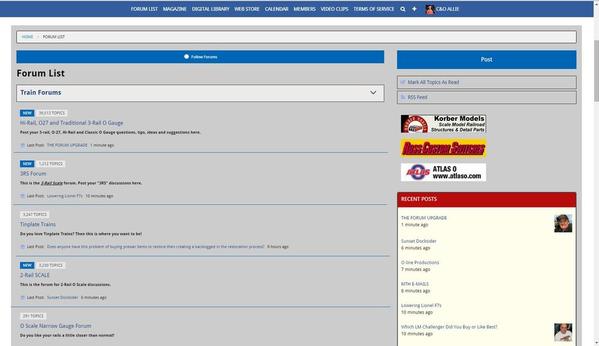
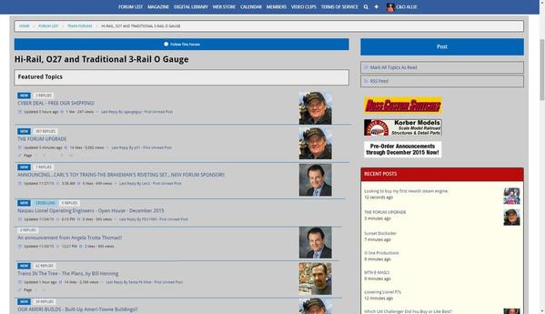
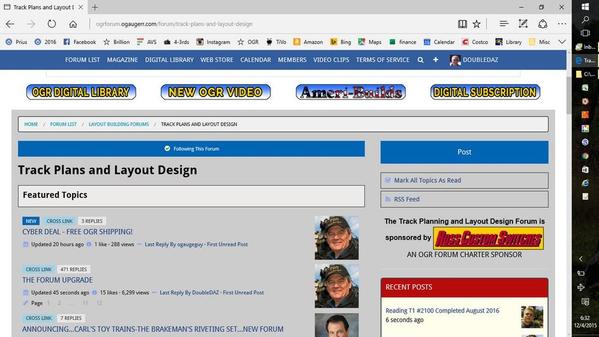
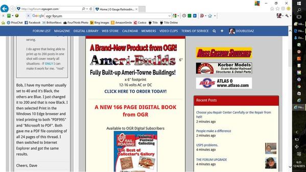
Rich, here are examples of what I see in Windows 10 Edge and IE. The first 2 are Edge, the second 2 are IE. Notice how the left column stays the same NARROW size in IE while it expands in Edge once you select a forum. I normally use Edge, but decided to try IE after I saw some of the complaints.
Attachments
With all the comments about the screen display issues, I don't believe I have seen my major disappointment commented on. Maybe it is just me, but I miss the forum name of the starter of each post, now all you see is the avatar photo - if there is one. I will read every post by some of our folks, others - never. It is great that they are there on the replies when you click on a post, but where are they on the original listings? I am afraid I will never be able to recognize every poster by his/her photo, let alone the ones with a blank space.
027Ted posted:Lionel Grandpa posted:OGR Webmaster posted:Almost HALF of our traffic here is now on tablets and smart phones. That traffic segment is growing, while the number of people using a desktop or laptop computer is dropping.
How does OGR or Hoopla know what type of device we use to access the forum?
Every website and/or website host collects tons of little tidbits as you surf the web. Some of it is necessary to deliver the content you request.
Look at the upside, what the website doesn't collect, your operating system does lol.
I was curious about that statistic myself, but more from a technical standpoint. The smart phone interface at least was considerably different that the desktop, in that it automatically gathered the following items after a scroll which the desktop site would enforce pages that required effort to get more information. And that's just what I noticed - there could be considerably more differences behind the scenes that would affect the stats.
Also, the total traffic is always going to sum to 100% - I'd be curious if the desktop traffic segment is still increasing but just not at the rate of the mobile. If the overall traffic is increasing (which has been reported with new monthly records), both could be increasing.
The other stat I would take into consideration is the extent that mobile vs. desktop participate in the forum. In the end, what draws people in is the value of the content. If most of the active posters are desktop oriented, alienating them will eventually drop the quality of conversations and in the long term drop the overall attendance in general.
Many of the initial issues have been addressed, hopefully a couple more can make the list. ![]()
I wonder if we could bring back the "generic" avatar for folks without one so at least they have a name. For instance, there is no indication who is the thread starter for this thread.
My other remaining issue is also the forum topic list. Tons of white space and tiny text that is very hard to read. You have to remember, a lot of us old codgers don't have perfect eyes. ![]() Making the avatars larger expanded the list vertically, which is bad. However, to add insult to injury, they didn't use that extra space for anything useful!
Making the avatars larger expanded the list vertically, which is bad. However, to add insult to injury, they didn't use that extra space for anything useful!
The "NEW" and "x replies" could have been put in front of or behind the topic title, and all the fonts mad much larger so they'd be easy to read, IMO that would have been a far more user friendly format. The second line is even tinier font that the first line for reasons that also escape me.
Attachments
OK, one more comment, also on the forum topic index. Some of the text fades into the background, the pastel colors are really a poor choice for text.
Attachments
I'm with Ed H on the 'Recent Comments' column. There should be a way, maybe in "Preferences", to turn it off. It wasn't quite as bad on the old page, but on a PC it's now taking up almost 1/3 of the width of the page. It's also a bit redundent when recent comments are already coming to the top on the home page anyway.
The new layout is also very hard on my eyes. Something about the contrast between the post 'block' and page background is just not right, and I have to keep looking away to avoid a headache.
There also needs to be better deliniation between posts. The way the page is now looks like the way other pages display responses to posts. It's really hard to tell where a post ends and a new one begins.
And just like when my bank changed their page to support phones and tablets better, now us PC users have to scroll forever to get through a page. Maybe that would get better if "Recent Comments" were hideable and the posts widened out.
Wow, Now it looks much better today!
Could the "Recent Posts" be placed under the sub-forum in which they were posted (say the 1st 3 posts under each sub-forum) instead of the large column on the right?
Right now the Recent Posts column is 1/3 the width of the page.
I'd still add a splash of color, the gray background is much better, but maybe a different color would give it some life.
Other than that, we'll get use to it in a couple of days.
I'd like to step away from the bandwagon to point something out. It may be that other users have a different experience on larger monitors, but on my 15" MacBook the actual text of the forum posts has always been about 2/3 of the width of the screen. The reason the recent threads section looks larger now is that the larger amount of wasted blank space to the left of every post has been removed. all the information about the poster that used to be to the left of a post is now above, so the entire text box has mover to the left about 1/6 screen width. I would venture to guess that the actual % of screen width for the text has not changed at all.
In addition I like it that way. Long ago someone realized the human eye reads better in narrow, long columns. That is why books are printed the way they are and news print and magazines use multiple columns
Moving along, the text seems larger today which is nice. Others have already addressed the no names on posters without avatars and such.
JGL
Is it possible to have the page numbers at the top of a topic to be a darker colour instead of the light grey?
Also on my iPad I notice that it takes longer to do a refresh, is this because of the upgrade?
Lastly, when scrolling down a topic it again seems sluggish as it goes down the postings, is this also part of the upgrade as well?
Both gave me a PDF file consisting of all 24 pages of this thread. I then switched to Internet Explorer and got the same results.
Thanks Dave. Your response confirms the problem is clearly on my end. I've been using Chrome, running Windows 7. Will fool around with IE and Firefox and experiment changing quantities. Thanks again.
Rich, some thing is amiss. I went to cut and paste a NMRA spec into the two rail forum and the left margin went off the screen. I tried to correct it then my text went off the screen too. TT
OGR Webmaster posted:If you have a long, multi-page thread that you want to print, set the number of posts to appear on one page to the maximum of 200. In all but the longest of threads, all the posts will be on one page. Then print it and you'll have the whole thing in one file.
FWIW, this thread is three pages when set to 200! ![]()
Lionel Grandpa posted:How does OGR or Hoopla know what type of device we use to access the forum?
Any time you visit ANY web site, that site can determine what type of browser or computer you are using. It is part of the standard internet protocol.
I can handle the upgrade but please if/when you can get this blue off, it is really hard on the eyes to read. Thank you
Compare the side bar to this a see the difference.
The colors after the background change are much easier on the eyes. Having the whole screen white on a 28" monitor is kinda' blinding! ![]() What "blue" are you looking at Jim?
What "blue" are you looking at Jim?
DoubleDAZ posted:
Doubledaz, it would appear that Internet Exploder doesn't know how to handle these pages. (Gee, there's a surprise.) There should NEVER be posted content in the left column, as shown in image 4. The only thing that should ever appear in that column is the Forum List, as shown in Image 1. The solution? Stop using IE. Use Edge or Firefox and things will be OK.
Even though this appears to be an Internet Exploder problem, I'm going to run this by the Hoopla Tech Support folks, anyway.
EDIT:
I can duplicate this problem on a computer running IE 11 on Windows 7 Professional. It is clearly an Internet Exploder issue. I have alerted Hoopla Tech Support.
Now I understand all the complaints from you folks about the narrow left column! The forum is SUPPOSED to look like Images 1 and 2 above. Images 3 and 4 are NOT the way it is supposed to look. Pages display like this only in Internet Exploder...yet another reason to stop using that terrible browser. Note that it looks fine in Edge.
FIREFOX is your friend...
The one I see is #2 unless I have become color blind the forum page is lite blue.
Well after reading the newer post I guess it could be gray or blue. Tough call.
Ukaflyer posted:Is it possible to have the page numbers at the top of a topic to be a darker colour instead of the light grey?
Also on my iPad I notice that it takes longer to do a refresh, is this because of the upgrade?
Lastly, when scrolling down a topic it again seems sluggish as it goes down the postings, is this also part of the upgrade as well?
I am working on finding/changing the appropriate css to change to fix the page number problem.
using my Ipad I have not noticed the behavior you are experiencing in your other two questions.
Rich,
I think there is something strange going on with photo posting. Please see my recent For-Sale listing here. Nothing terribly unusual about it, other than perhaps a higher-than-normal amount of photos at 22. Note that the original posting was done on my desktop.
The desktop version (FireFox 42) looks fine. The mobile version served on my phone (iPhone 6 running iOS 9) has the photos screwed-up. Some are missing, some are in the wrong place, and Hoop.La has generated new "blurry" duplicate images of others.
Here's the desktop screenshot showing all 22 photos: 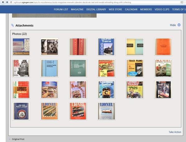
Here's the same screenshot from my phone: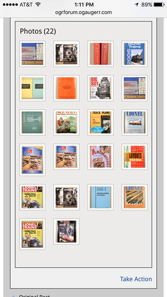
As you can see, some are missing, and in some cases, duplicates have been created. (Remember, this looks fine concurrently on my desktop.)
Here are two other phone screenshots with wrong photos and blurry duplicates of other images shown in their place. These are correct in the desktop version.)
I don't recall anything unusual I did during the posting and editing process, other than uploading all the photos at once, and then moving them around so that they're in the right spot and order.
Please advise if you receive any feedback from Hoop.La.
Thanks-
Todd
Attachments
Rich, the forum works for IE11, here's a sample from my machine. It looks pretty similar to Firefox, which is my normal browser.
Attachments
So far, on Firefox 42 it seems to be working well. As with any upgrade, there are often a few bumps in the road. For Internet Exploder users, I'd recommend putting the page into compatibility view (on the tools menu) as it seems that every update to IE seems to introduce a glitch or two. In addition to subjugating and oppressing computer users, I support a couple of County-wide web-based emergency communications systems and IE has been a thorn in my side (and those of the application's developers) for some time.
Besides my photo "trouble ticket" posted above, I have two suggestions.
1) Bring back the functionality that notes when a posting has been edited, and by whom.
2) Bring back the anonymous "gray-face" avatar. In training my brain to read things in the new format, it's easy to spot the beginning of a new reply when there's an avatar shown. But for those of us that don't use them, there isn't ANY avatar image posted at all, and it's easy to miss the beginning of a new reply.
Good luck with the rest of the tweaking.
TRW
Bob Snyder posted:Thanks Dave. Your response confirms the problem is clearly on my end. I've been using Chrome, running Windows 7. Will fool around with IE and Firefox and experiment changing quantities. Thanks again.
Great news Dave (and Rich) .... using Internet Explorer with my Windows 7 machine solves the problem of printing across multiple pages within a topic. Tried two different topics, and both created just one all-inclusive .pdf file flawlessly. Not sure if it is a combination of Chrome + Windows 7 or something else that caused the problem for me, but I am a happy camper.
And, for what it's worth, I like the new look/format a lot, but do find the slight lack of contrast of light blue on gray to be less than perfect - have to squint a bit - but will get used to it.
Thanks for both for your assistance.
Bob Snyder posted:Thanks Dave. Your response confirms the problem is clearly on my end. I've been using Chrome, running Windows 7. Will fool around with IE and Firefox and experiment changing quantities. Thanks again.
I tired Windows 10 Chrome with both PDF995 and Microsoft To PDF and ended up with 0 byte files, so there is something amiss with Chrome.
BTW, thanks for bringing this up, it reminded me I can "print" some of these posts/threads to PDF for later reference offline.
I'd also like to say that after spending much of yesterday and today fooling around with the forum using Windows Edge, I'm quite happy with it. It's taken a bit to get used to the scrolling, but the changes that have been made have improved things quite a bit. I've actually found a few features I've never used because I've been forced to check the new ways of doing things and stumbled on to them. ![]()
Doubedaz, I just got this from Hoopla about the narrow column issue you (and others) are having with IE:
"It looks like the code to target the parent is not working in IE 11, and is instead loading within the iframe...we were able to track down this issue and it should be fixed in the next hotfix."
Thanks for sharing those screen shots. They were invaluable in opening my eyes to this IE-specific problem. Hoopla confirmed that it is a problem that only effects Internet Exploder, so we know that definitely is the issue.
PaperTRW posted:Rich,
I think there is something strange going on with photo posting. Please see my recent For-Sale listing here.
Todd, I looked at your For Sale post on my phone and it looked fine. All 22 images are there, they display in the proper place and they are all sharp and clear. Not sure why you saw the fuzzy images.


