Check in tomorrow to see what the UP could have had instead of the big boy.  


Pictures es have been added


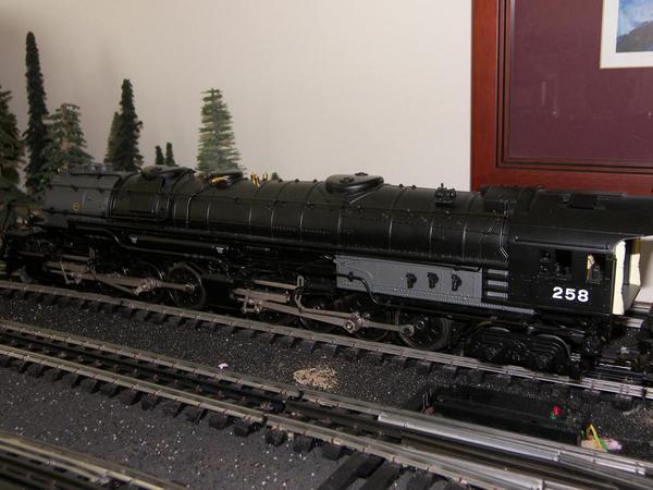
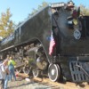
Yes it is a UP 2-8-8-4 EM1 now in Union Pacific livery. It is legacy with whistle steam. 


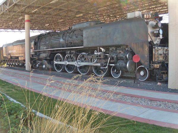
I have been thinking for awhile that UP should have had the EM1, of course they never did. But if they did it would have fit right in of big powerful steam engines. 


My friend Alex Malliae painted and re lettered the tender for Union Pacific. Another great job. The tender was originally WP but getting a blow out deal a year or so ago I could not pass it up. 


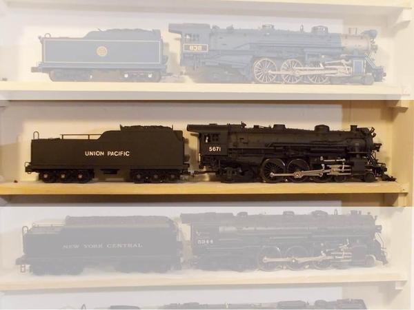
It is now added to my fleet of big Union Pacific power.yes it is fantasy but it is really cool.


image

image

image

image

image

Attachments

Images (5)
  • image
  • image
  • image
  • image
  • image
Last edited by david1
Original Post

Replies sorted oldest to newest

It looks okay to me. The EM-1 looks good like that.


I've use the same font as david1 did when I repaint locos in UP and consider it a satisfactory substitute - not perfect,but not enough to stand in the way of a good conversion project. On the N&W J below, I used vinyl Helvetica as a reverse stencil (applied before the yellow was sprayed over them and removed them when it was still wet).  The second loco is a Legacy Southern Crescent repainted black and with white Helvetica vinyl letters. 

Slide1This was the Southern Crescent before repainting.  


SC to UP

Attachments

Images (2)
  • Slide1
  • SC to UP
Originally Posted by Professor Chaos:


Hate to point this out, but wrong typeface.  UP's is very distinct. (Compare the lettering on the tender with the lettering on the caboose)


This is one of my pet peeves when manufacturers do this - steam era rolling stock with a mid-century typeface like Helevetica.


Looks good to me a that is all that counts
Originally Posted by Lee Willis:

It looks okay to me. The EM-1 looks good like that.


I've use the same font as david1 did when I repaint locos in UP and consider it a satisfactory substitute - not perfect,but not enough to stand in the way of a good conversion project. On the N&W J below, I used vinyl Helvetica as a reverse stencil (applied before the yellow was sprayed over them and removed them when it was still wet).  The second loco is a Legacy Southern Crescent repainted black and with white Helvetica vinyl letters. 

Slide1

Oh Lee your killing me.....

Originally Posted by Professor Chaos:

Glad you like it;  it's just one of those things that drives me up the wall!


Of standard typefaces, Futura is probably closest, but Railfonts has a "City Of" font that was designed after the UP type:


up

Yea your right but I really can't tell the difference between the fonts you posted. Maybe it's my eye sight but the difference is so little it's hard for me to tell. 

Originally Posted by Hot Water:
Originally Posted by david1:
Originally Posted by Hot Water:


Mr. Otto Jabelmann is probably spinning in his grave!


He would most likely agree with me,

Nope, since the EM-1 was designed to burn far better coal than what was available on the western/mountainous portions of the Union Pacific system.

I would think that Mr. Jabelmann was so brilliant he would have found a way to make it work. 


But I do repeat this whole exercise is a what if not that it should have. 

Originally Posted by david1:

I would think that Mr. Jabelmann was so brilliant he would have found a way to make it work. 

No, he wouldn't have bothered since the EM-1 2-8-8-4 had only 64 inch diameter drive wheels, and the Union Pacific Railroad was interested in a "fast freight" steam locomotive. That is why the 3900 class 4-6-6-4 locomotives had 69 inch drive wheels, and the 4000 class locomotives had 67/68 inch drive wheels. An EM-1 would have been simply too slow for them, even if they could get it to burn that Wyoming Hanna Coal!

Originally Posted by david1:
Originally Posted by Professor Chaos:

Glad you like it;  it's just one of those things that drives me up the wall!


Of standard typefaces, Futura is probably closest, but Railfonts has a "City Of" font that was designed after the UP type:


up

Yea your right but I really can't tell the difference between the fonts you posted. Maybe it's my eye sight but the difference is so little it's hard for me to tell. 

I can;t tell enough difference to really care, either, but I suppose a "rivet counter" could: to each his own (font).


I'd use any of them if none of the others was available.  If all were, I'd use city of although I might be tempted to "shave" Futura.  It has a nice look otherwise.

Last edited by Lee Willis

The EM1 was purpose designed specifically for the B&O, and more than that, she was specifically designed for the B&O in the circumstances of the day...1944-'45.  She was and is, a vastly underrated and under appreciated piece of locomotive architecture. Keep in mind, B&O would have gone for EMC/ EMD FT Diesels, had they been available in the proper time frame.  The EM1 was designed to give the operating dept. the best possible balance between cost and performance....and was expected to be what amounted to a coal burning Diesel, of sorts, when assessing the bottom line. Given the wealth of Diesel operating knowledge B&O had assimilated by that time, and their cumulative steam experience....Best and Only was able to work with Baldwin to engineer an absolute masterpiece....given the parameters.  Now this can be said of any steamer to a degree, but for B&O, there was precious little wiggle room.  UP could and did go for the Big Boy....for many of the same reasons C&O went for the Allegheny.  They could afford to live with it !

And it wouldn't stop with gigantic reciprocating steam. Both UP and C&O played with steam turbines, and Uncle Pete went over the top with a big GTEL fleet !

When one lives in iron ore country such as myself they have a tendency to be fans of the DM&IR's Baldwin Yellowstones. These locos actually produced more tractive effort than the Big Boy at 140,000 ft/lbs compared to the 135,000 of the Big Boy. I also bought the EM-1 lionel made in DM&IR, it looks a little weird with the beige boiler and no centipede thender but I like it none the less. Both my MTH Yellowstone and the EM-1 are a bit out of place with my mostly UP equipment but they are sweet locos. Your UP version looks sharp, did you put a sheild on the nose?

Yellowstones were very cool, I agree.  I have one and love it.


As to the "silver" lettering.  Well, my Up H7 3595 has silver letters and numbers:

  •  All the others are white, both MTH and Lionel, of course, they could be wrong . . .
  • But . . . in 1954, at age 5, in a trainyard near Provo, UT, I stood next to a UP Challenger or Big Boy - I don't remember which except it had allotof great big wheels, that my Dad explained the articulated nature, that it bent, and it was huge, and it radiated heat even though we were not that close.  It had white Union Pacific lettering on the tender and loco .  I think I would have known the difference: silver is pretty easy to tell.  ATSF had silver, the UP I saw had white.

Frankly, I know, I was five . . . my memory could be faulty.  But all but one of my Vision, Legacy, and Premier locos is white lettering: so on my layout - UP is white. 

Last edited by Lee Willis
Originally Posted by Lee Willis: 

As to the "silver" lettering.  Well, my Up H7 3595 has silver letters and numbers:

  •  All the others are white, both MTH and Lionel, of course, they could be wrong .


       Yes, if they are white, then those models of UP steam locomotives are wrong. Even the Sunset/3rd Rail super detailed brass models of #4013 & #4014 had all white lettering and numerals. I had to have the whole model corrected and re-lettered/numbered with the CORRECT Champ decals.

  • But . . . in 1954, at age 5, in a trainyard near Provo, UT, I stood next to a UP Challenger or Big Boy - I don't remember which except it had allotof great big wheels, that my Dad explained the articulated nature, that it bent, and it was huge, and it radiated heat even though we were not that close.  It had white Union Pacific lettering on the tender and loco .  I think I would have known the difference: silver is pretty easy to tell.


       Sorry, but all UP steam power was indeed lettered & numbered in what they UP referred to as "aluminum". When a locomotive was freshly out shopped & painted, it was readily obvious that it was NOT white. However, once in service, it was NOT very easy to determine the difference between white and the UP's aluminum lettering. 

  •  ATSF had silver, the UP I saw had white.


      I'll bet not. Please check the Union Pacific Historical website, for more information.


Frankly, I know, I was five . . . my memory could be faulty.  But all but one of my Vision, Legacy, and Premier locos is white lettering: so on my layout - UP is white. 


To each his own, but then please refrain from arguing with the facts.


Originally Posted by Hot Water:
Originally Posted by Joe Barker:

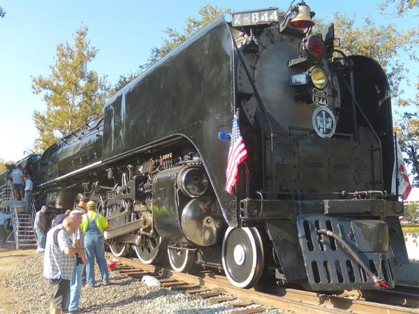
Looks like white lettering to me.  The first photo was taken at Odgen, Utah and the second is of 844 at Sacramento, CA.

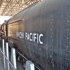
It may look like white to you, but neither 844, nor 3985, nor 4014 have white lettering & numerals.

Like I said, I remember as a kid white letters and numbers - but it was a long time ago (1954ish).


Anyway, I will be sticking with white.  The lettering on all but two of my Vision, JLC, MTH Premier, and Legacy models is white.  Only on my H7s are the letters and numbers silver.  So I when I repaint a black loco and re-letter it UP I have and will use white.  I'm not trying to match the prototype, but rather match my other models (they all sit on a shelf together sort of in order of time-first-placed-in service).

Interesting David. The Northern Pacific designed, developed, and ran the first Yellowstone locomotives. The Z-5 class was the largest locomotive of its day. The UP challenger and Big Boy did not exist at the time. Why the UP did not order a Yellowstone is beyond me. I believe they were designing/ building their own class of engines at that time, like the 2-8-8-0 bull moose. Maybe they had left over engines that they purchased like the Y-3 and H-7 that they didn't have the need. 

The EM1 really is not a Yellowstone, its a modern version and unique class of 2-8-8-4.

Why Lionel slaps different road names on engines that did not exist, I guess is to broaden their market and sales. 

I like your version of the EM-1, if your going to have fun, then just do it.

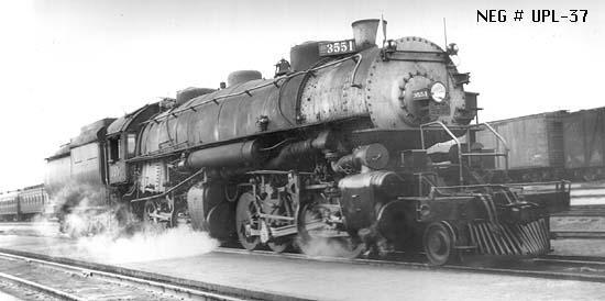
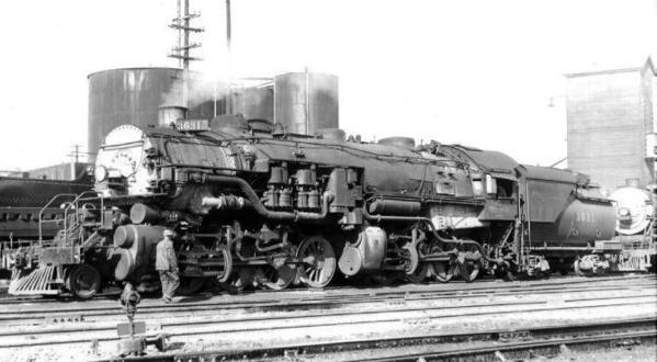
I was hoping Lionel would make a version of the Bull Moose.


upl37

DonneesFichier,table,articles,champ,image,cle,no_article,valeur,17,titre,2-8-8-0-bull-moose

Attachments

Images (2)
  • upl37
  • DonneesFichier,table,articles,champ,image,cle,no_article,valeur,17,titre,2-8-8-0-bull-moose
Post

OGR Publishing, Inc., 1310 Eastside Centre Ct, Suite 6, Mountain Home, AR 72653
800-980-OGRR (6477)
www.ogaugerr.com

×
×
×
×
Link copied to your clipboard.
×
×